work-heading
Projects
Campaigns
Campaign Devolopment
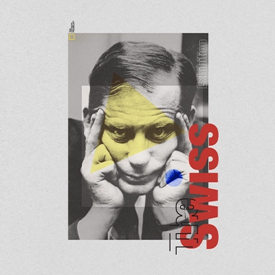
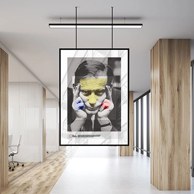
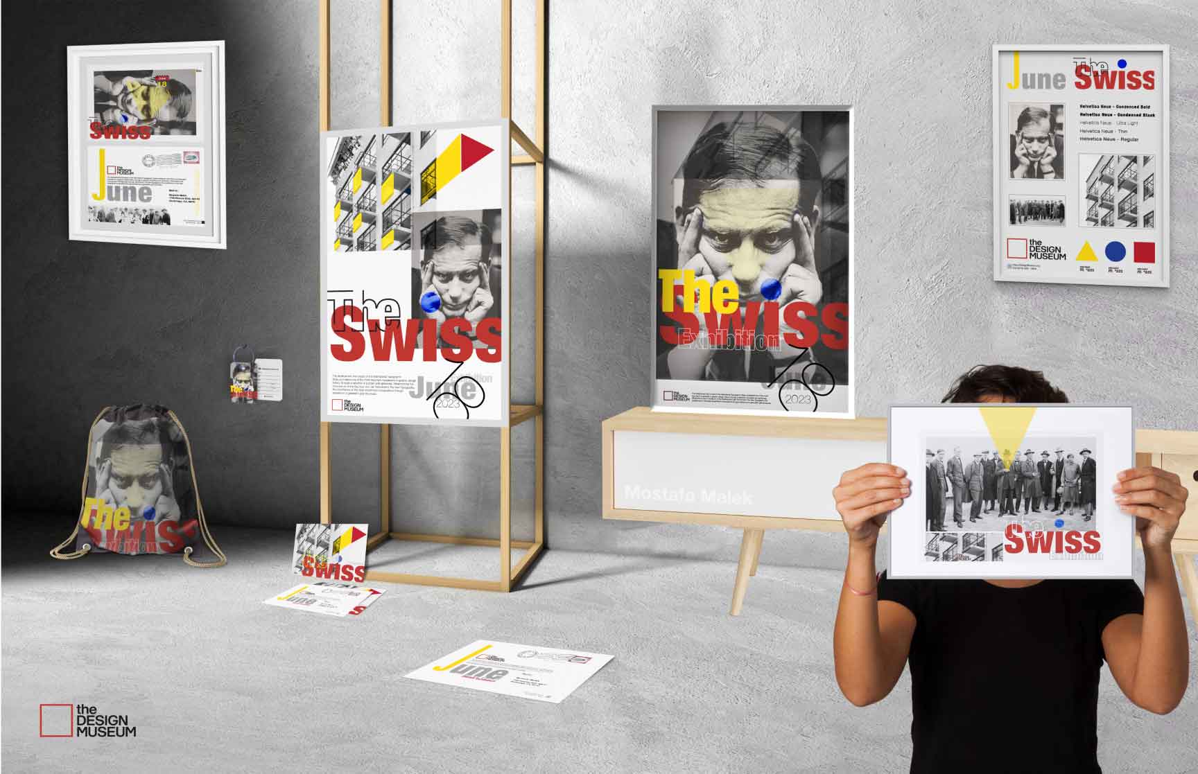
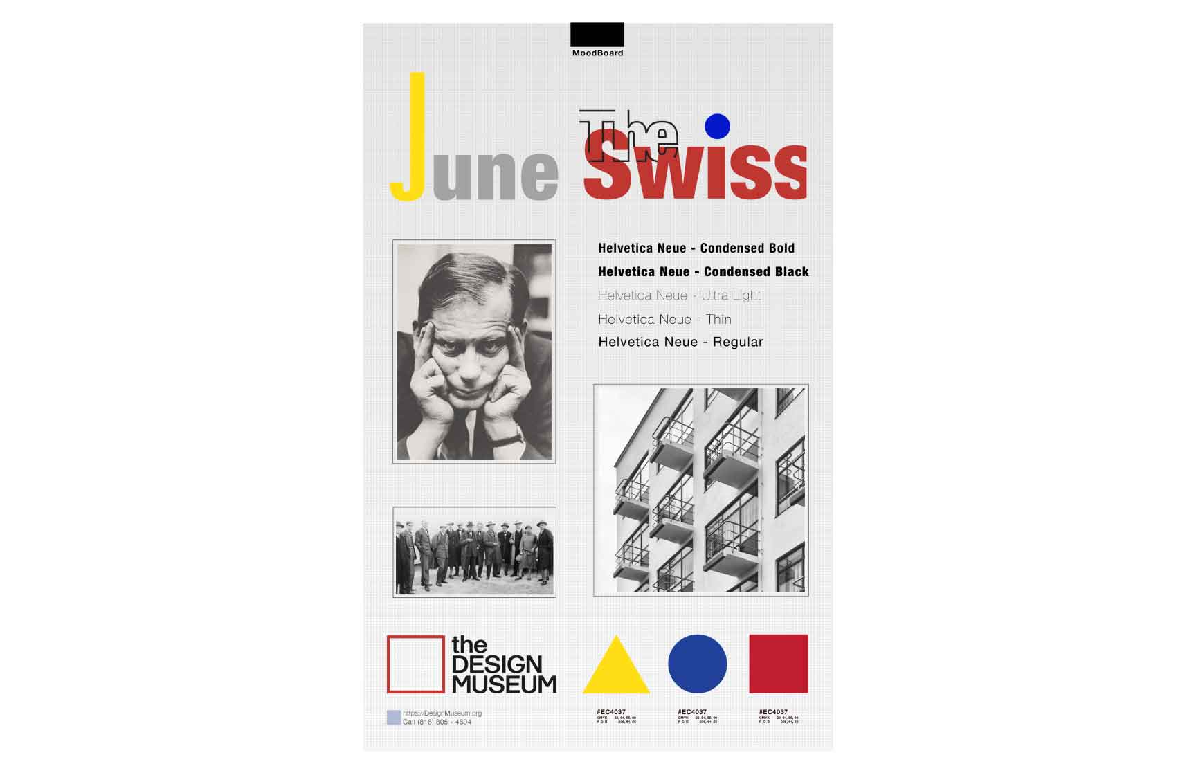
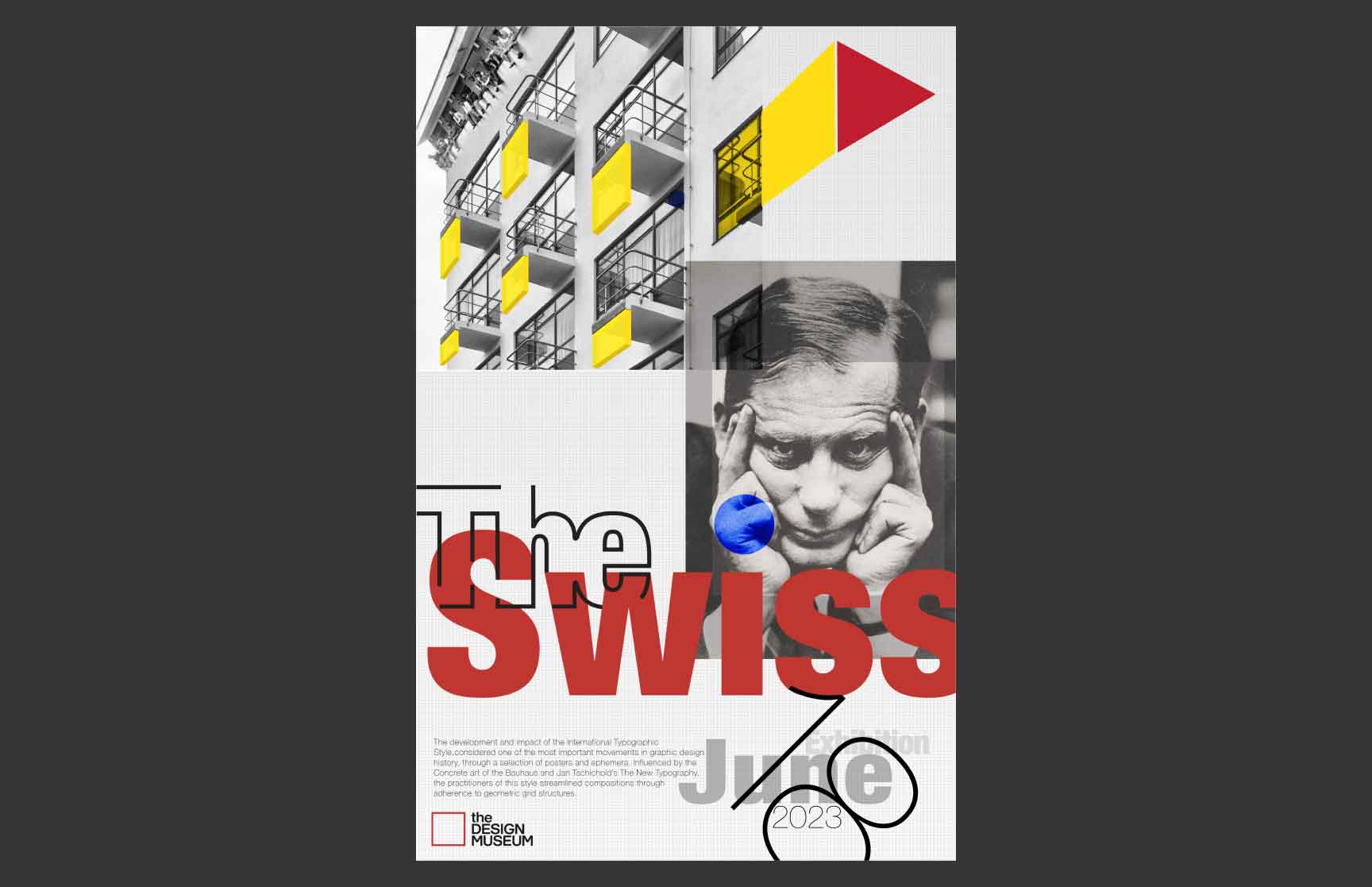
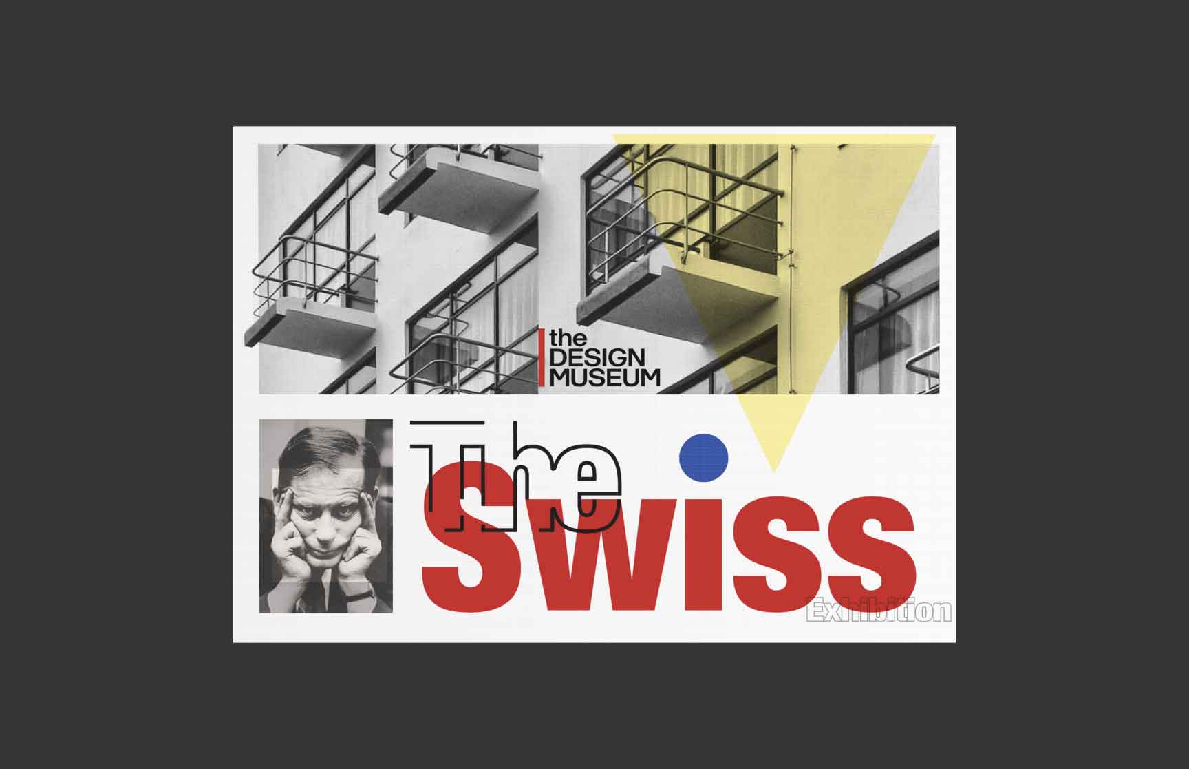
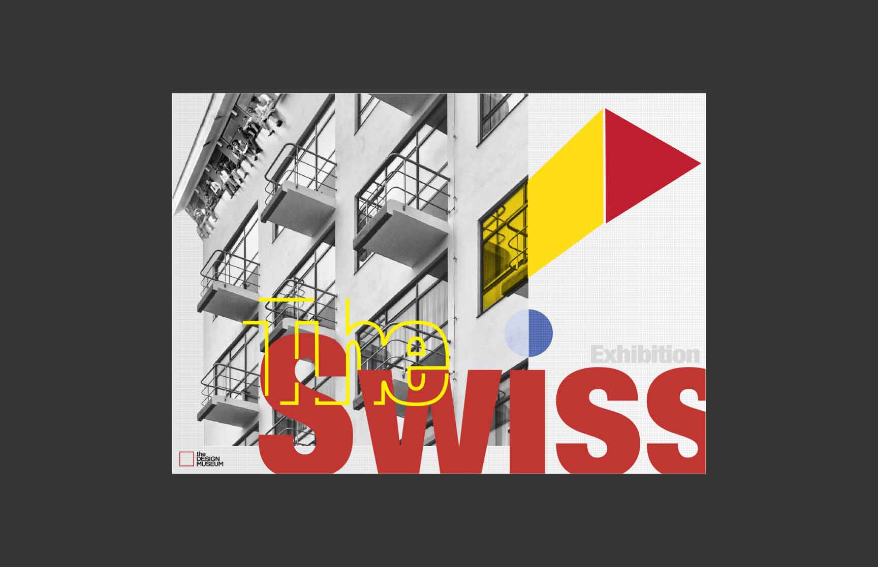
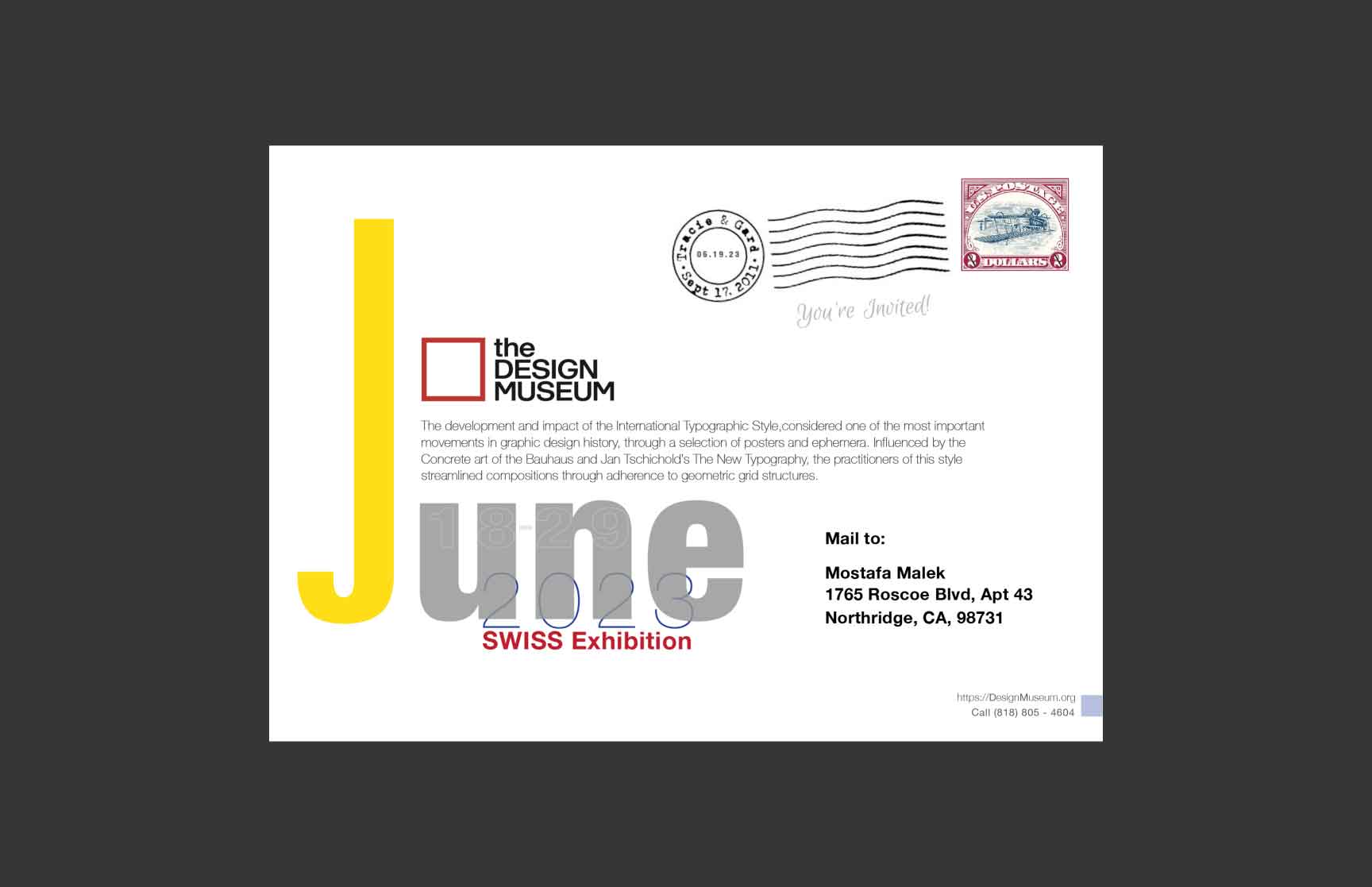
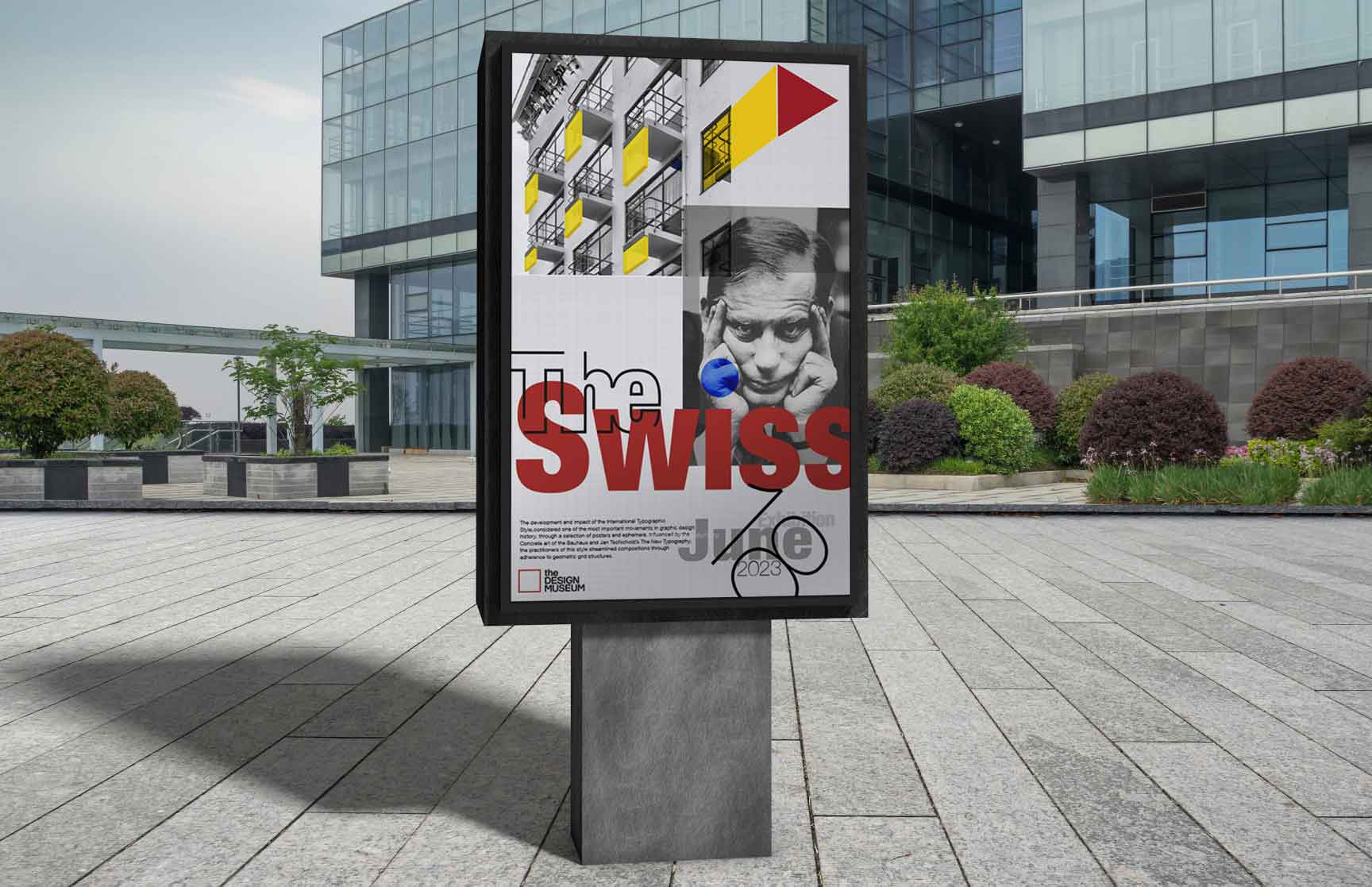
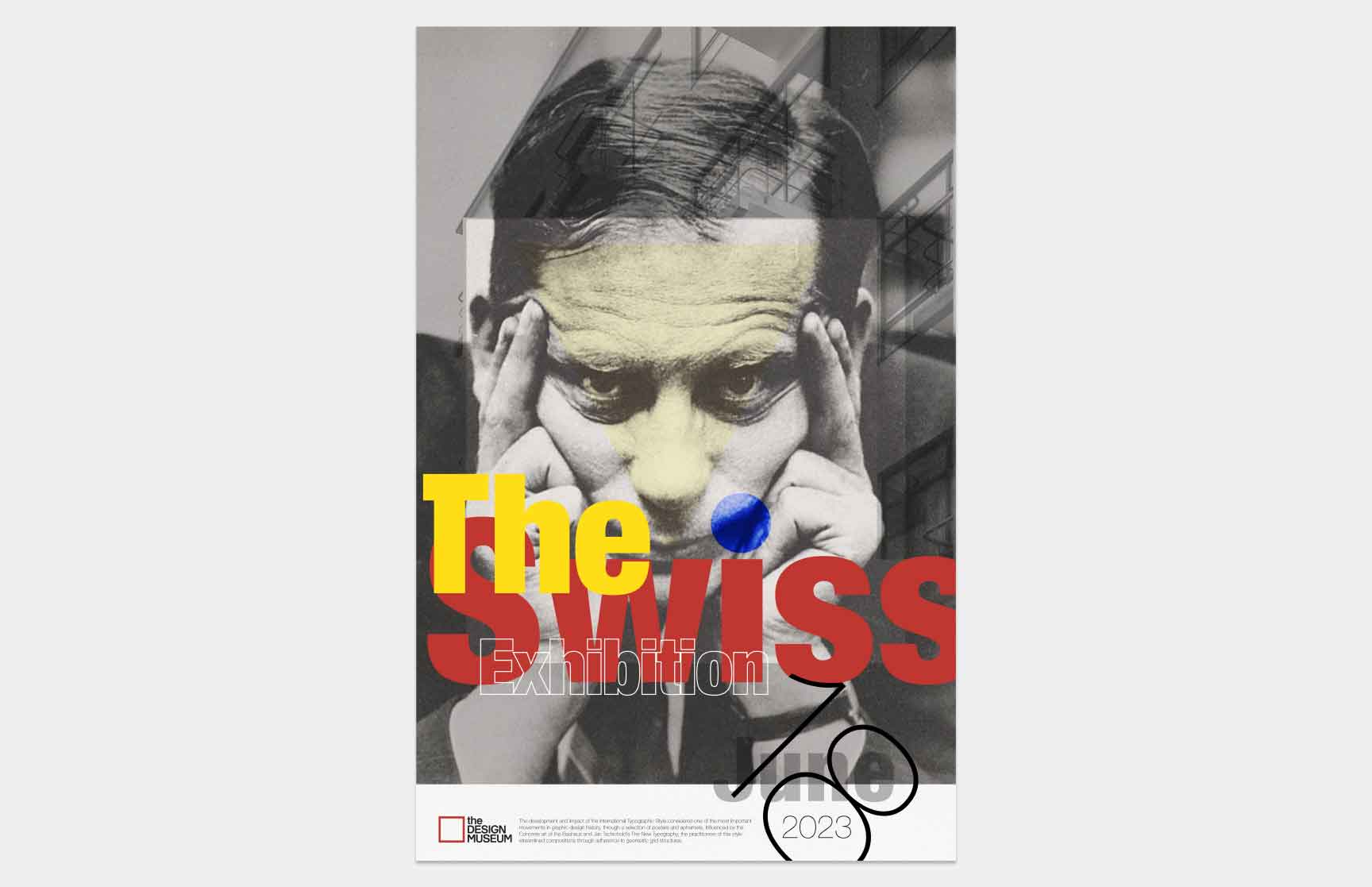
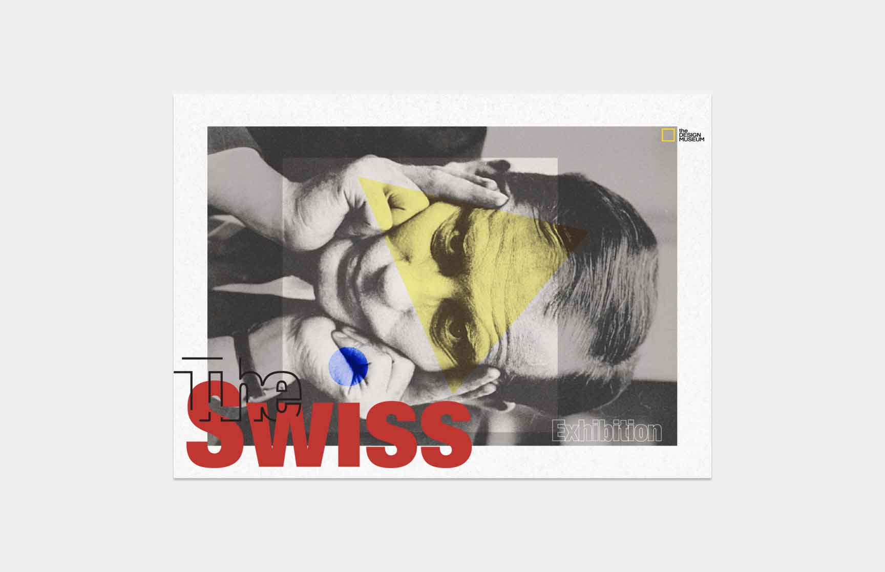
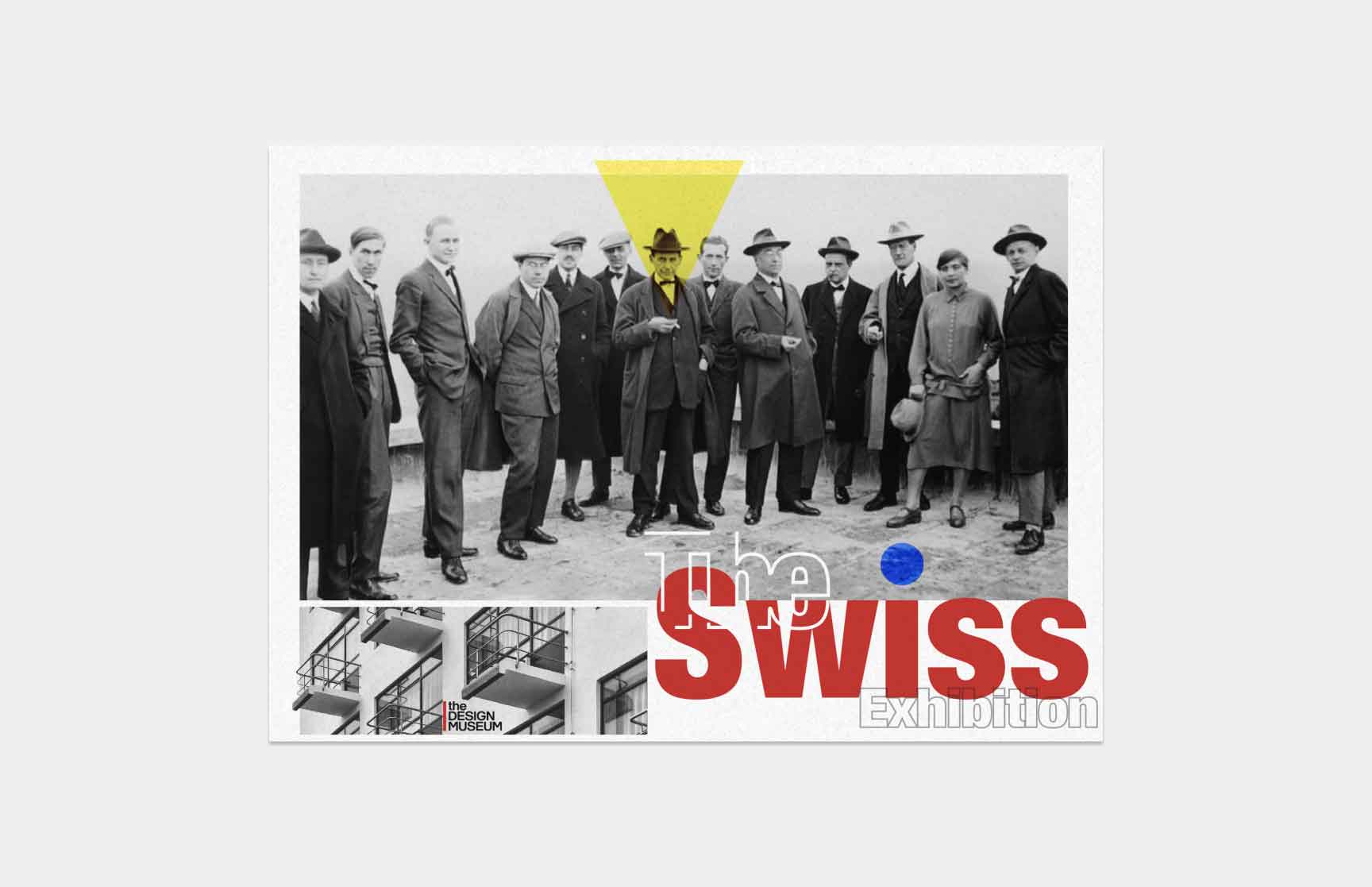
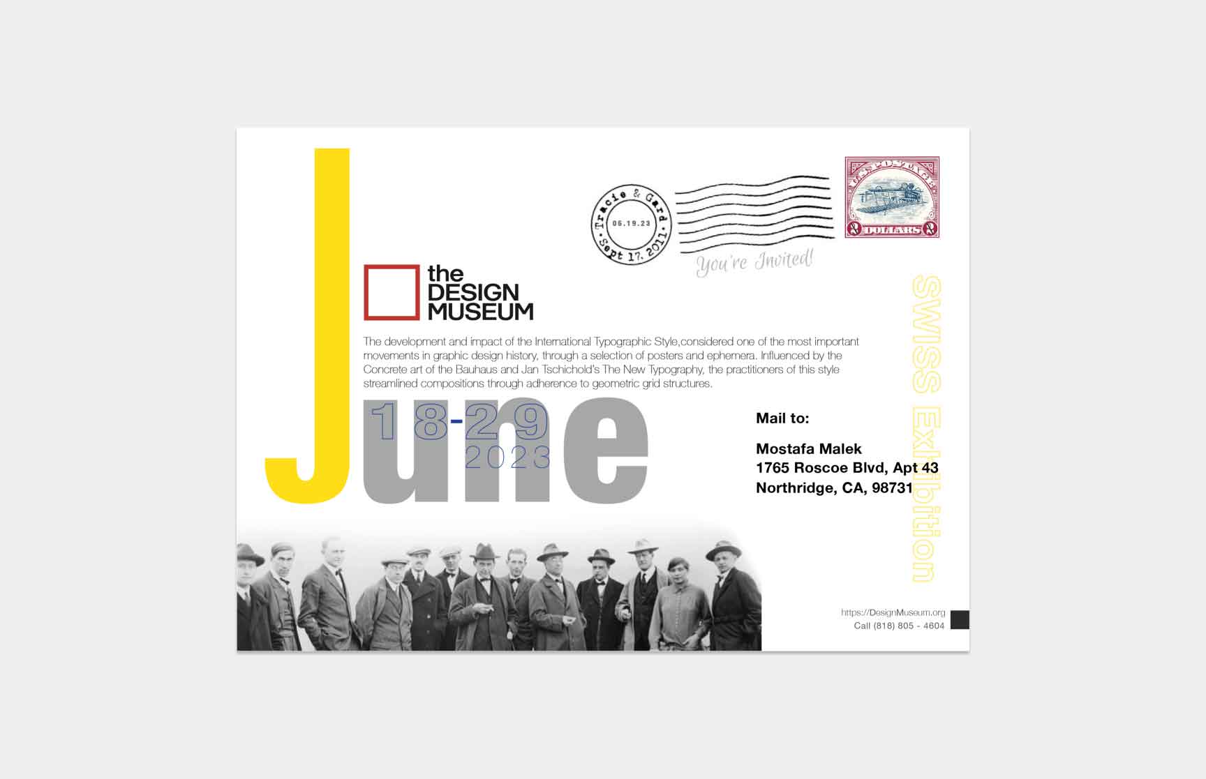
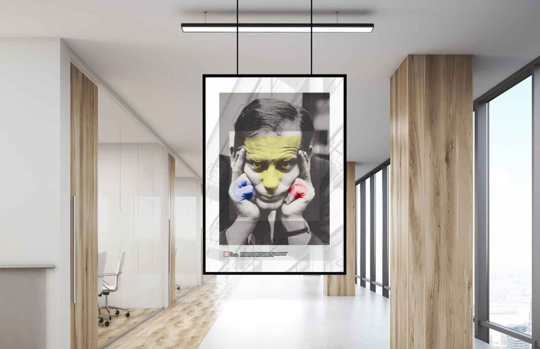
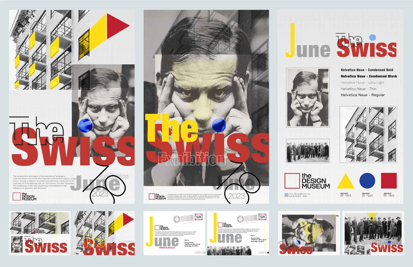
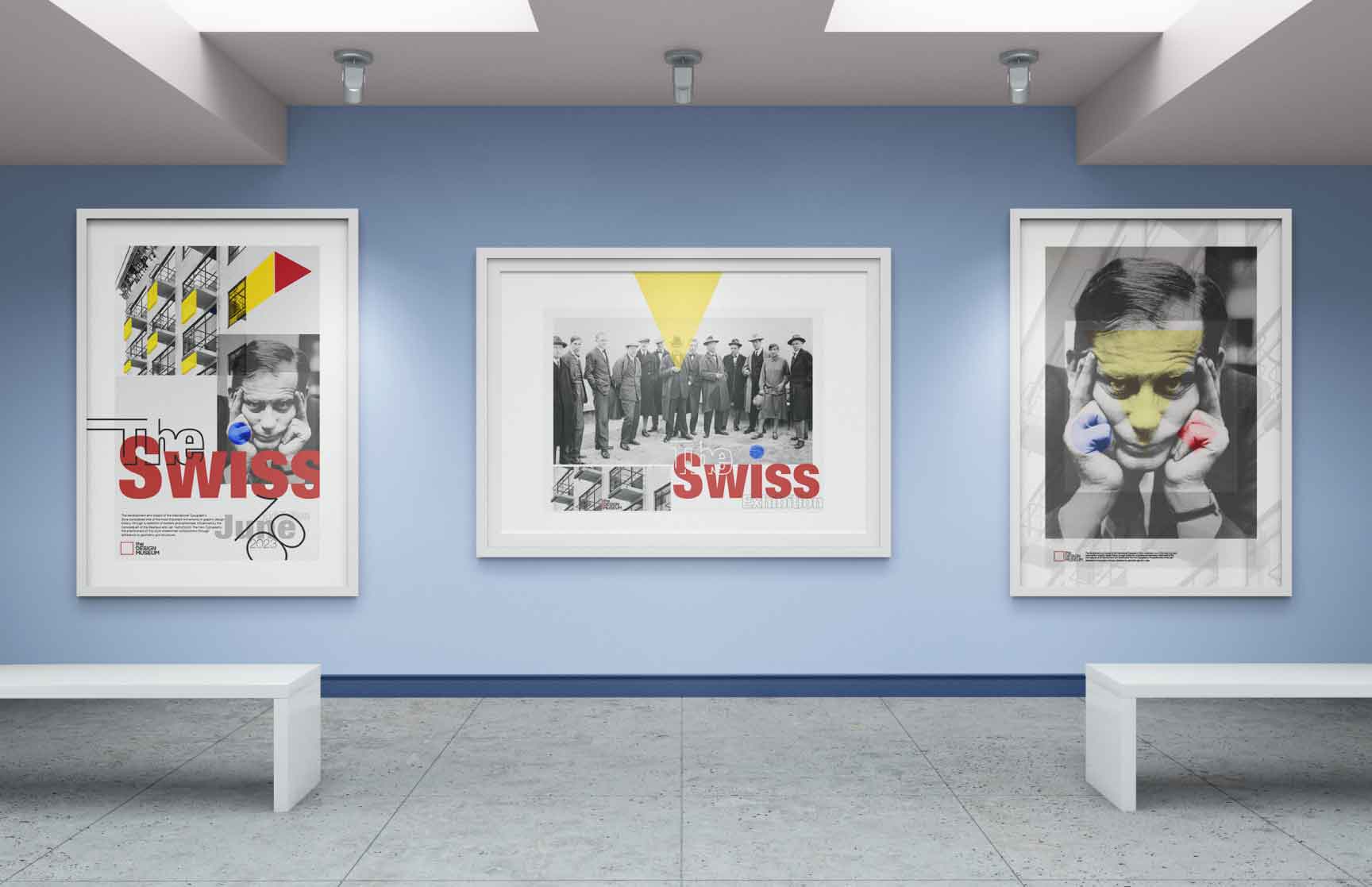
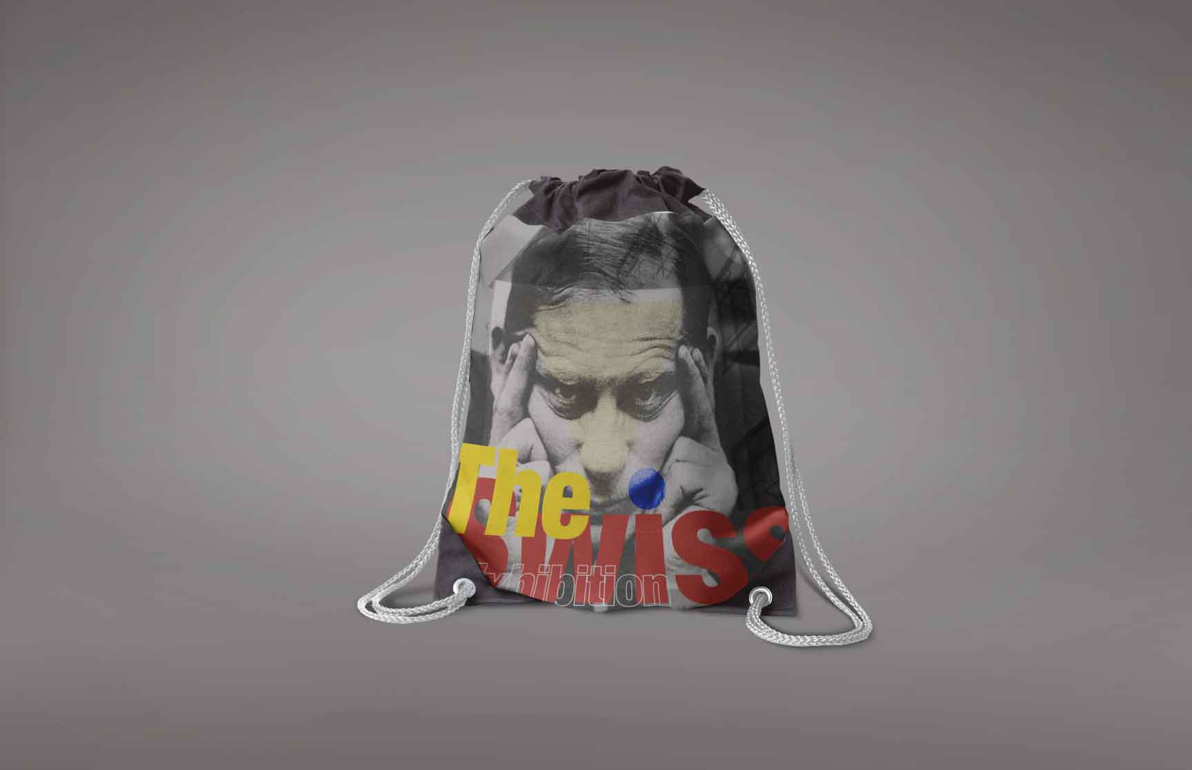
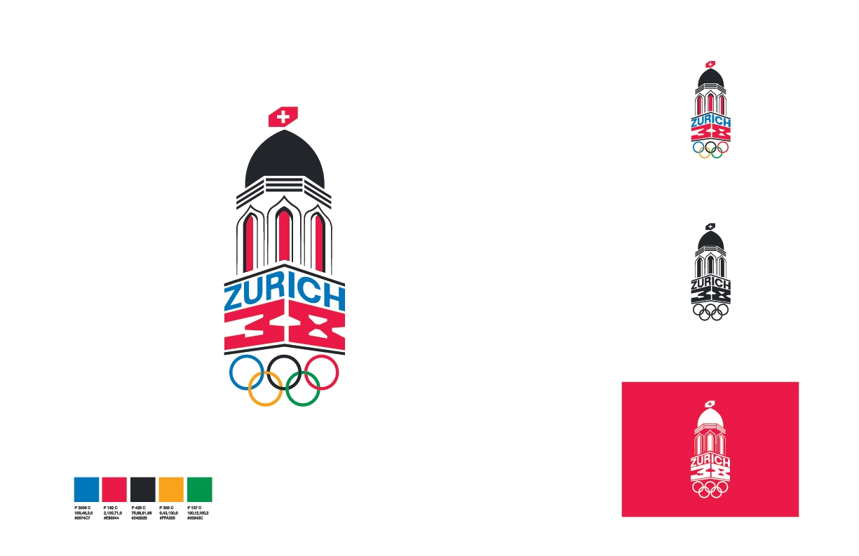
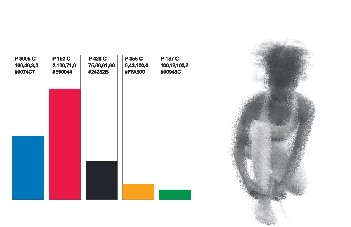
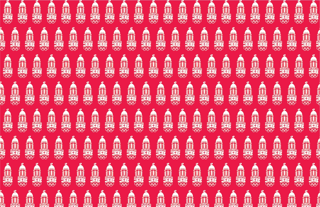
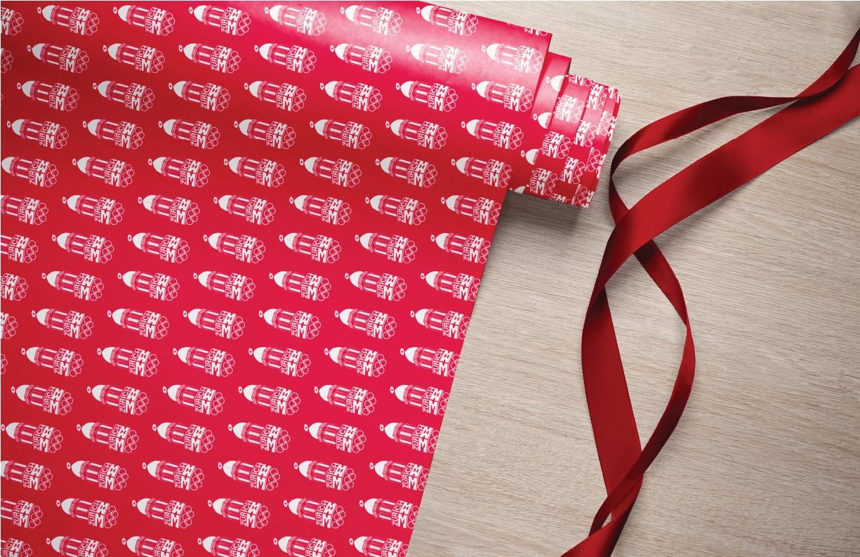
THE SWISS
Visual Identity system
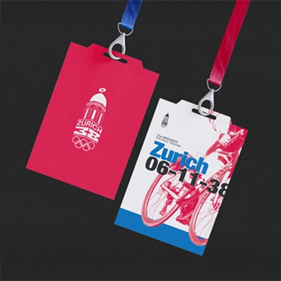
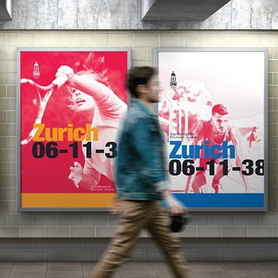
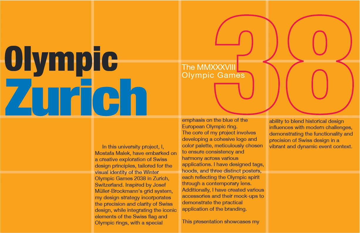
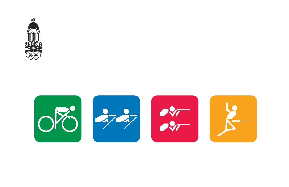
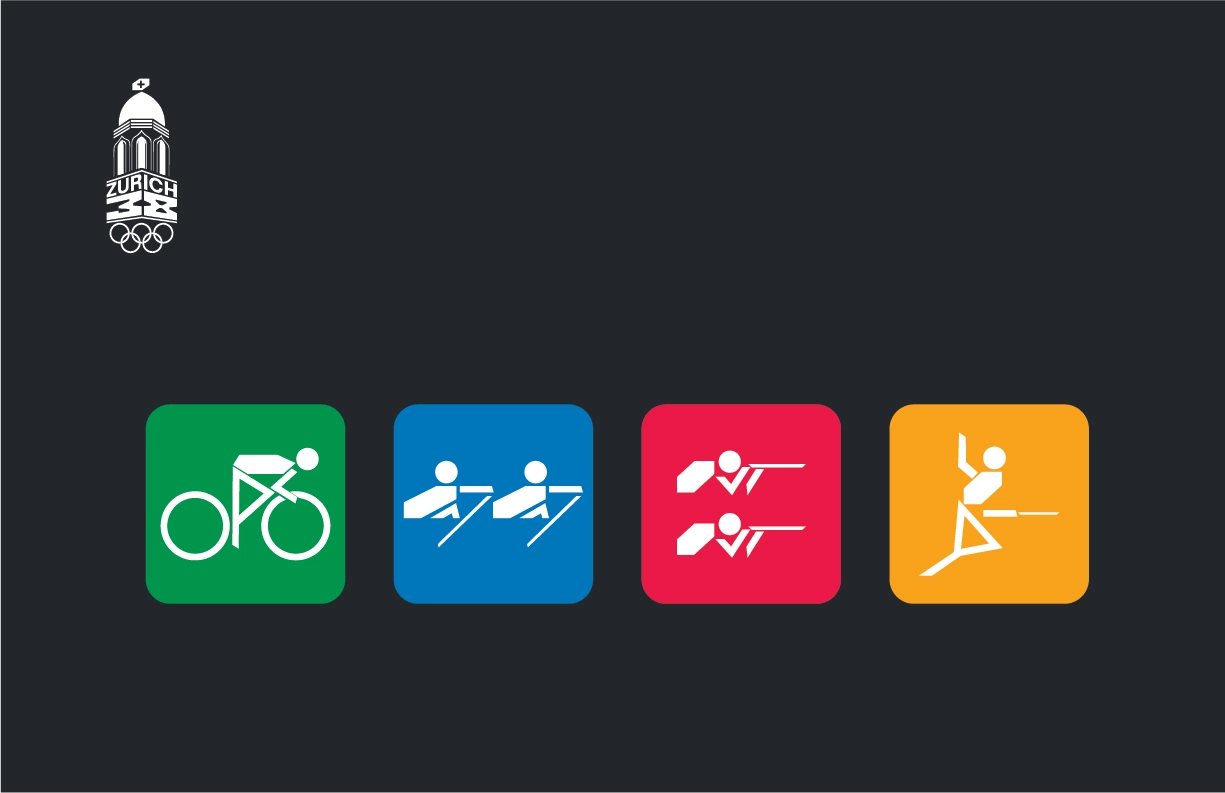
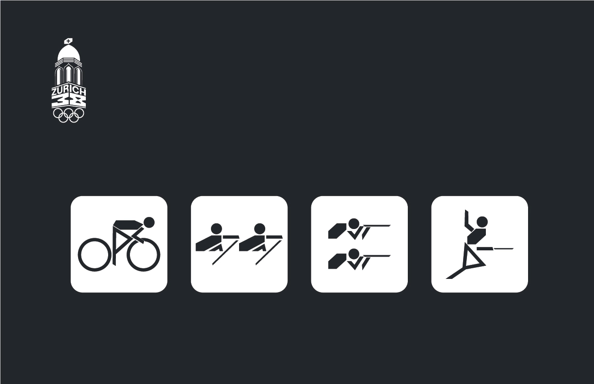
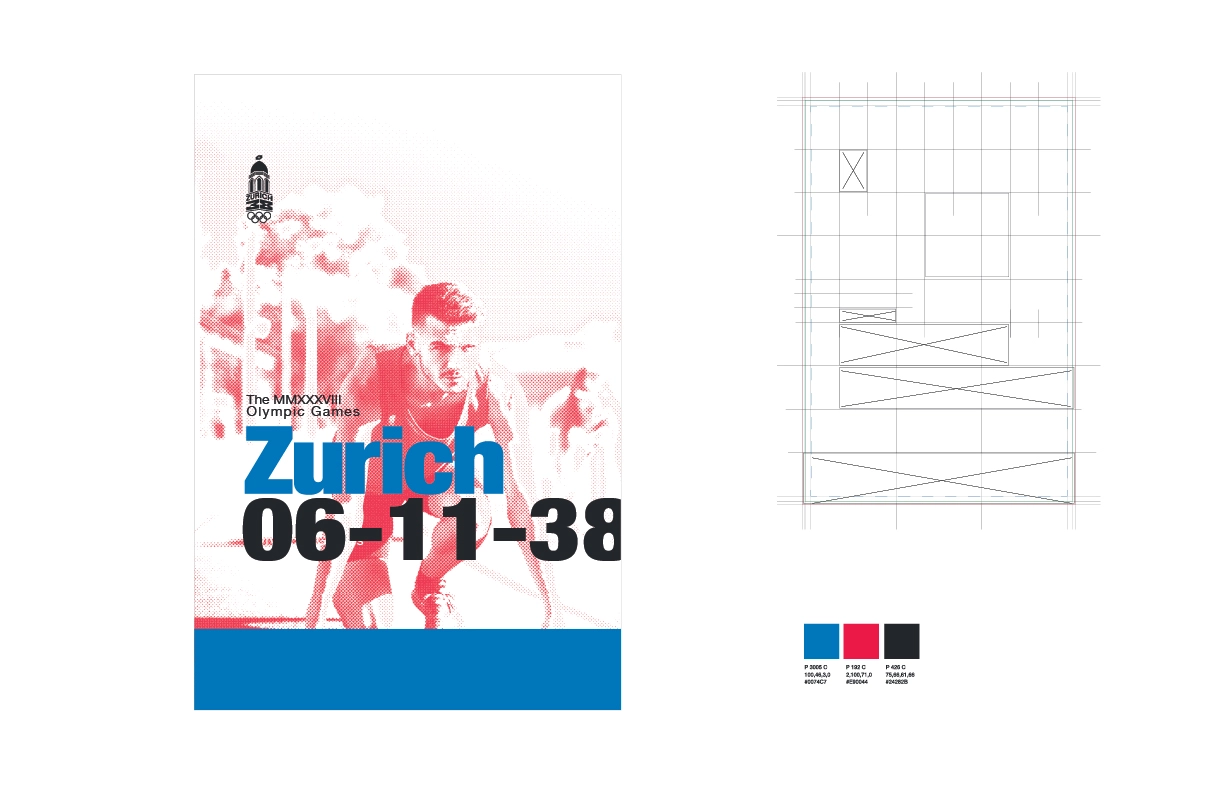
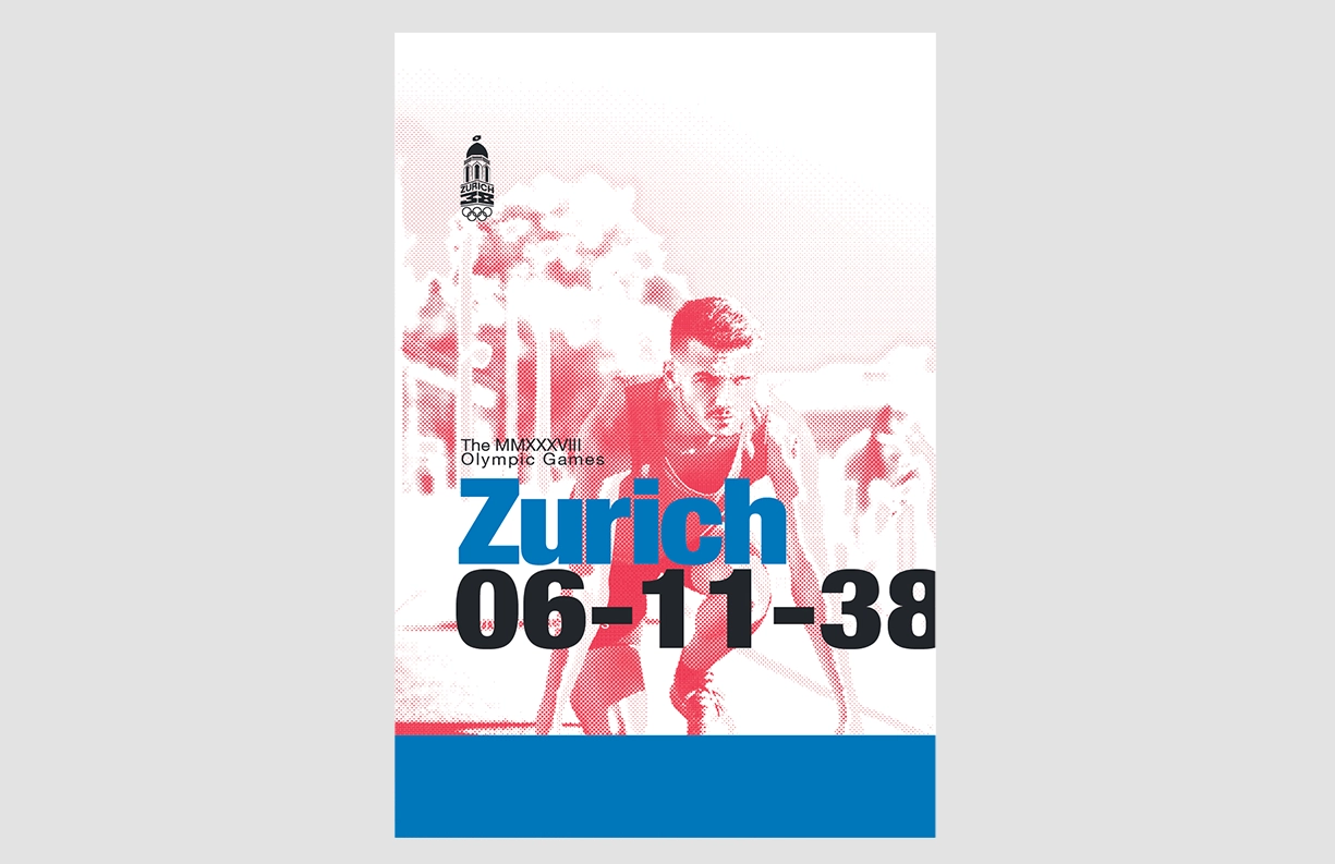
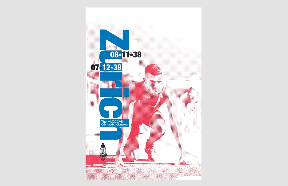
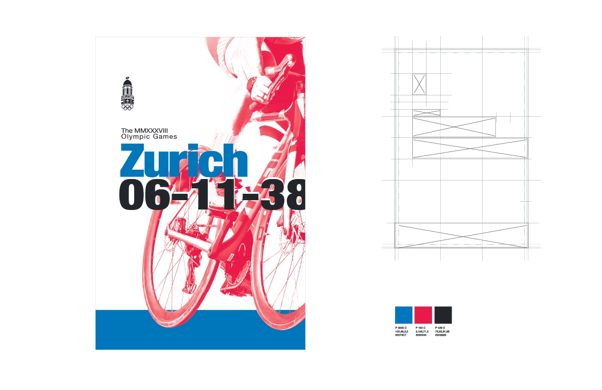
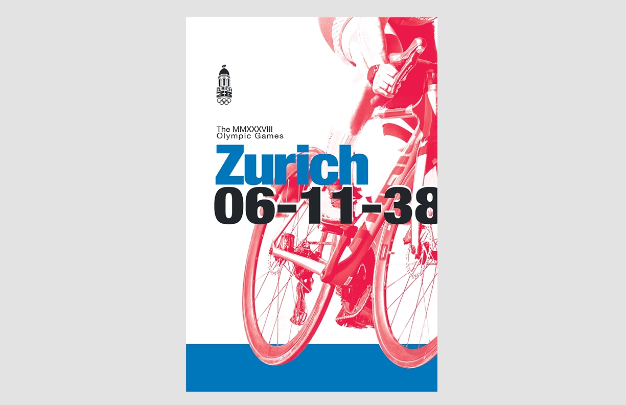
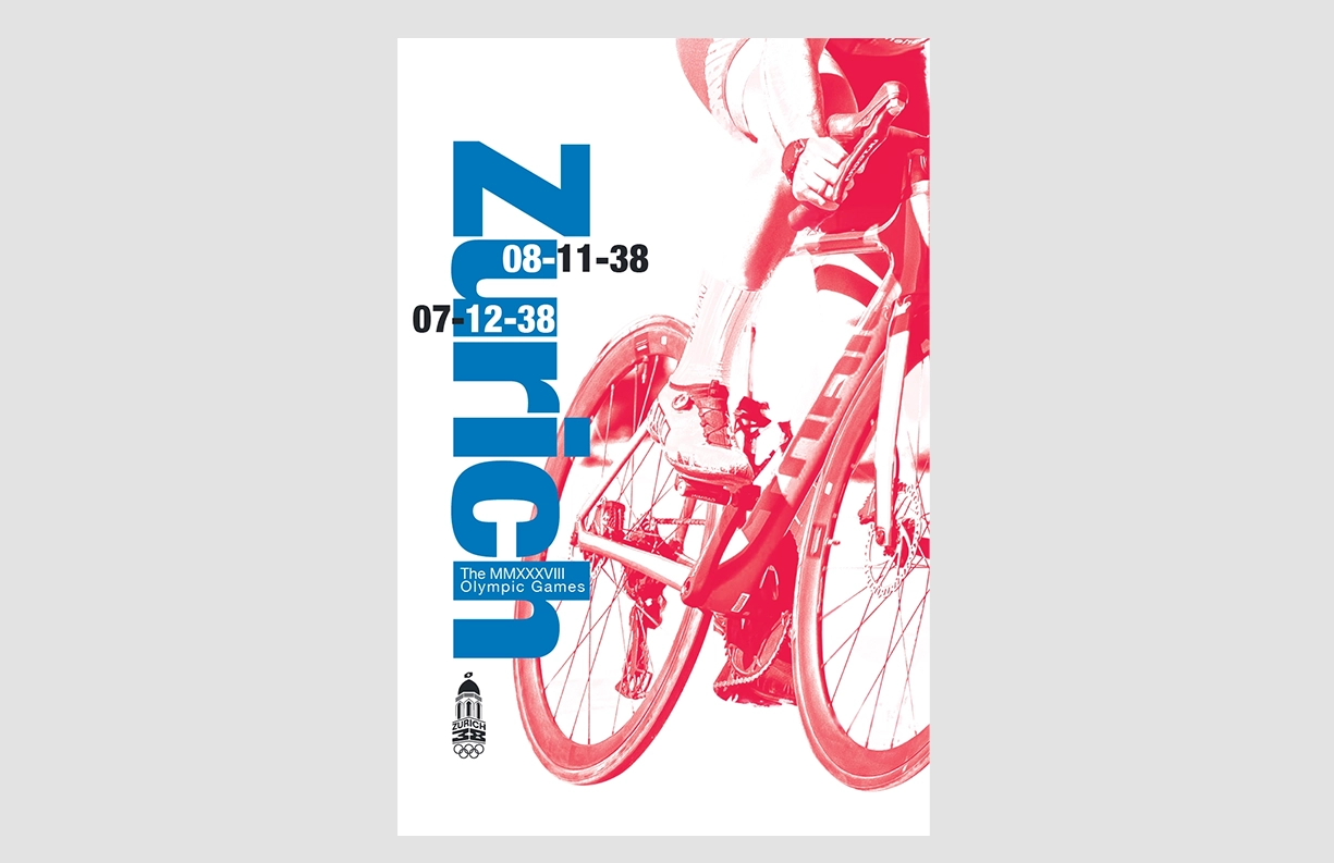
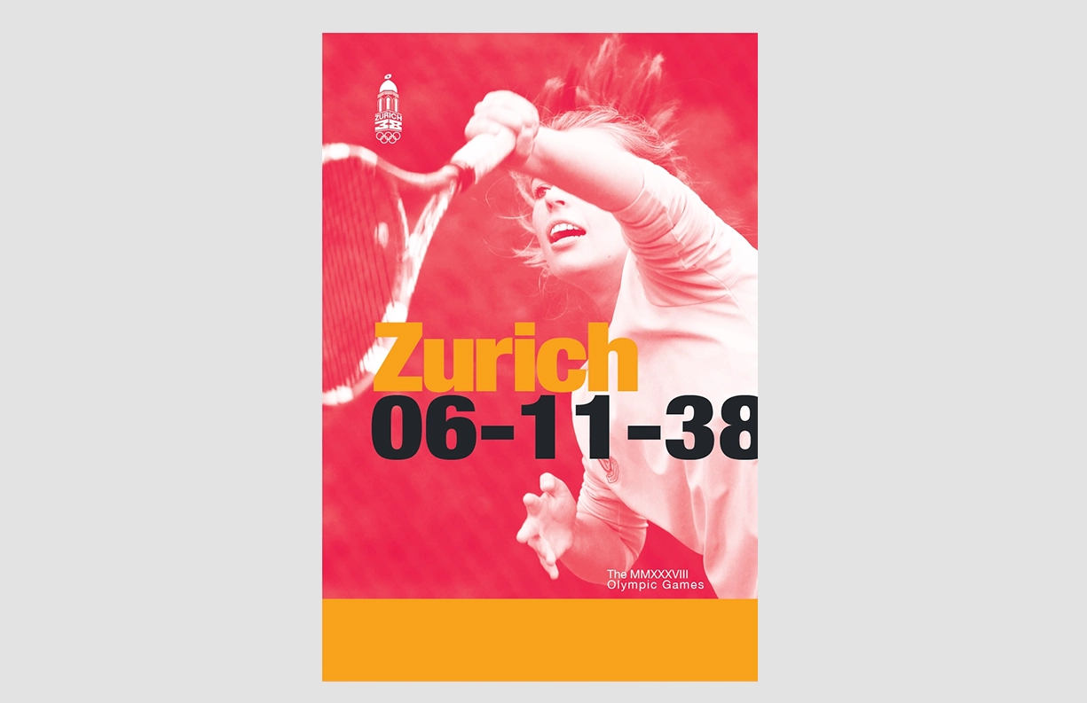
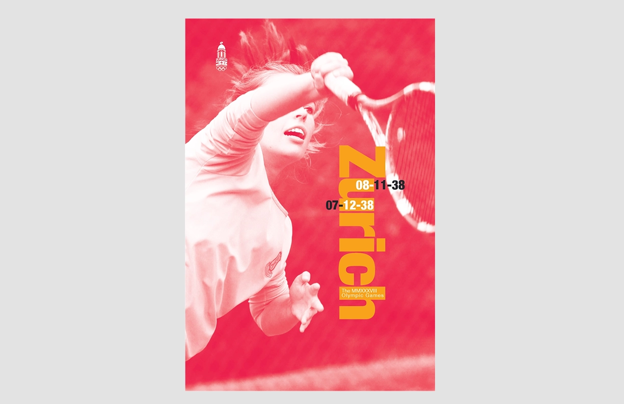
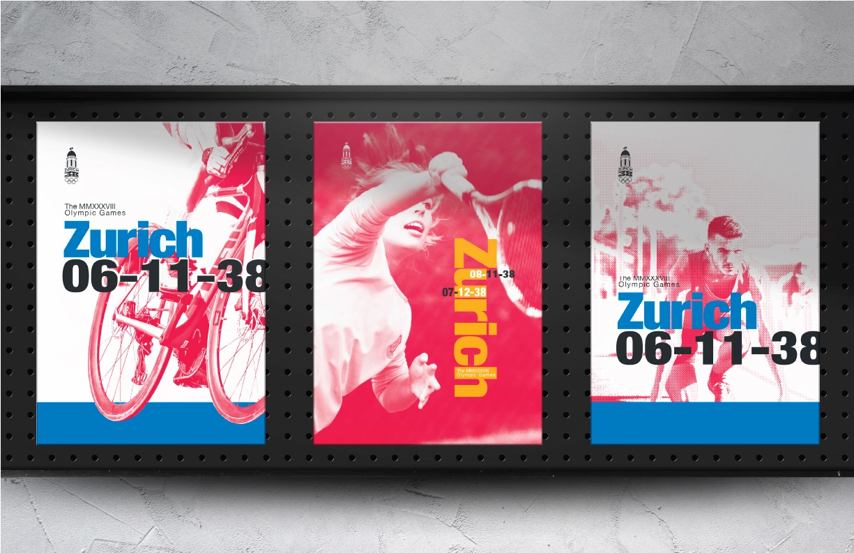
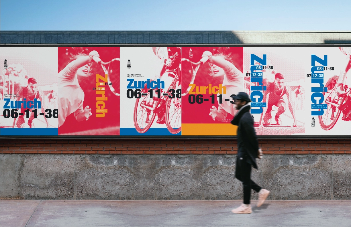
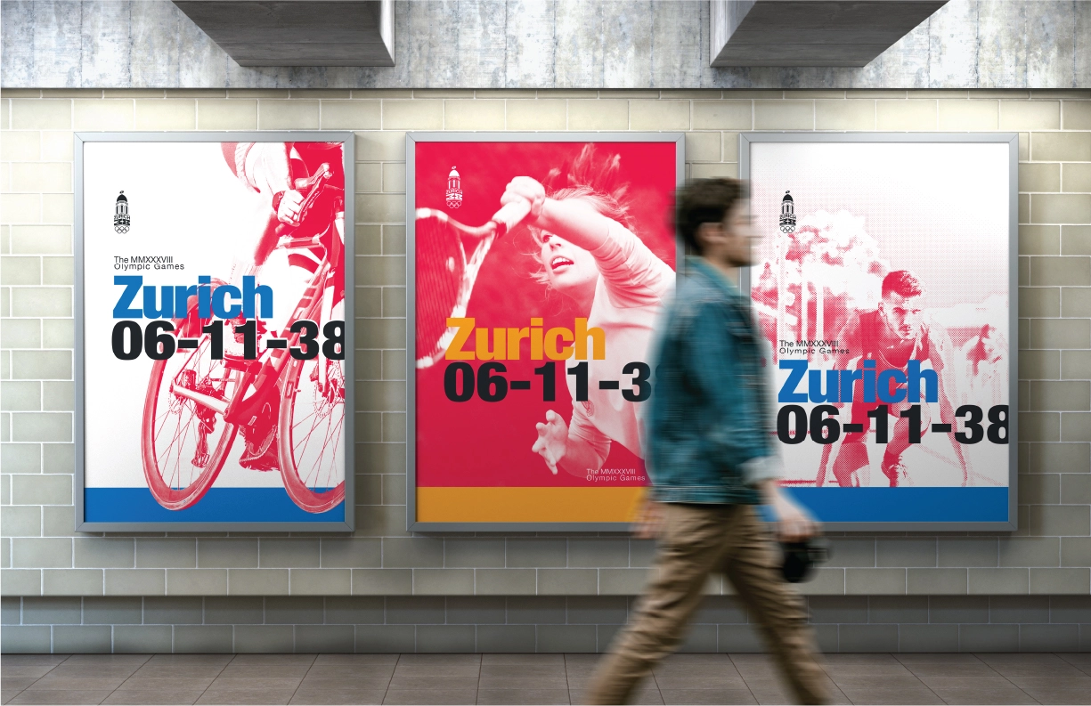
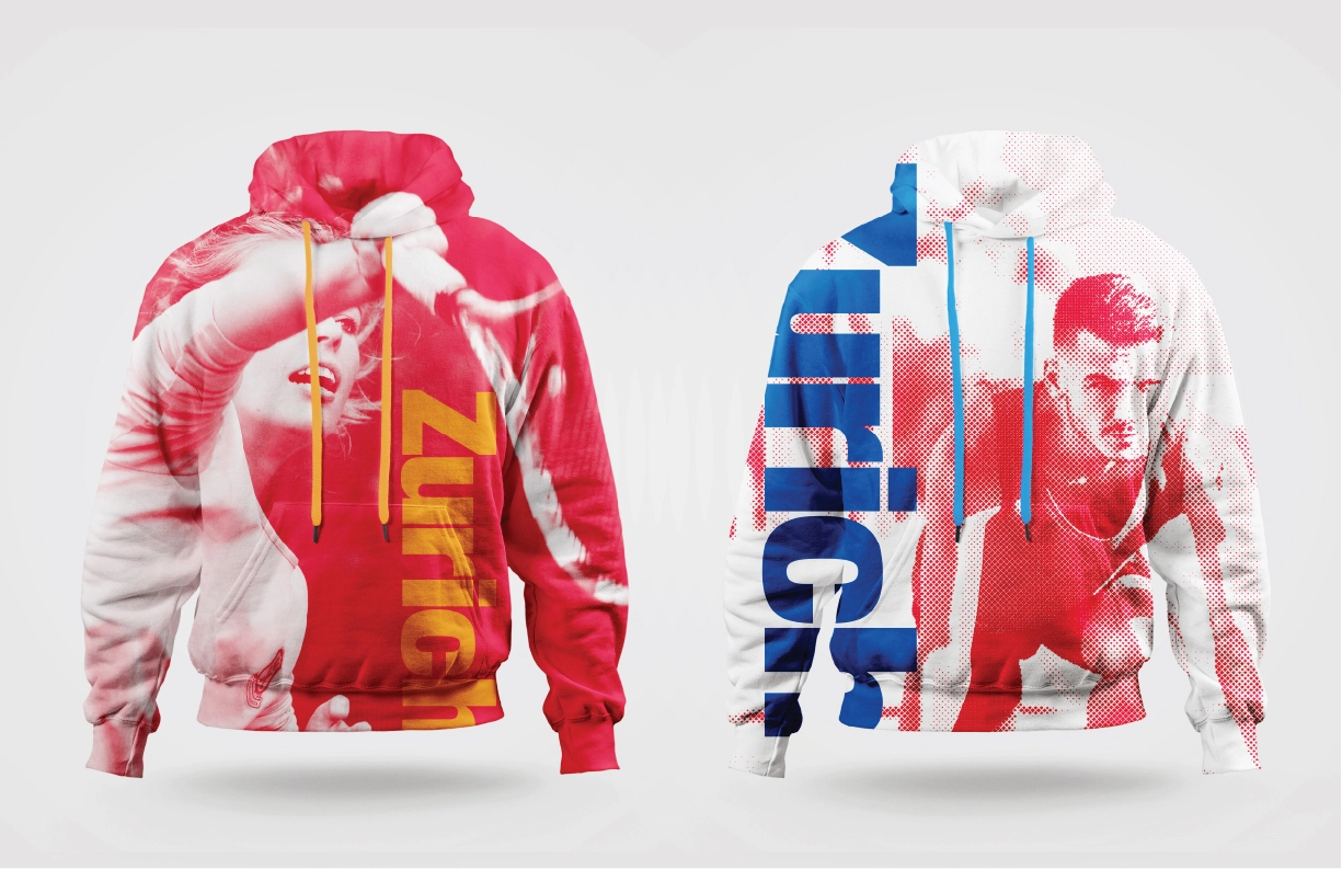
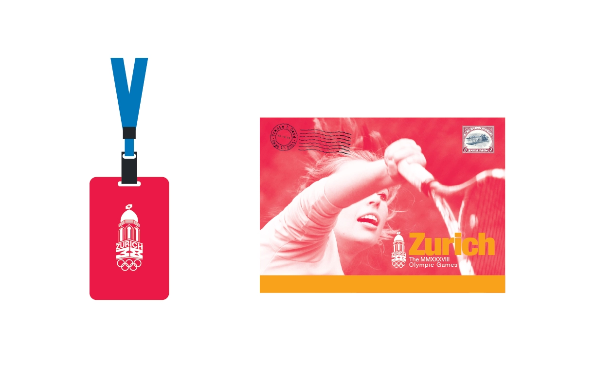
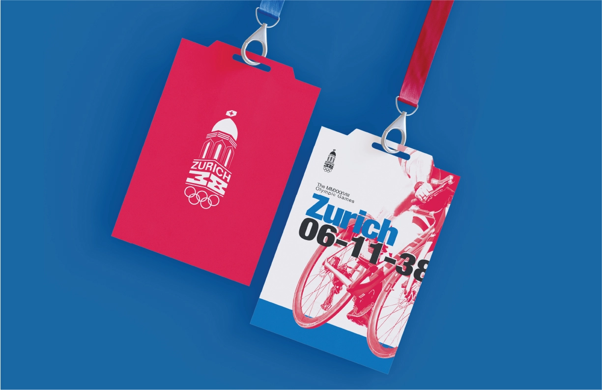
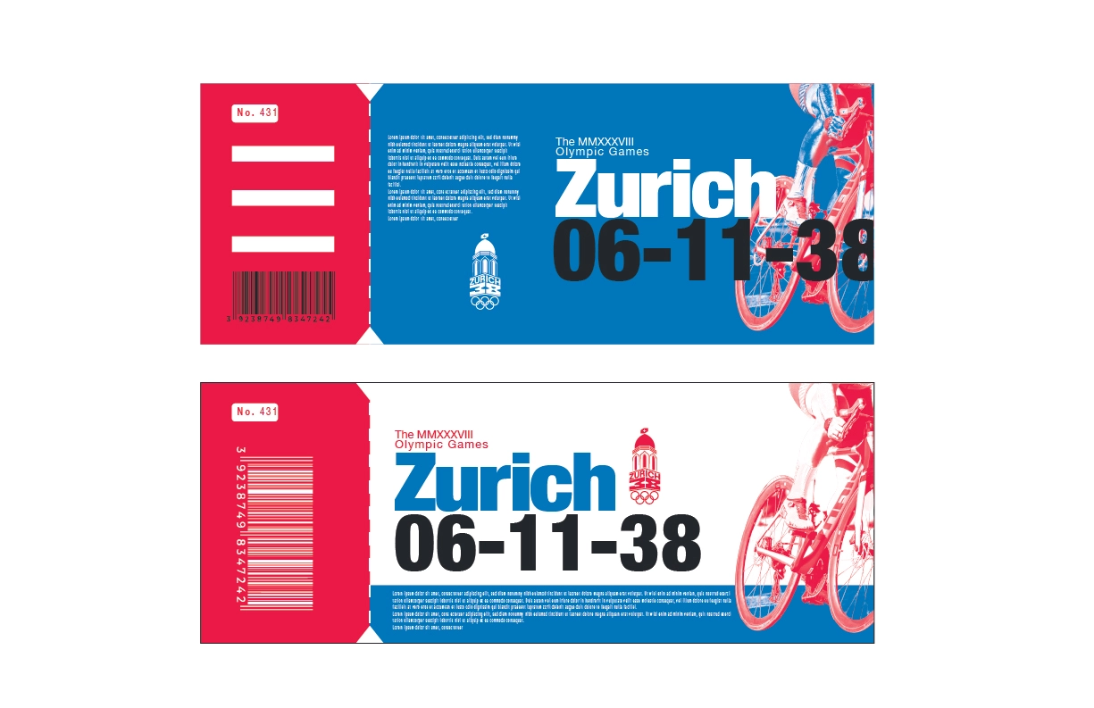
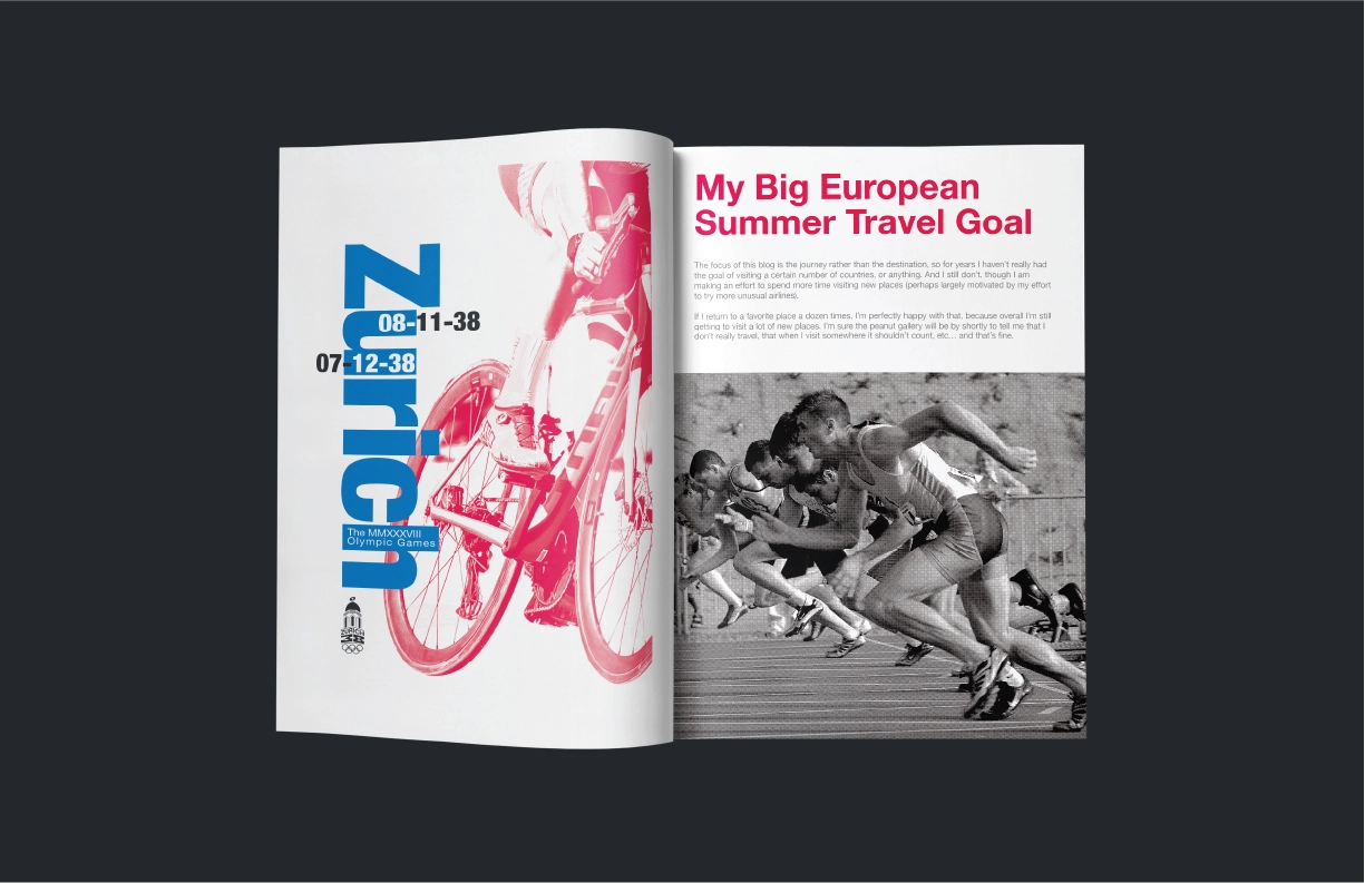
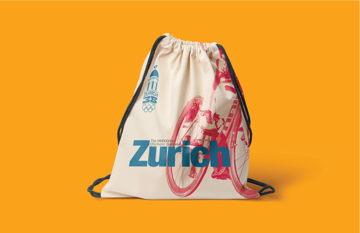
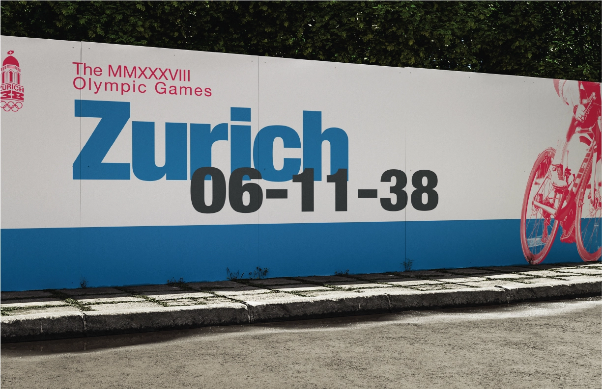
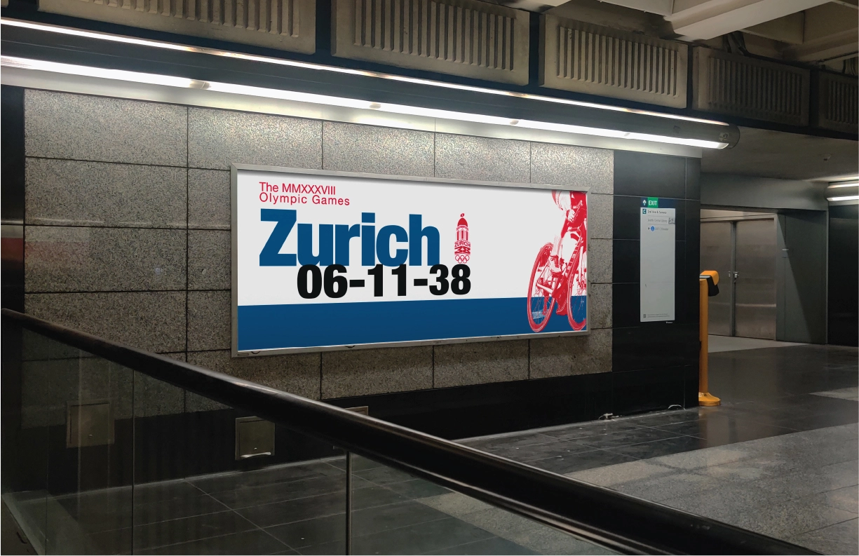
Zurich Olympic
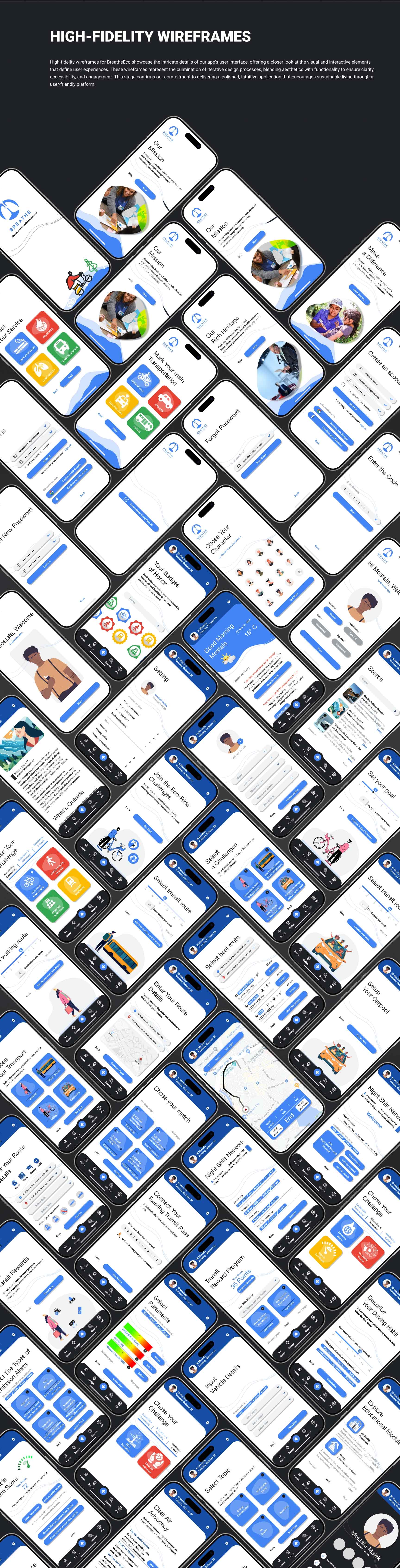
UI-UX Design
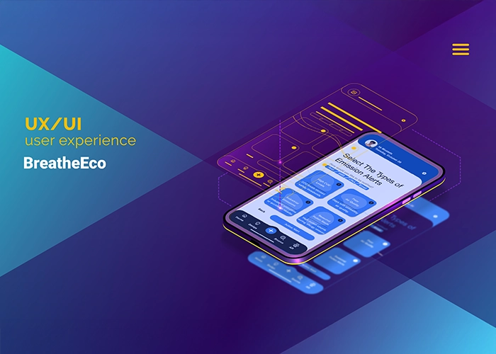
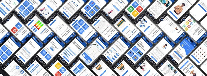
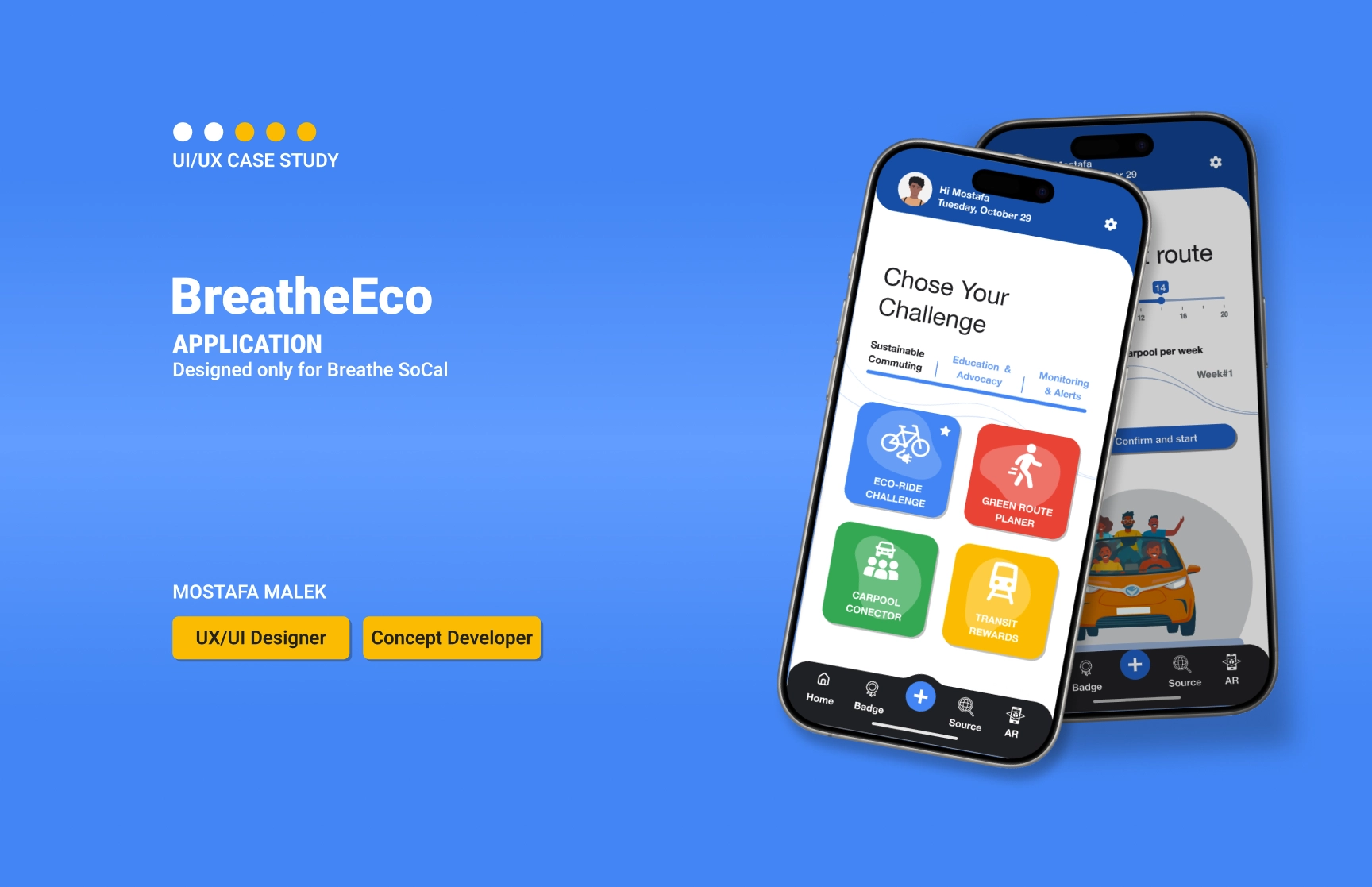
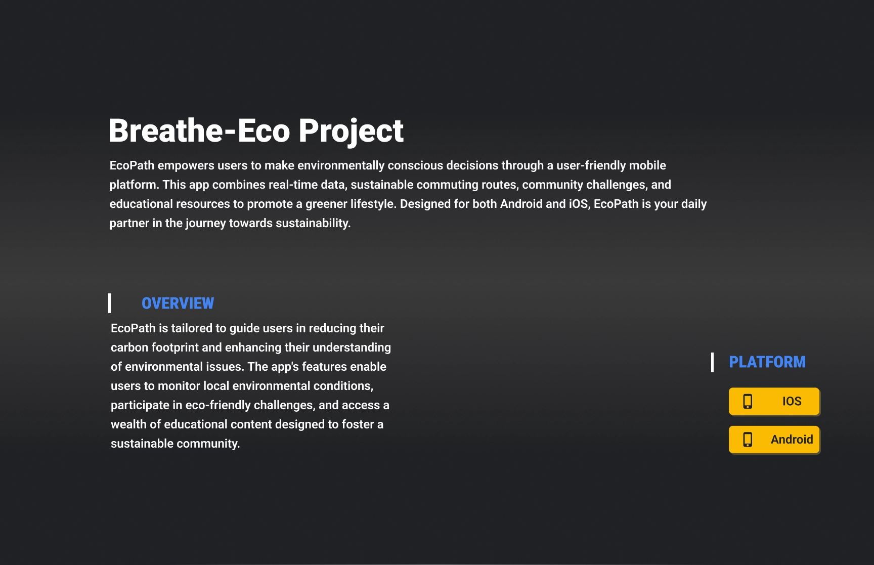
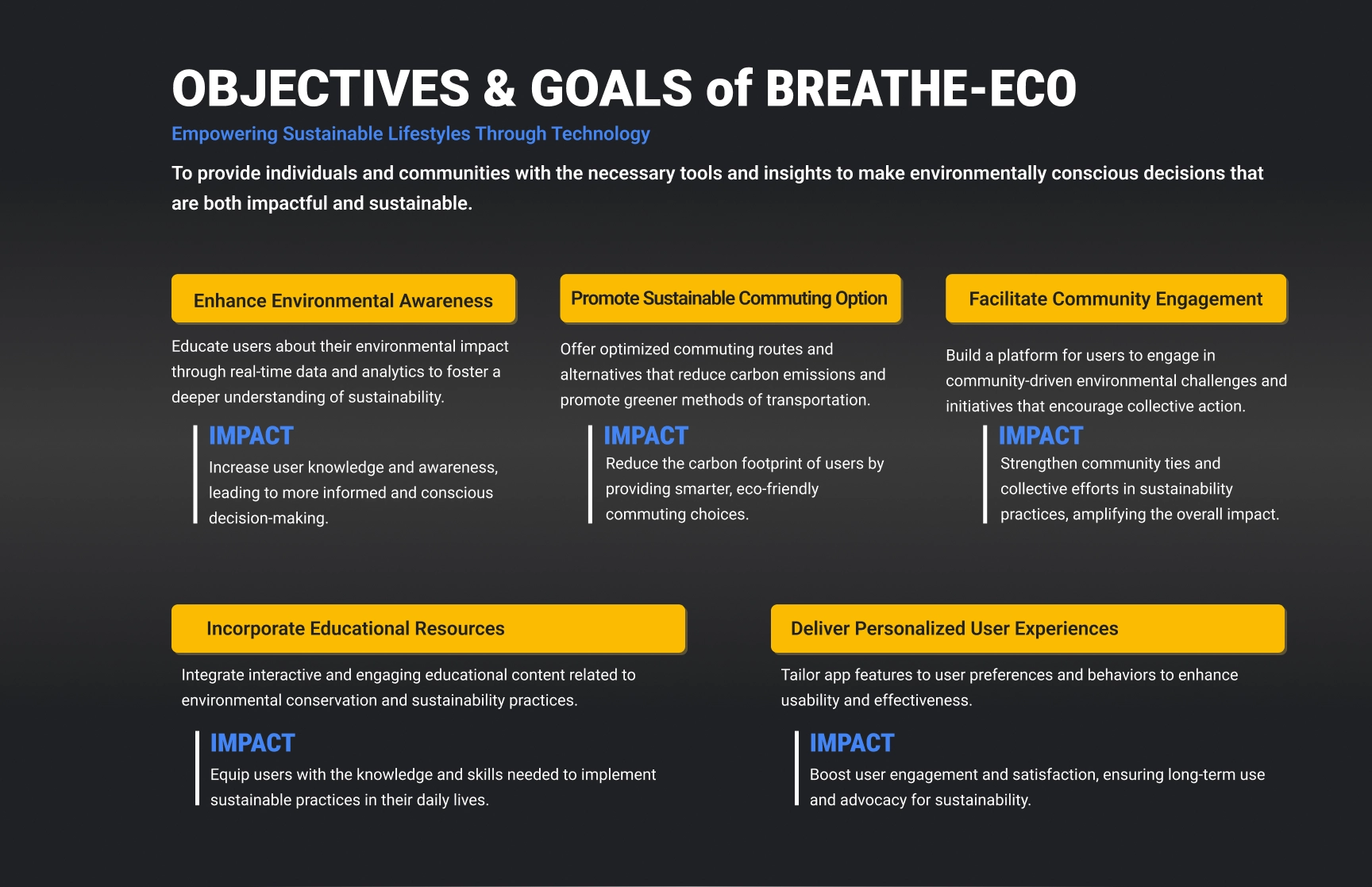
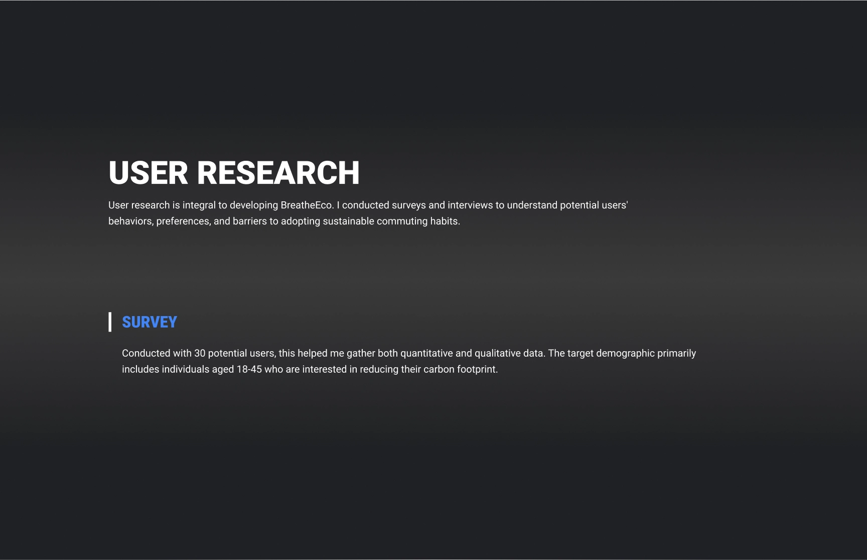
BREATHE-ECO App
Workpart2-heading
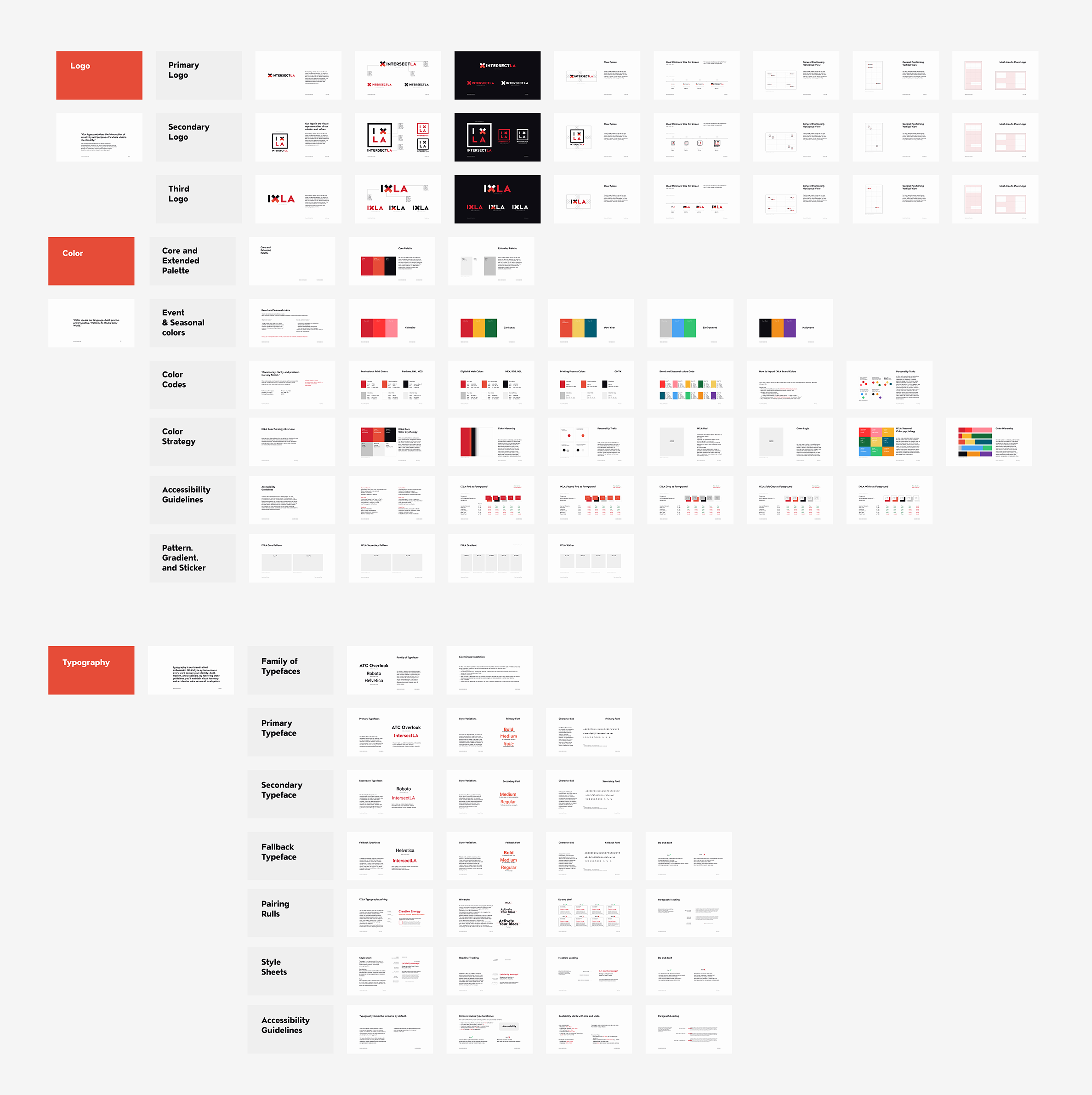
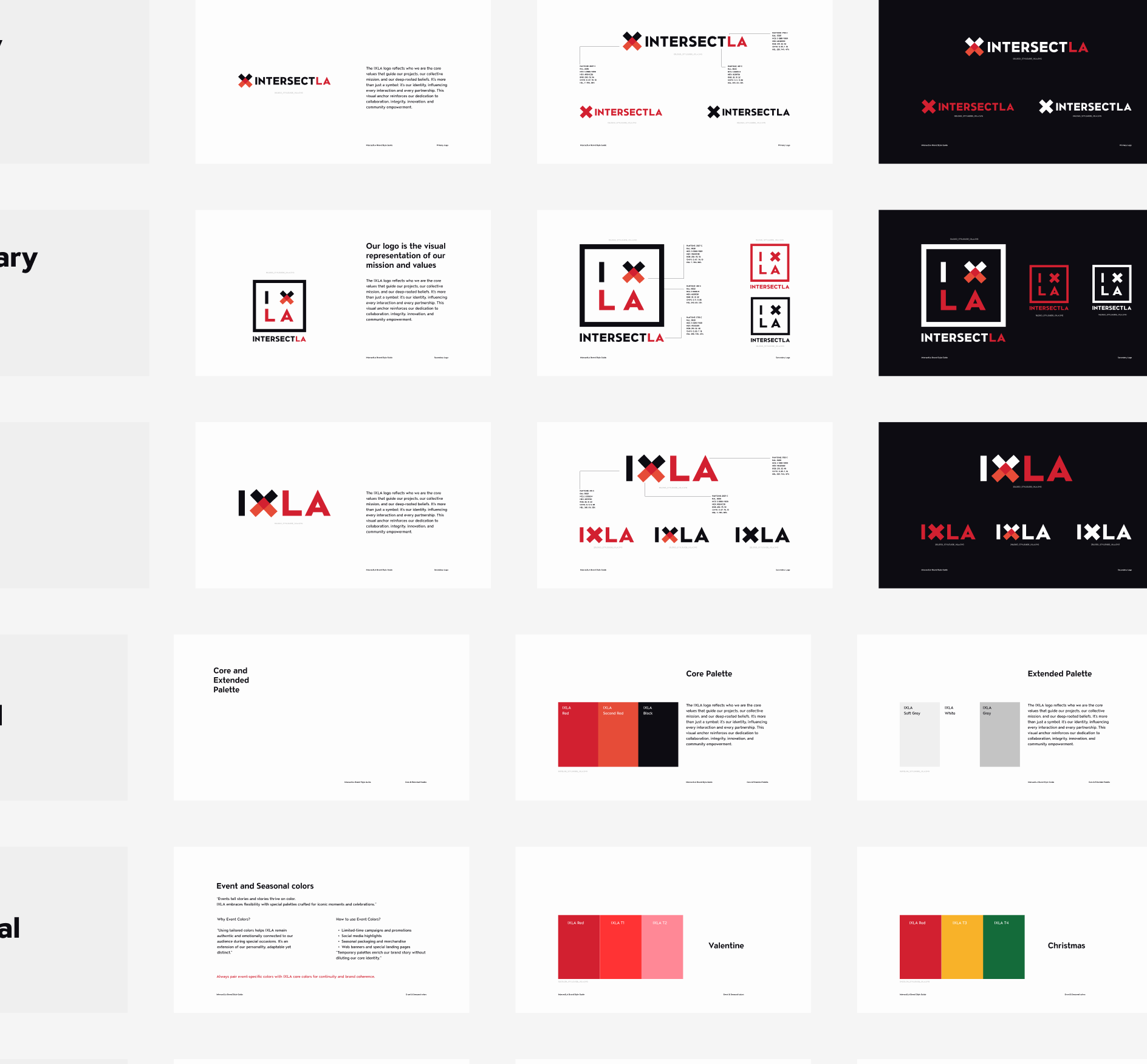
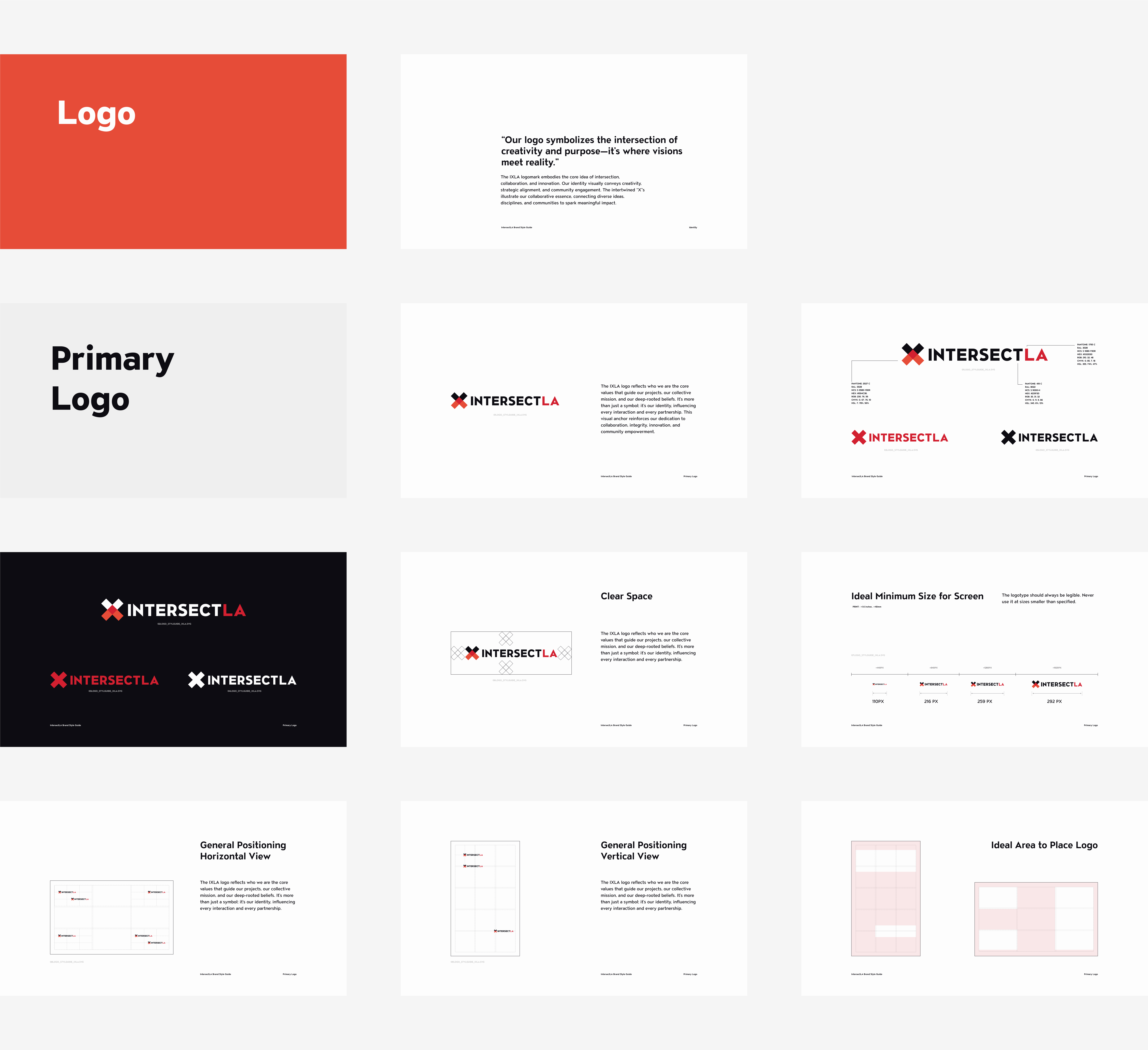
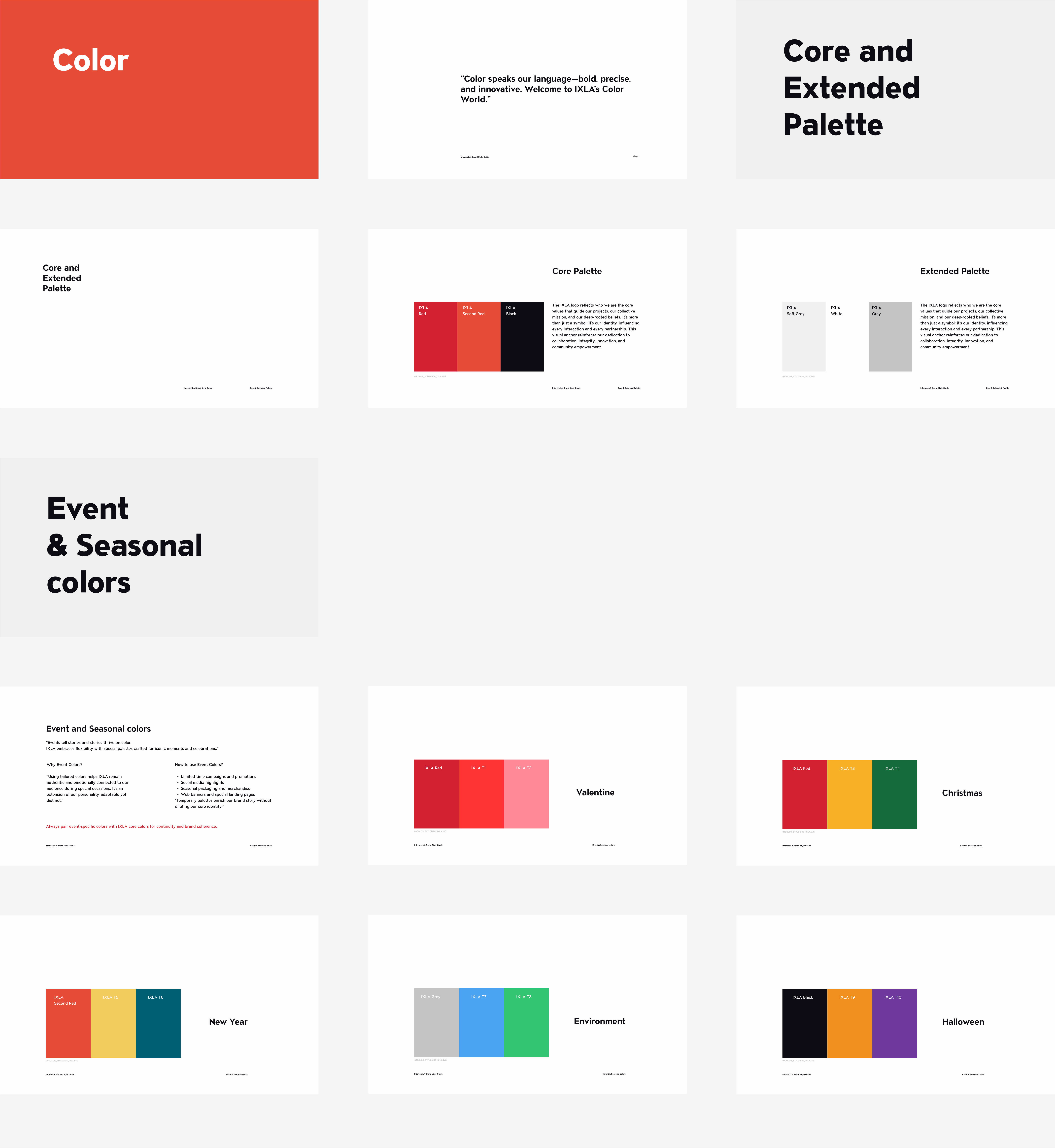
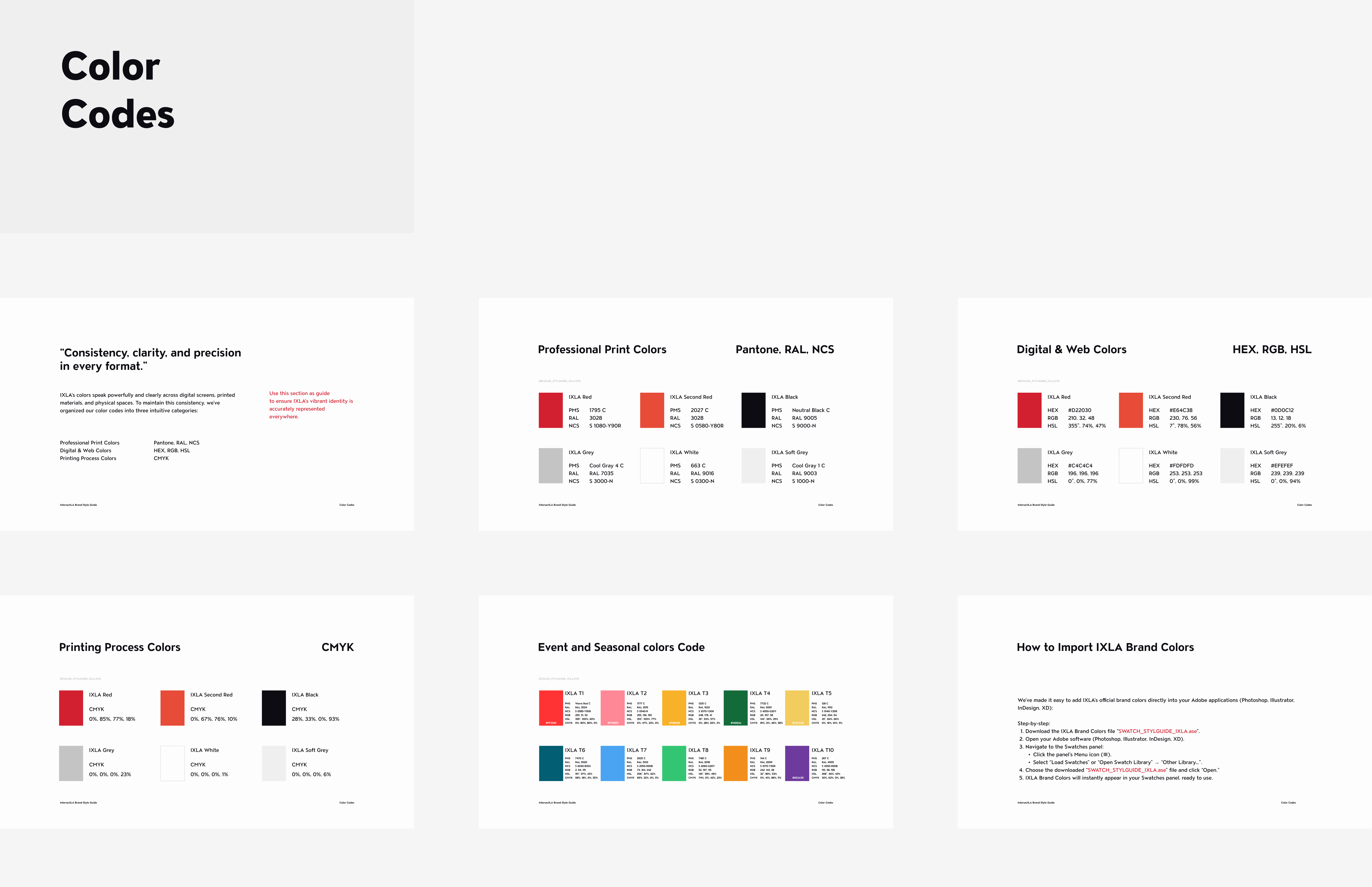
Brand Style Guide
Intersect LA
Workpart2-heading
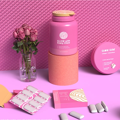

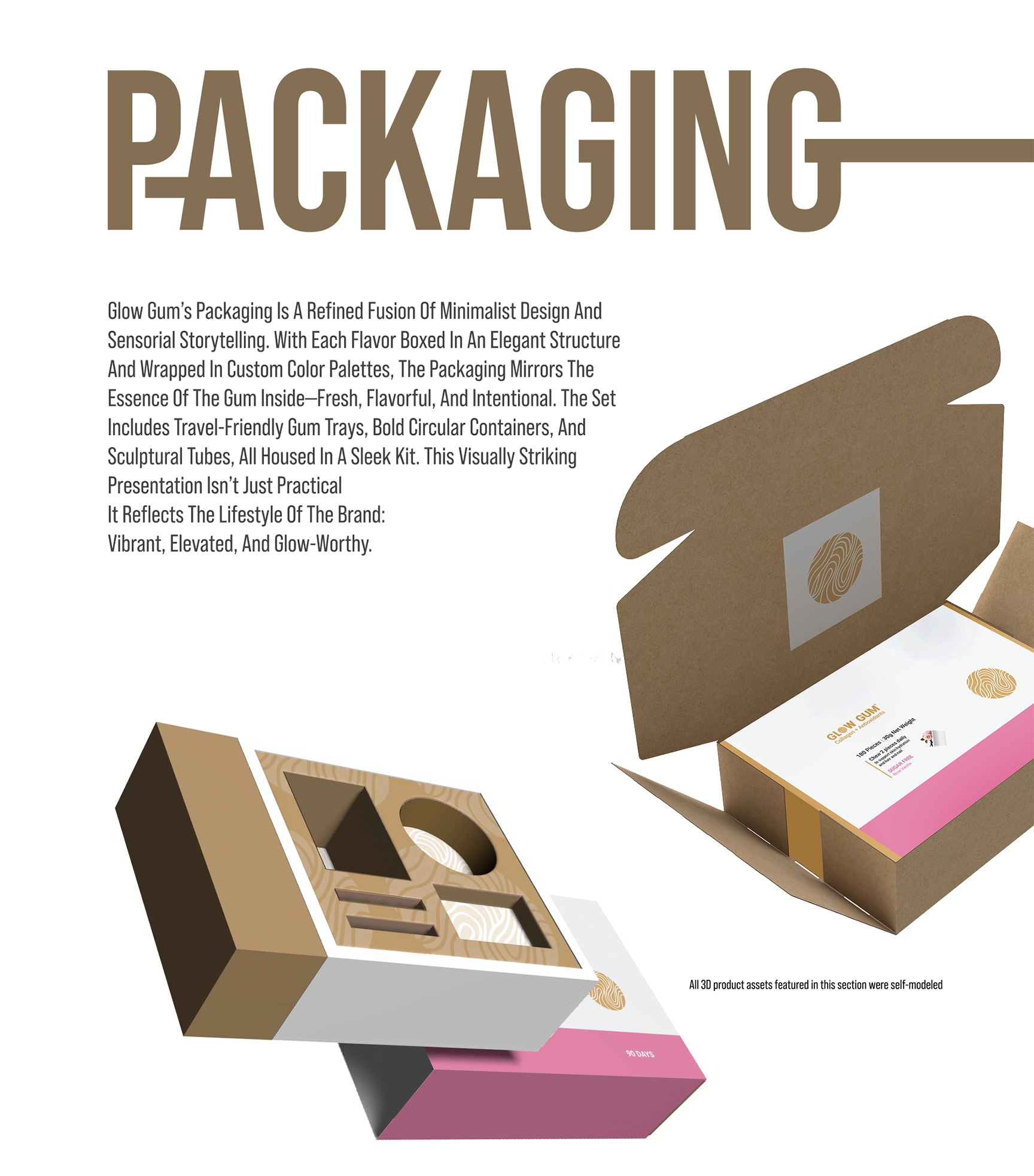
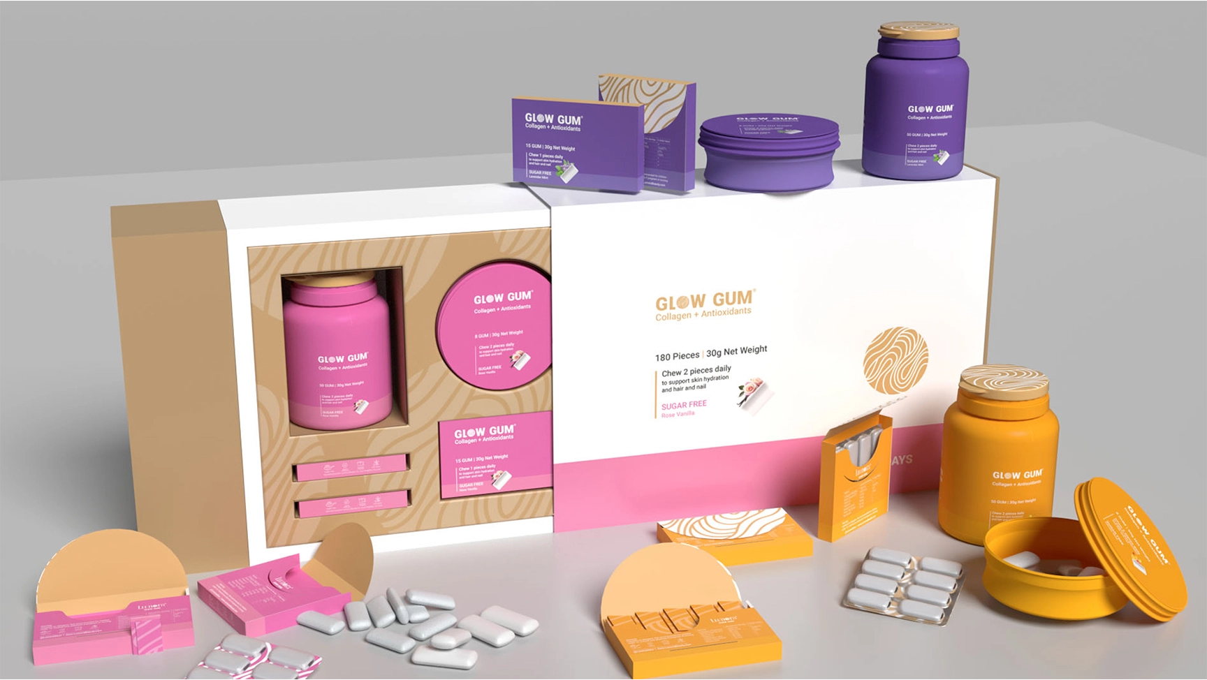
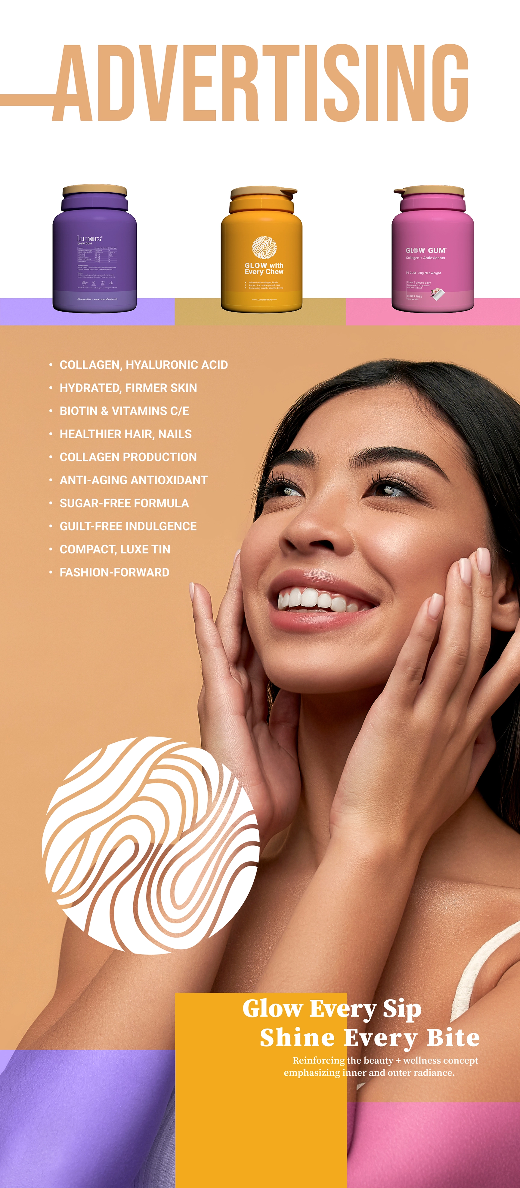
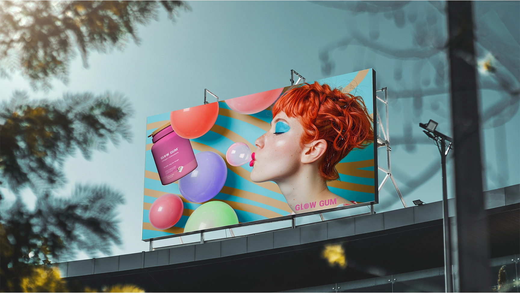
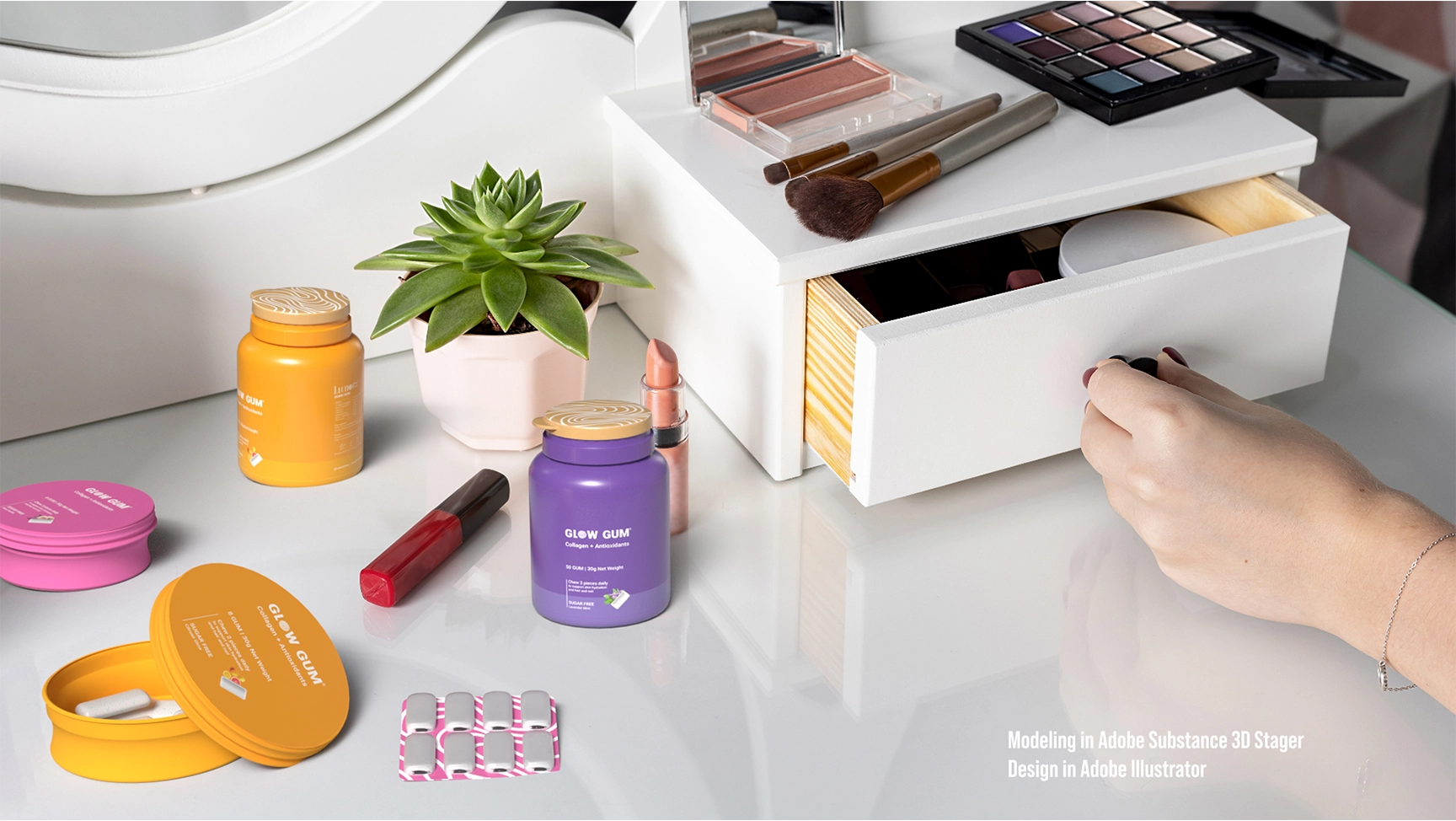
Product Design and Packaging
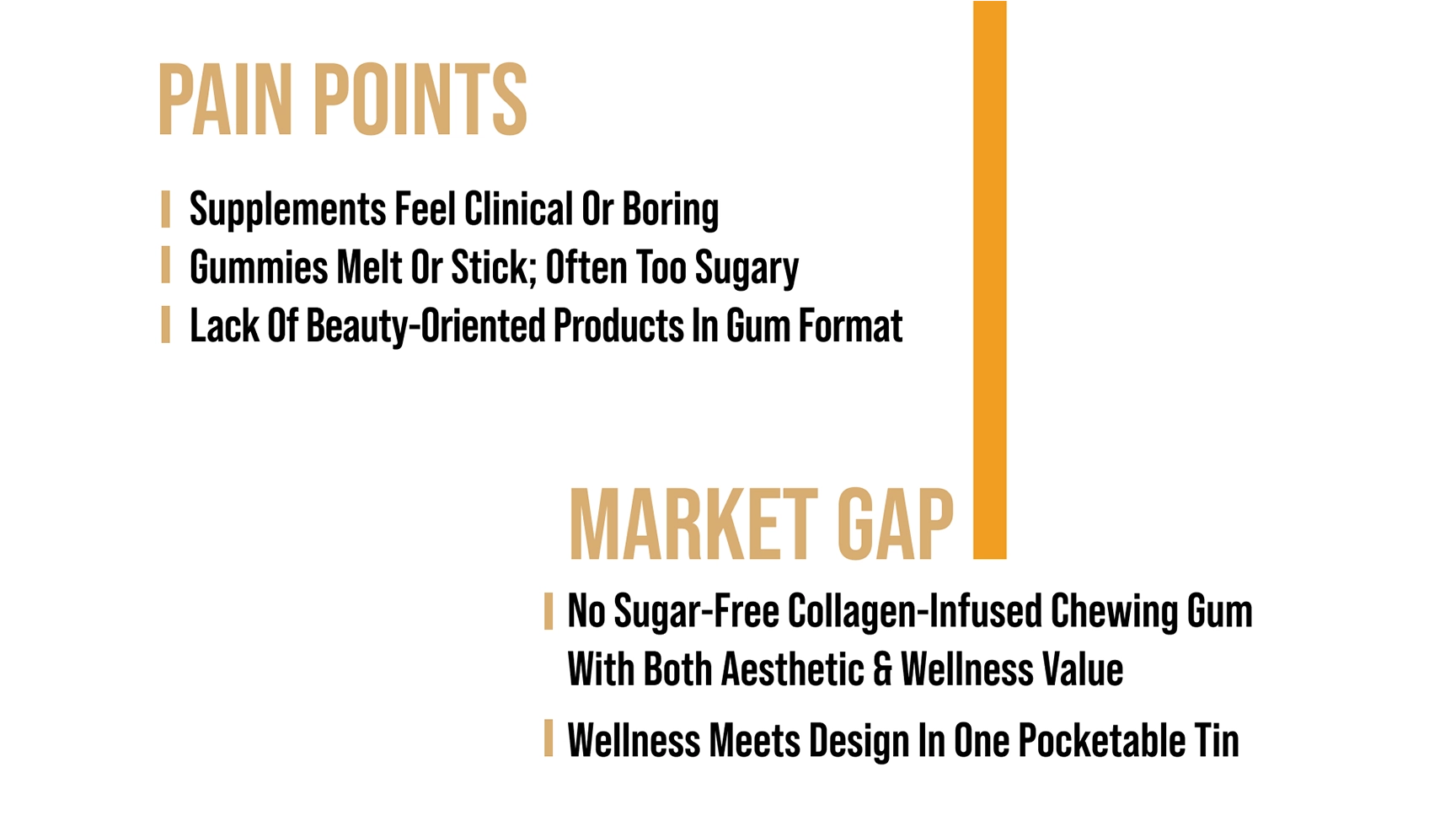
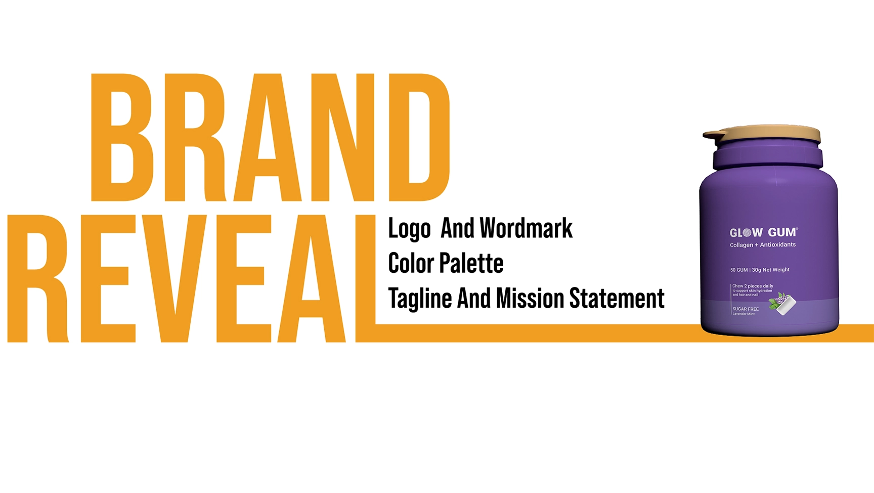
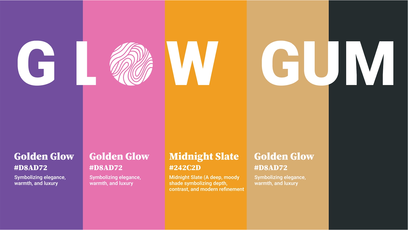
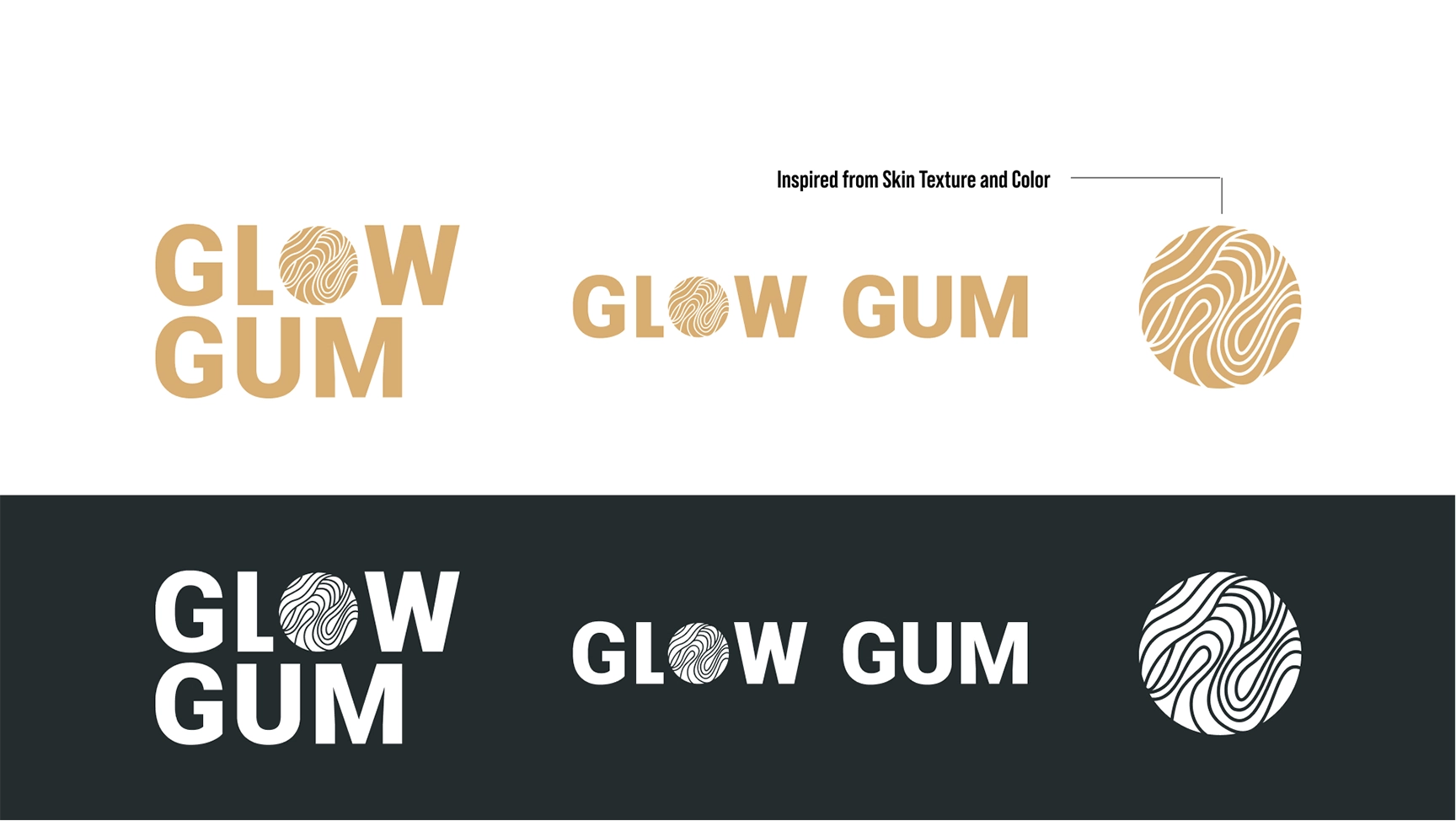
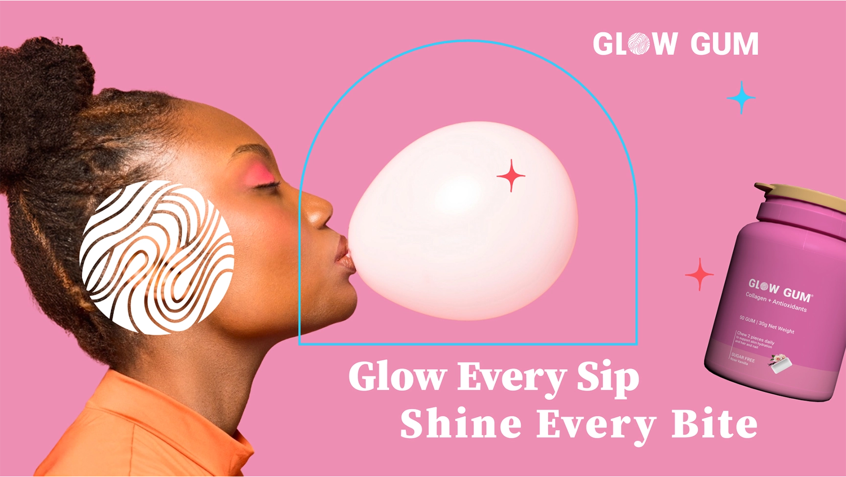
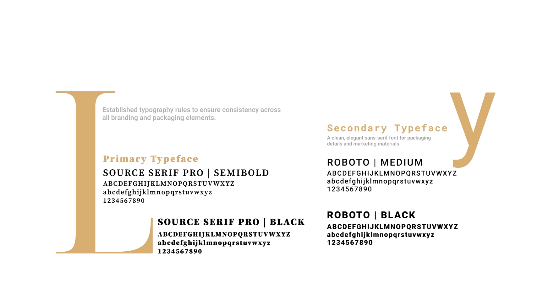
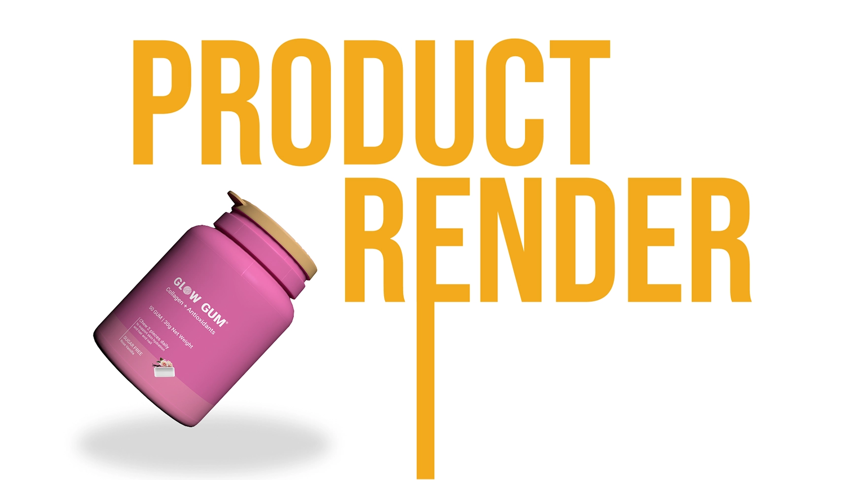
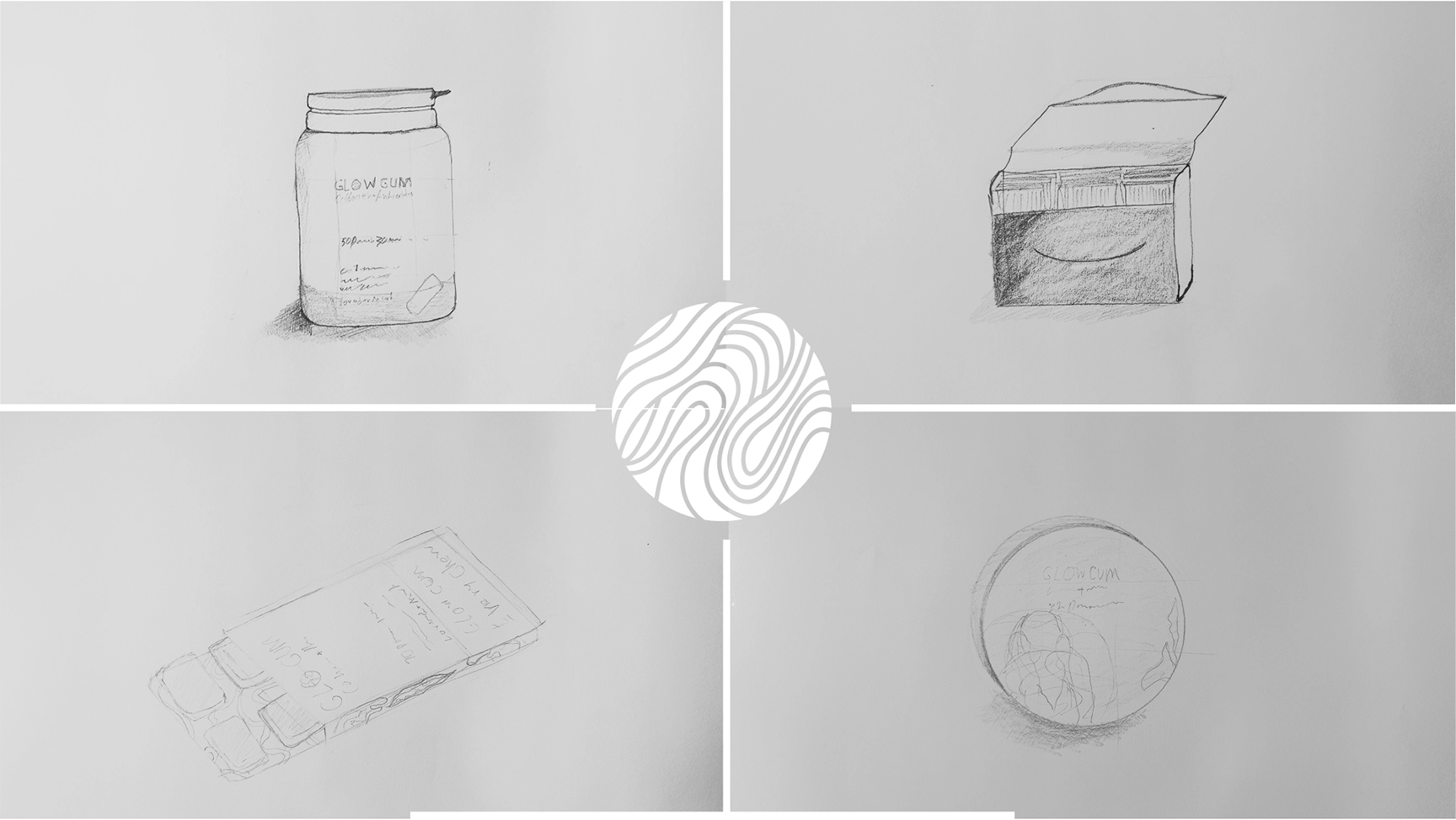
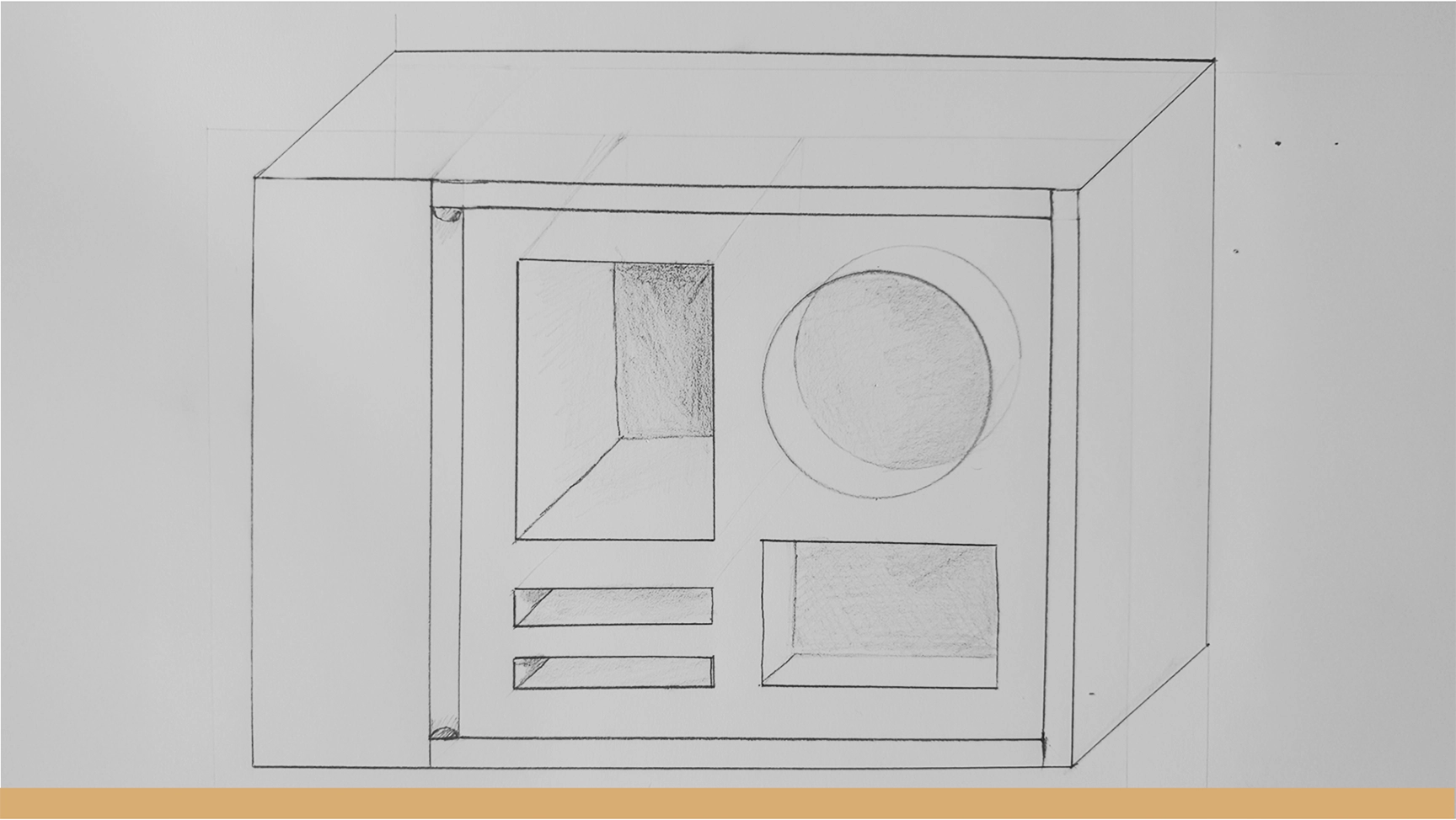
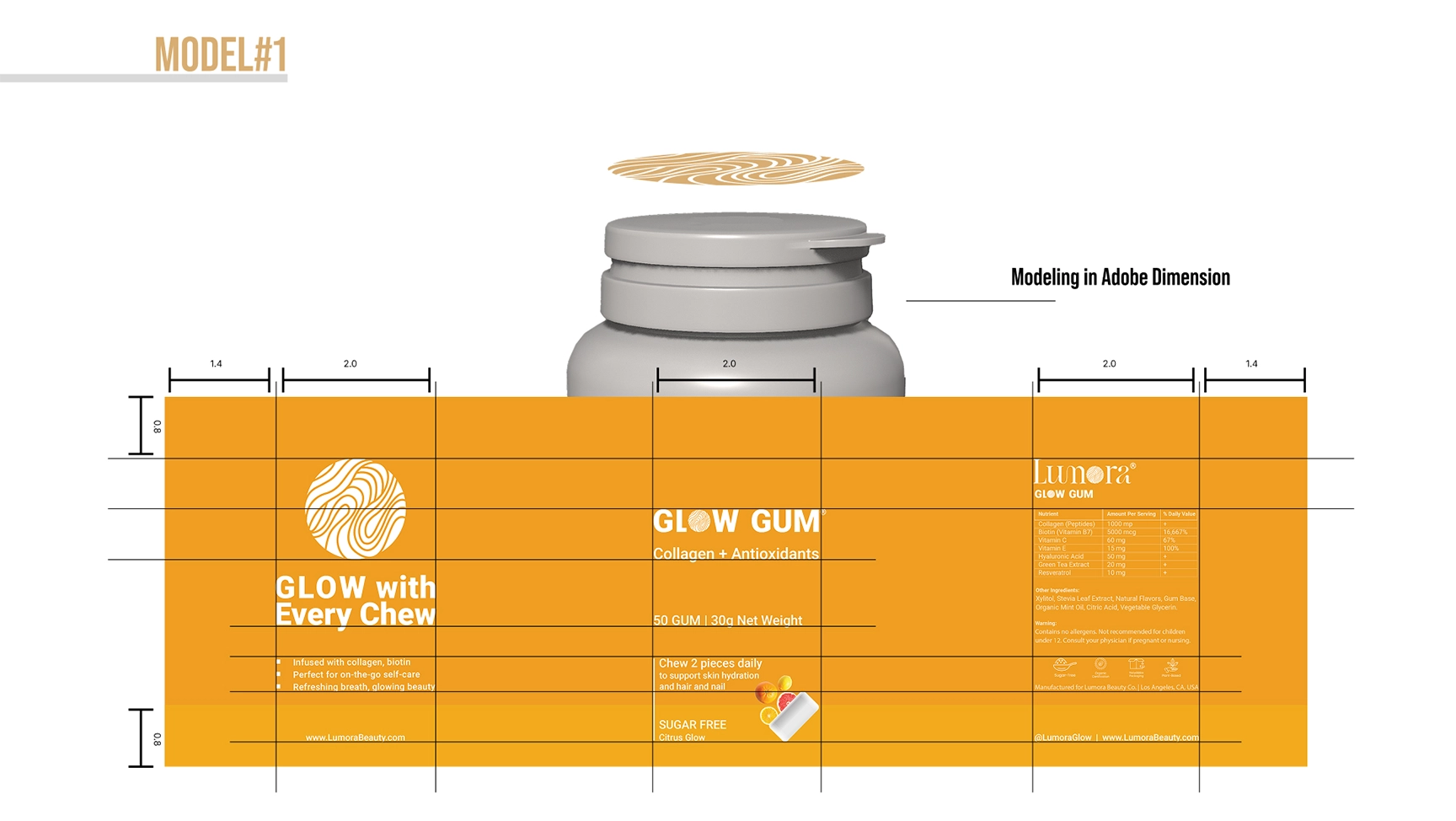
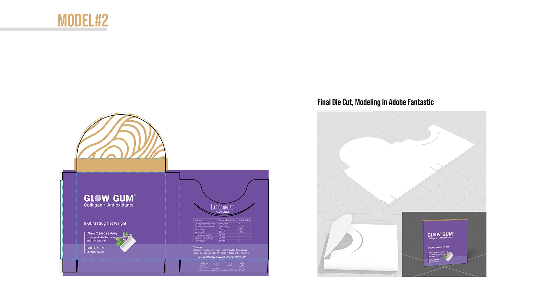
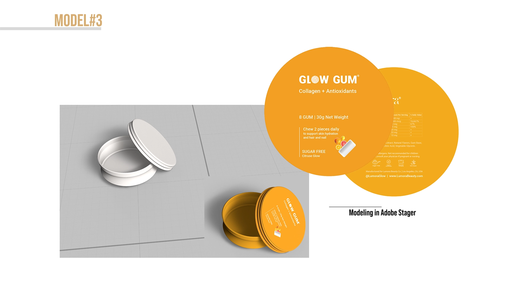
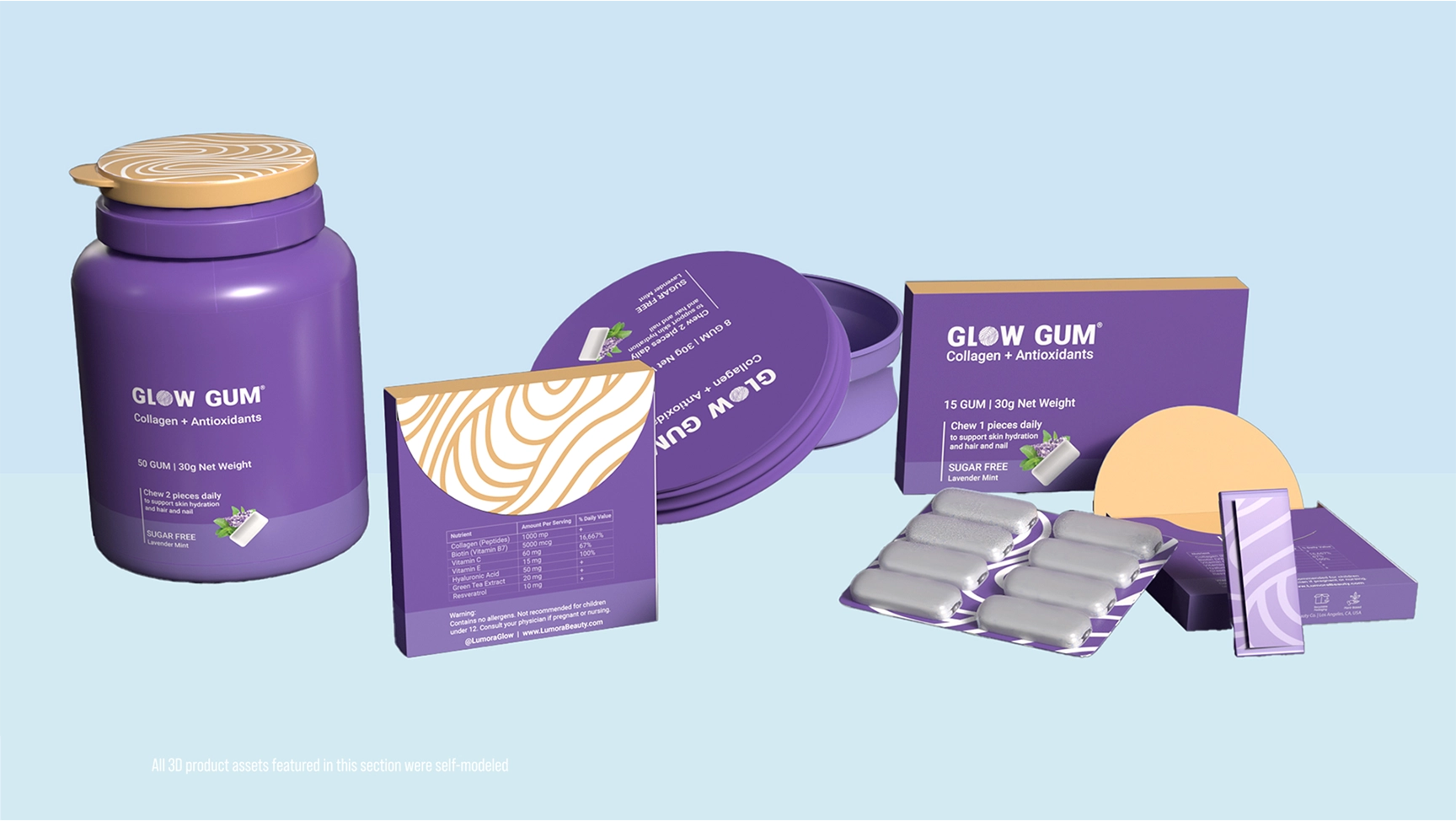
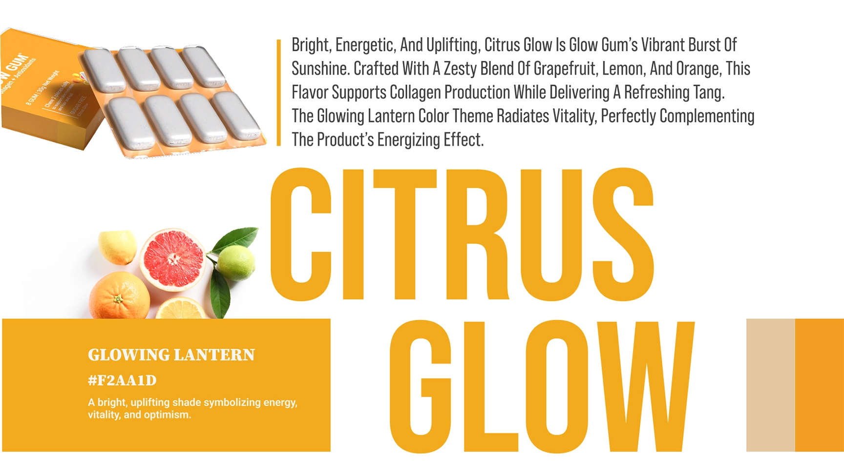
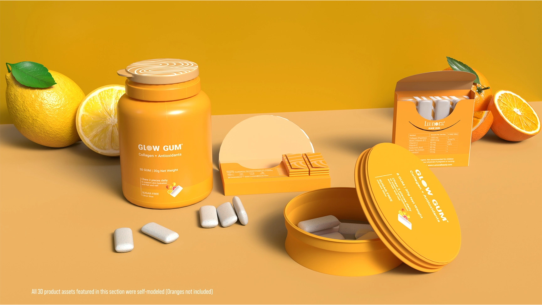
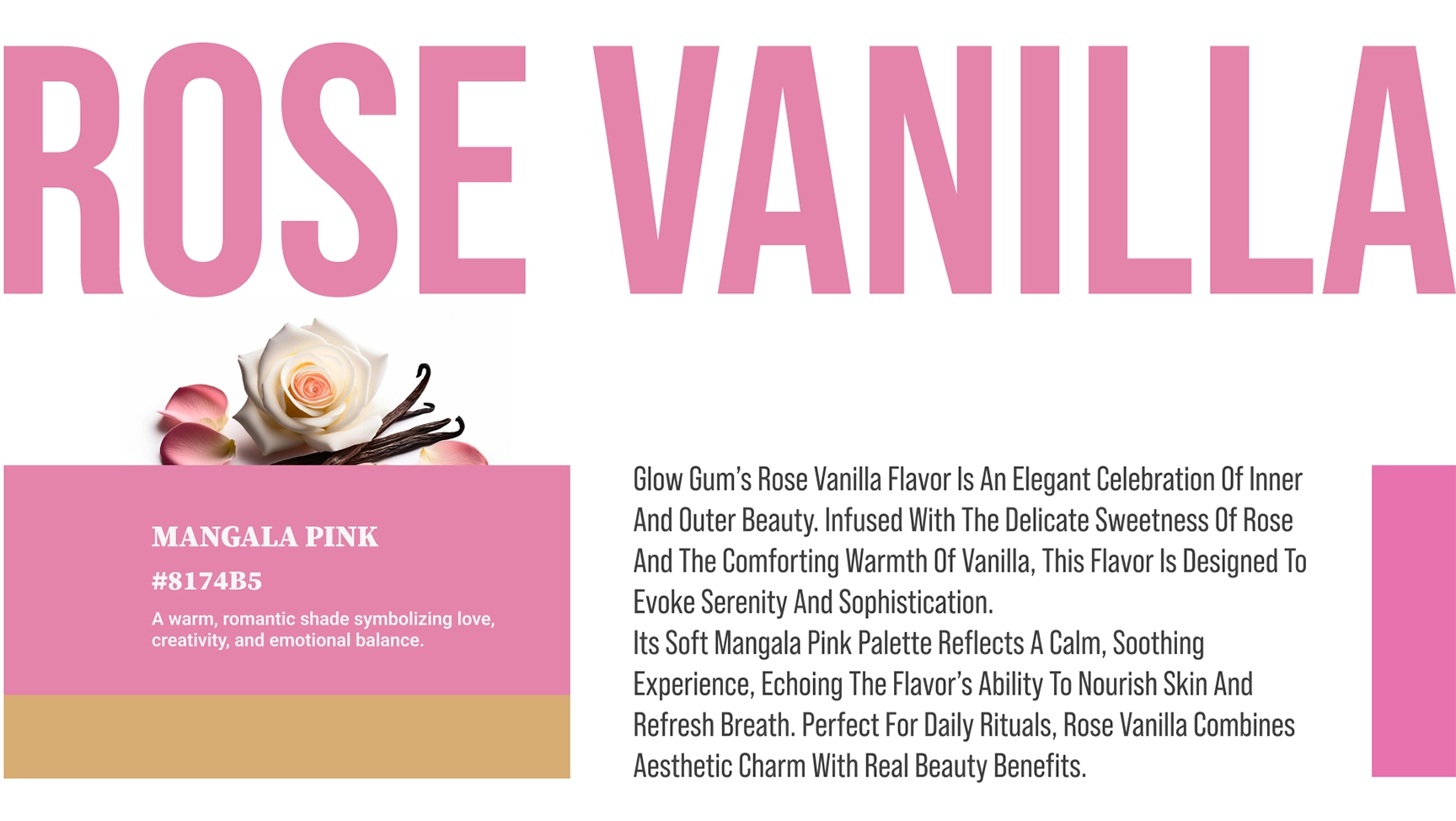
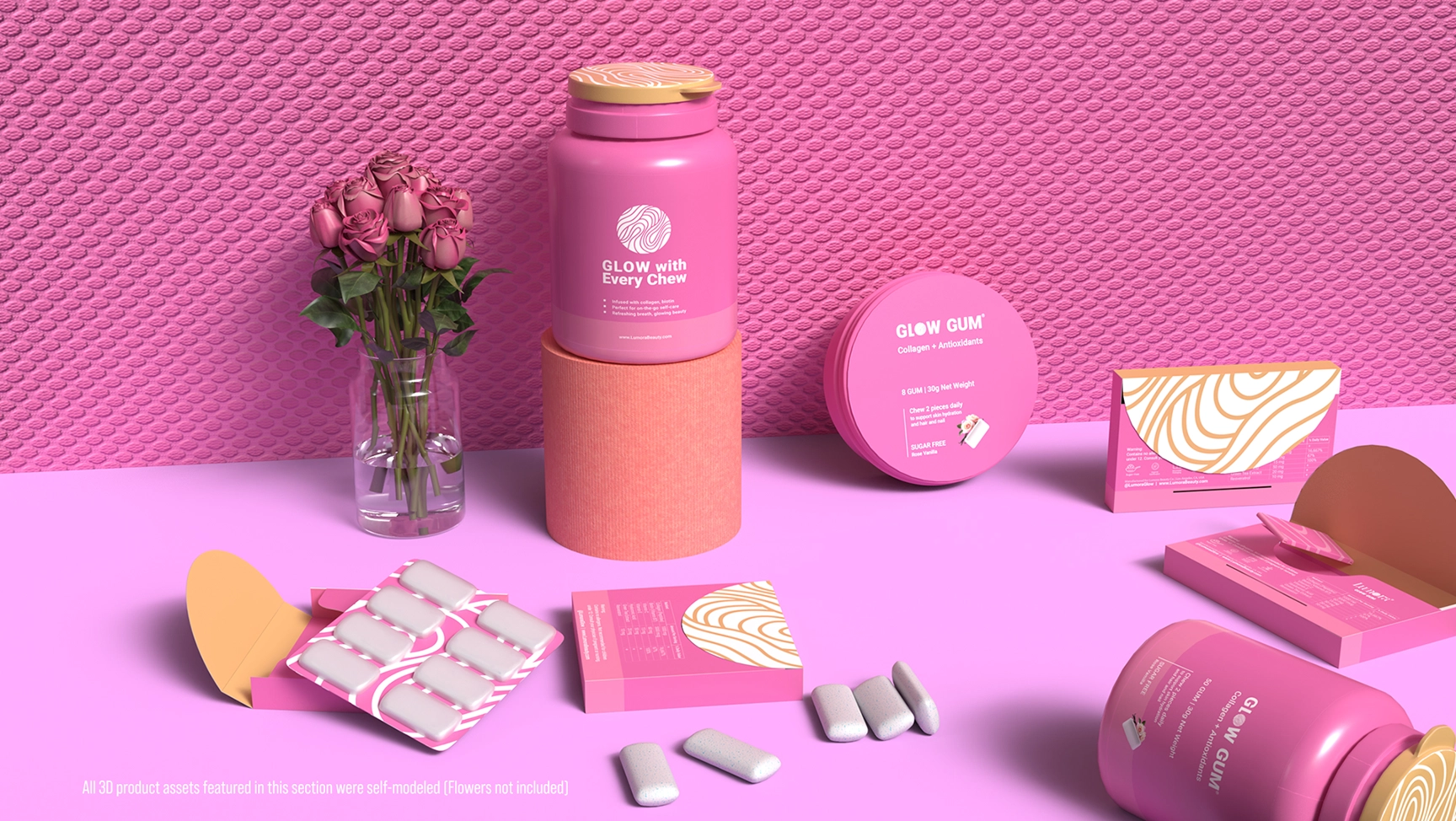
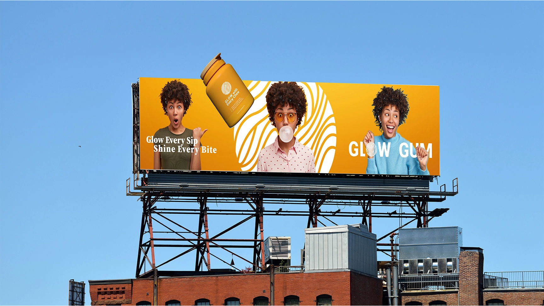
GlowGum - Skin Care Product
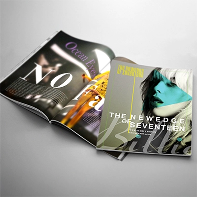
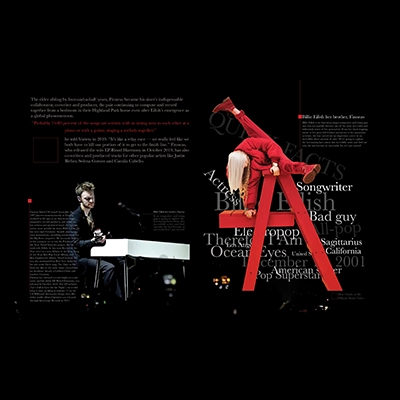
layout &magazines design
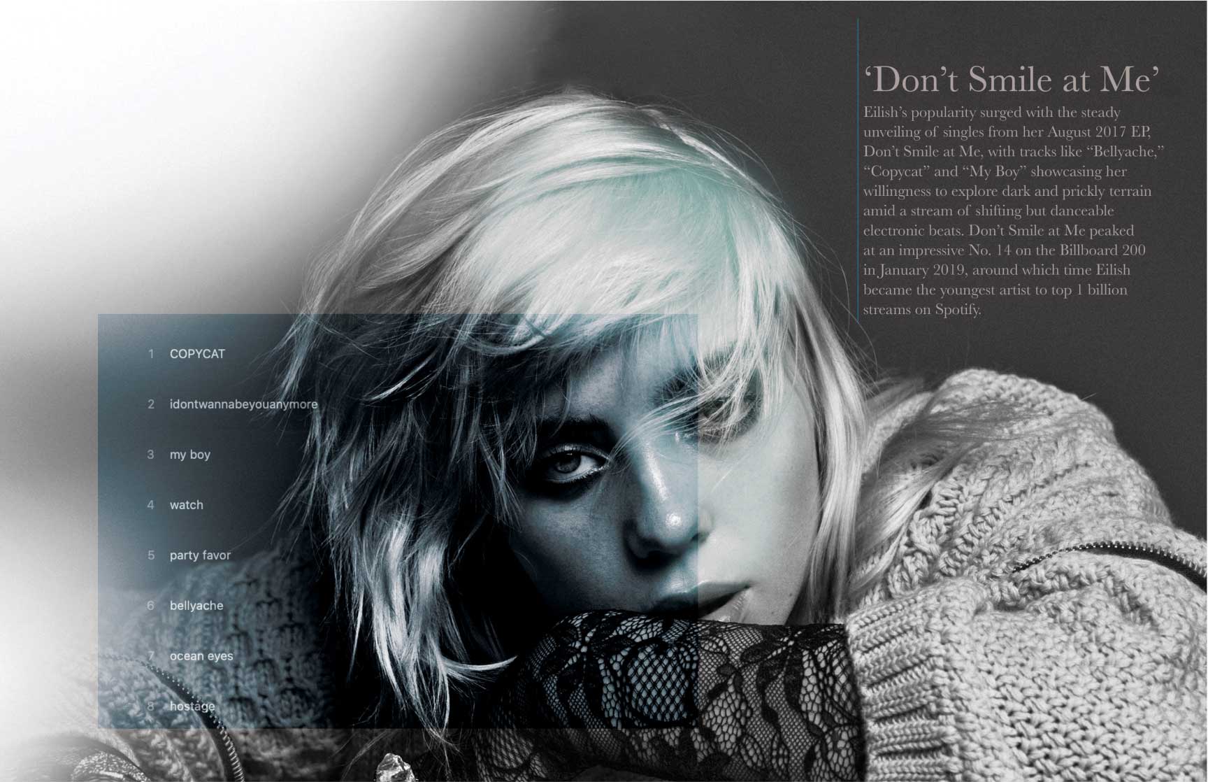
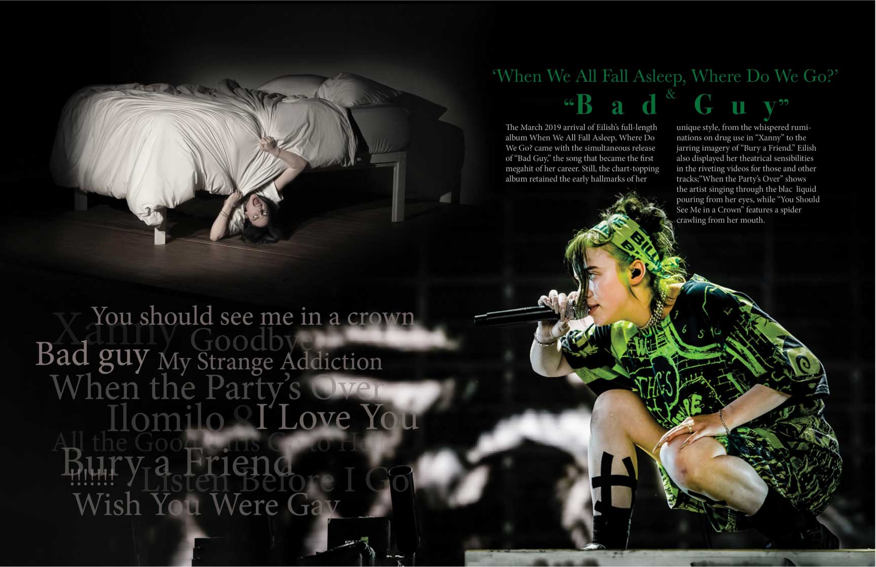
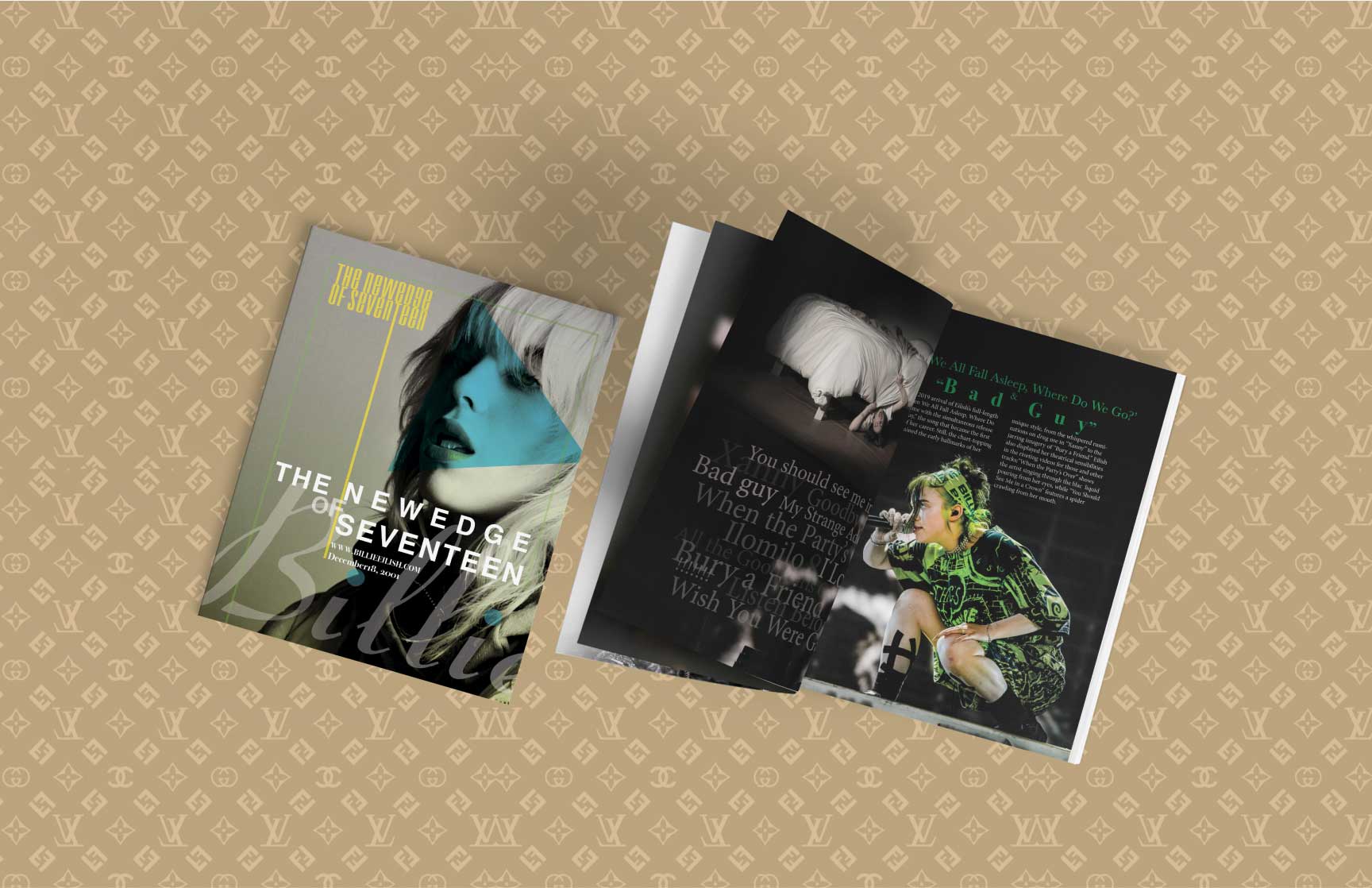
Billie Eilish
Swiss Project slidepanel
Zurich Project slidepanel


Breathe-Eco Project slidepanel
Brand Style Guide


GlowGum Project slidepanel


billie eilish Project slidepanel
expertise-heading
My Expertise
Crafting impactful designs and seamless digital experiences in graphic design, UI/UX, and creative direction.
Delivering purpose-driven brand experiences, accessible digital products, and AI-powered creative solutions that connect people, business, and technology.
Creative Technology & AI Integration
- Custom GPT Design & Training
- Automated Workflow Development (Make, Zapier, Slack)
- AI-Enhanced Branding & Asset Delivery Systems
- API Integration for Creative Operations
Sustainability & Design Ethics
- Accessible, Inclusive, and User-Centered Design
- Environmentally Responsible Packaging & Production
- Gender-Equitable and Culturally Aware Campaigns
- Ethical Use of AI & Automation in Design
Brand & Communication Design
- Brand Strategy & Positioning
- Packaging & Sustainable Product Design
- Visual Identity Systems & Style Guides
- Typography & Layout Design
- Print & Digital Campaigns
- Social Media Kits & Content Systems
UX/UI DESIGN
- User-Centered Research & Persona Building
- Wireframing & Interactive Prototyping (Figma)
- Accessibility & Inclusive Design
- Mobile App & Web Design
- Usability Testing & User Flows
- Design System Management
CREATIVE DIRECTION
- Campaign & Concept Development
- Cross-Functional Team Leadership
- Art Direction & Storytelling
- Problem-Solving & Strategic Thinking
- Design Mentorship & Collaboration
- AI-Driven Creative Automation
DEVELOPMENT & TOOLS
- Figma & Prototyping Platforms
- Adobe Creative Cloud & 3D substance Family
- HTML, CSS & Web Technologies
- No-Code Platforms (Webflow, Wix, Wordpress)
- AI Tools & Automation (ChatGPT, Zapier, Make)
- Google Workspace & Project Management Tools
softwereusing-heading
Software Used
certificate-heading

Professional in
Photoshop
Professional in
Photoshop

Professional in
Visual Design
Professional in
Visual Design

Professional in
InDesign
Professional in
InDesign
aboutme-heading
ABOUT MOSTAFA
Multidisciplinary designer with 15+ years translating business goals into brand-led, user-centric products. Proven record of lifting engagement to 70%, cutting design cycles 80%, and shepherding 100+ digital & print launches for businesses of all sizes and natures from agencies to start-ups, and municipalities.
Combines art-direction roots with data-driven design thinking, WCAG-compliant UX, and AI-powered workflows (custom ChatGPT, automation) to scale impact. Expert in Figma, Adobe CC, HTML/CSS, and cross-functional leadership; ready to drive end-to-end product vision where brand, accessibility, and growth converge.
- Melody Picture LLC
- Intersect LA
- Legacy Licensing Partners
- Freelance
- Capital Municipality
- Tandis Designers Ltd.
- 10/2024 - Present
- 01/2025 - 05/2025
- 01/2025 - 03/2025
- 02/2020 - 10/2024
- 04/2012 - 03/2019
- 10/2007 - 12/2018
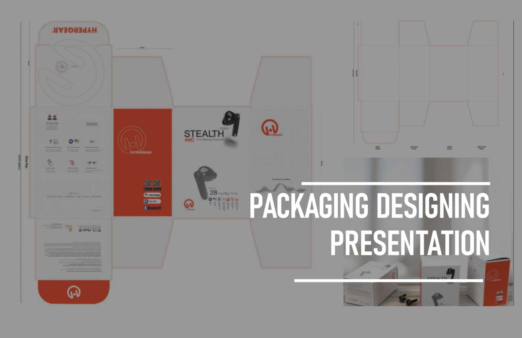
workpart3-heading
Packaging design
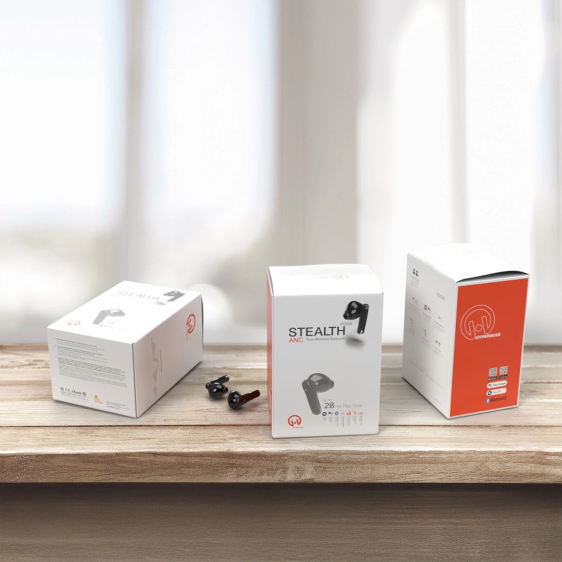
Stealth
Concept Devolopment
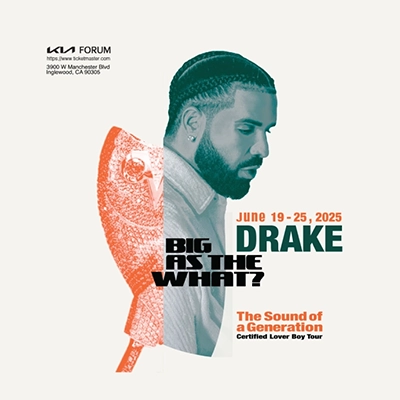
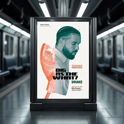
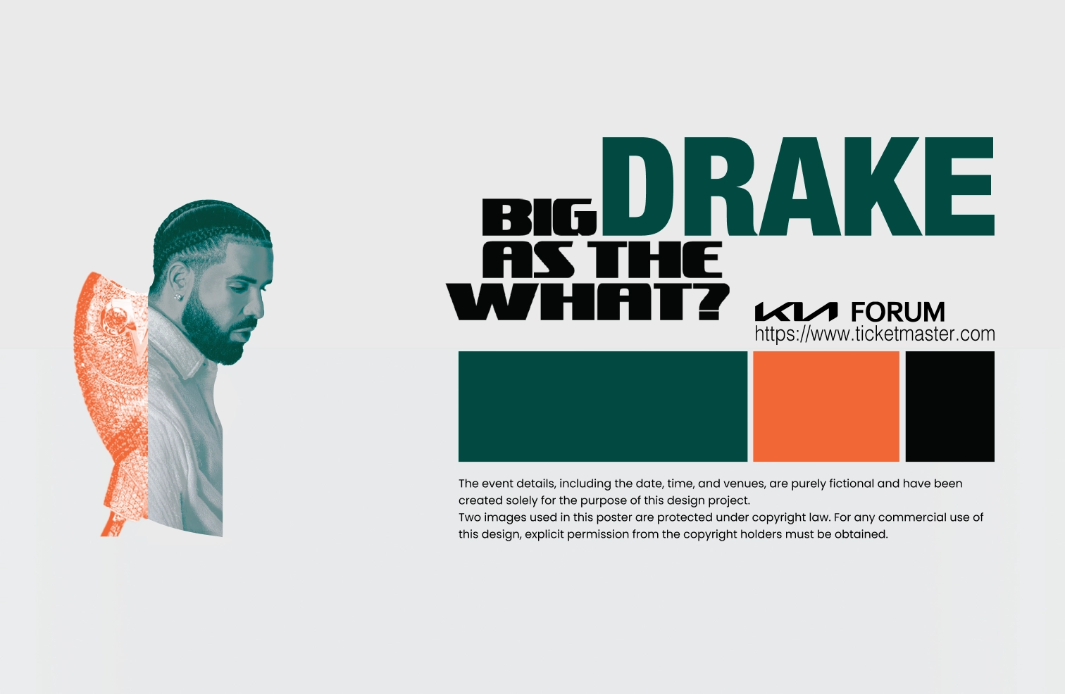
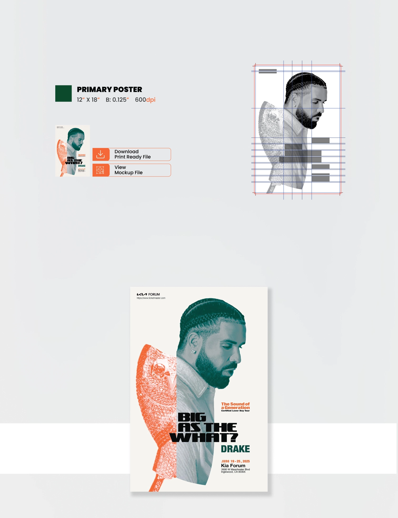
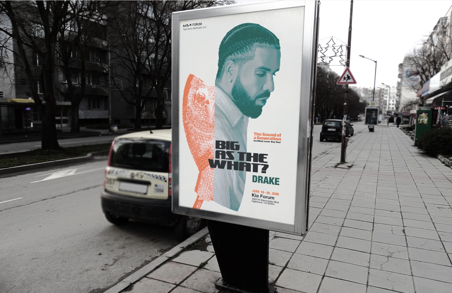
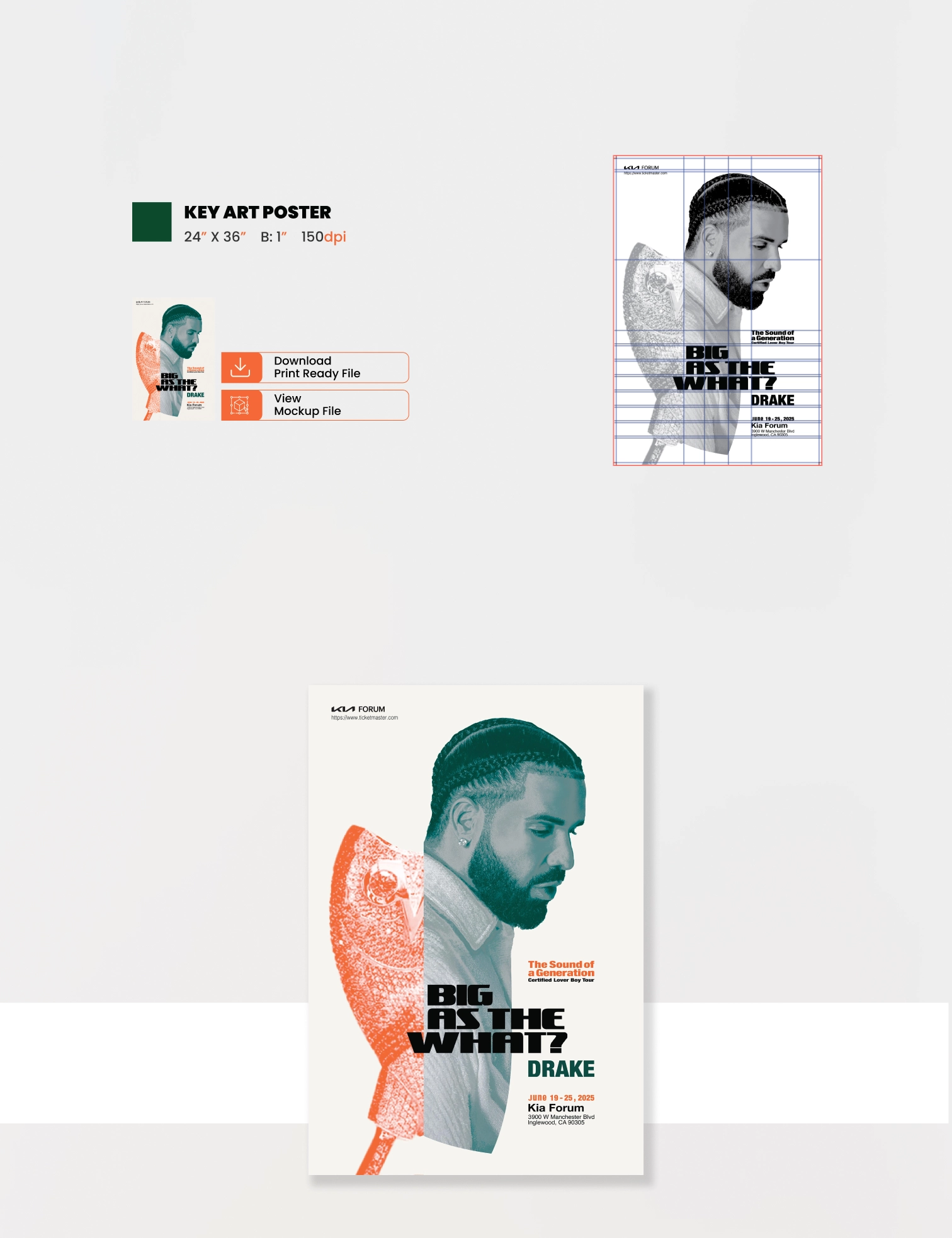
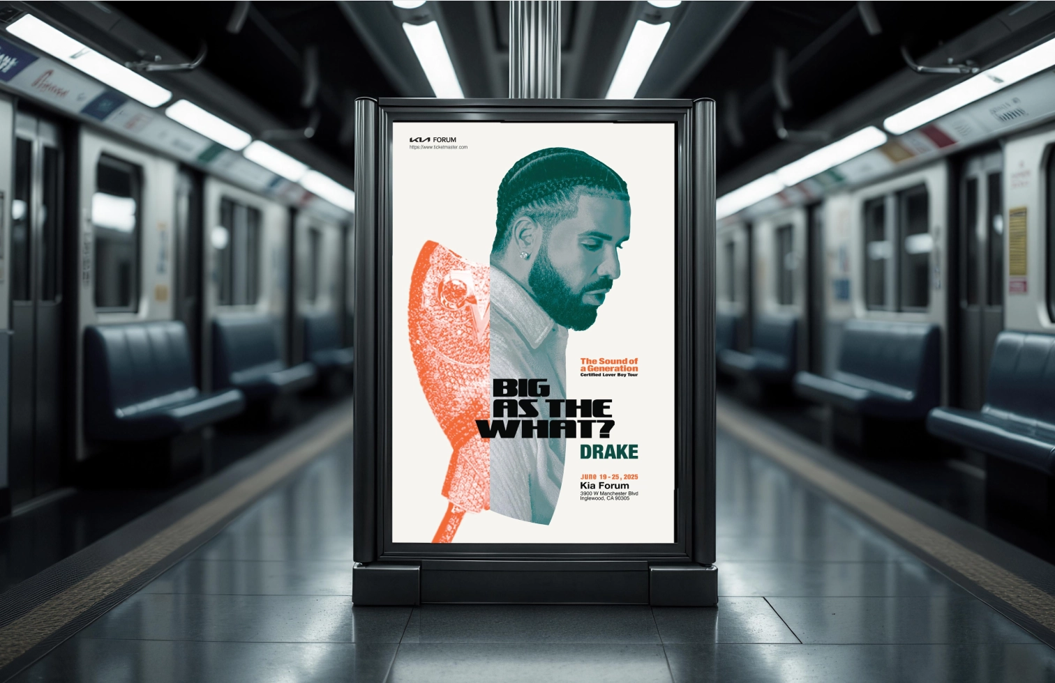
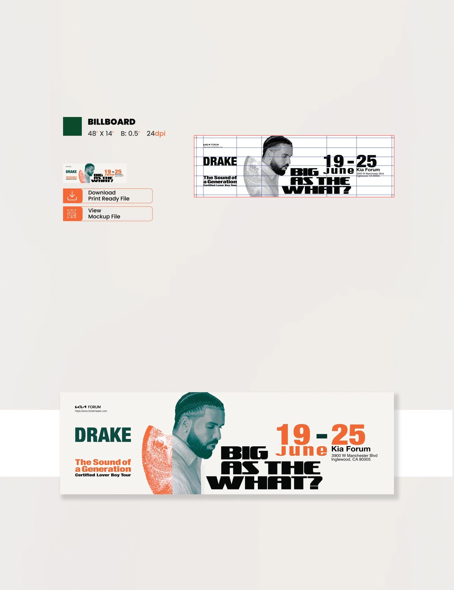
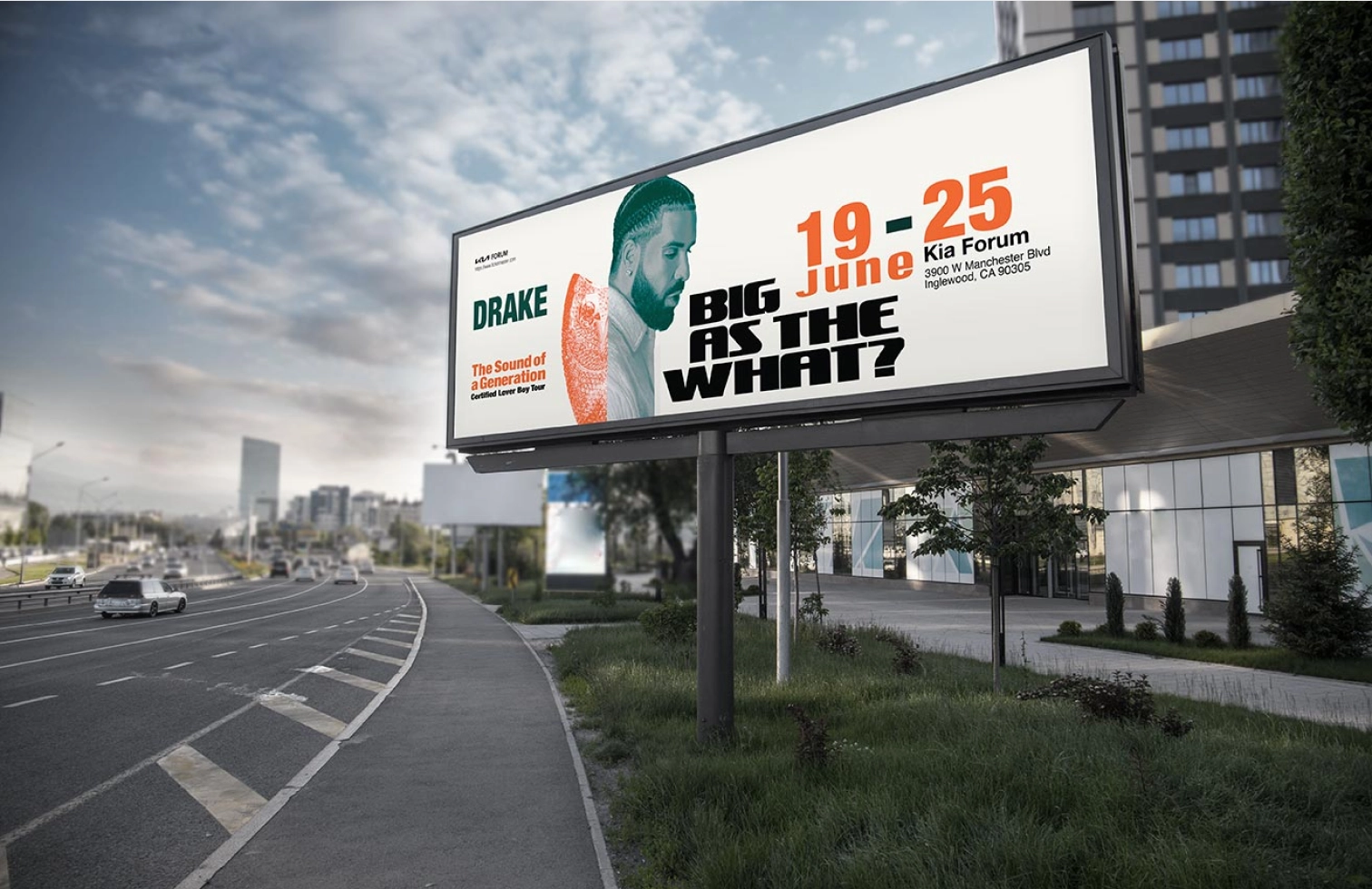
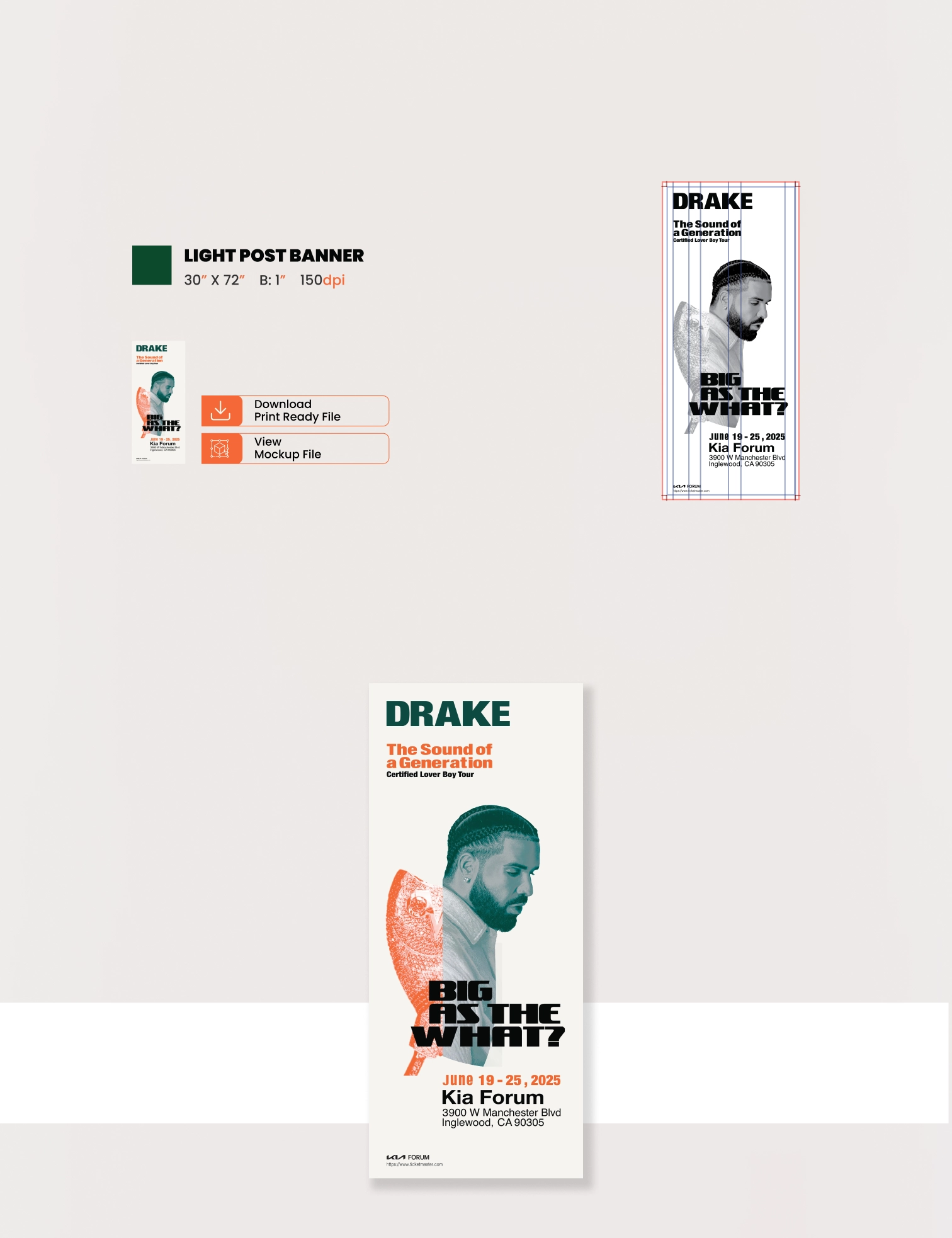
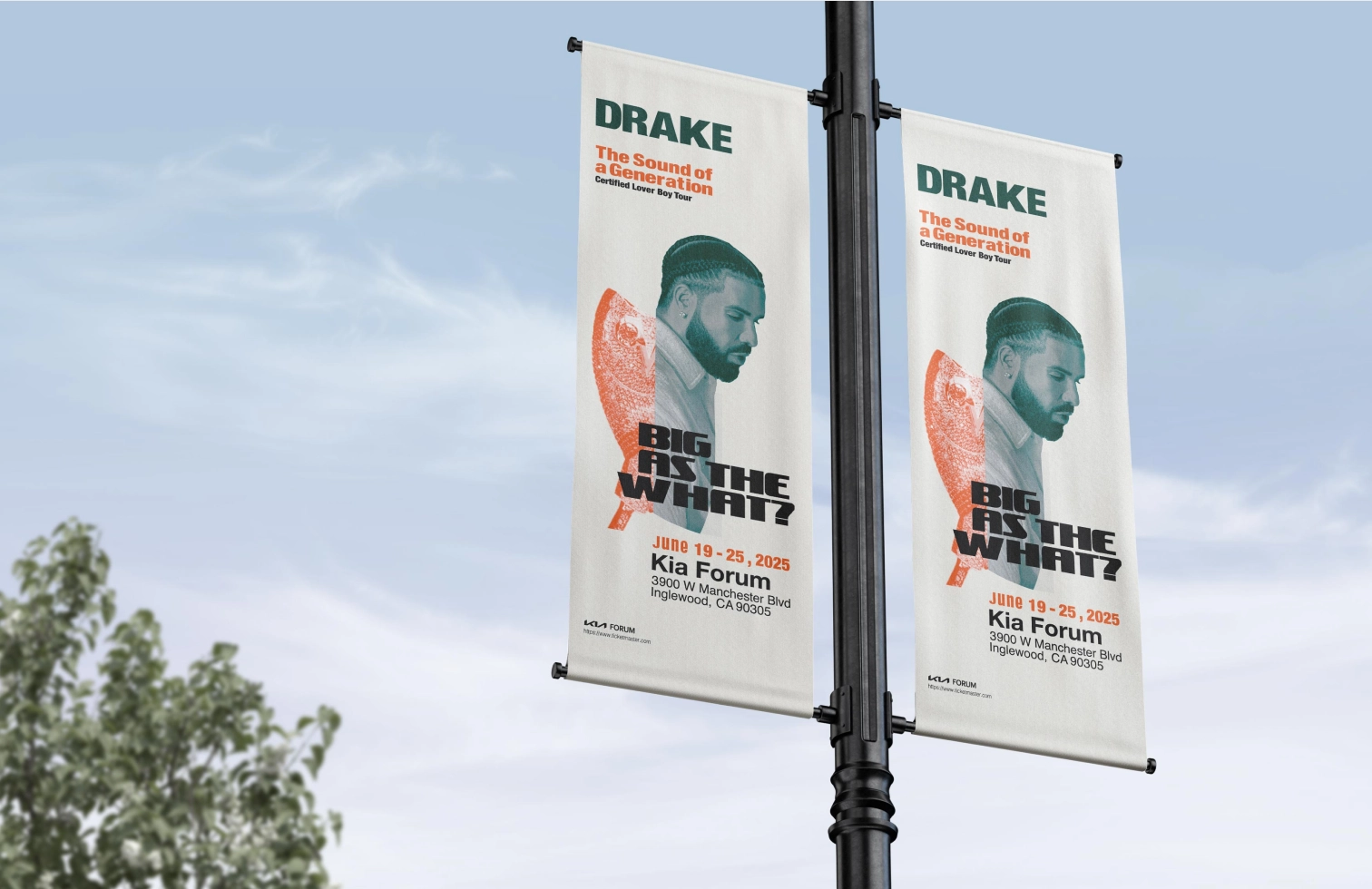
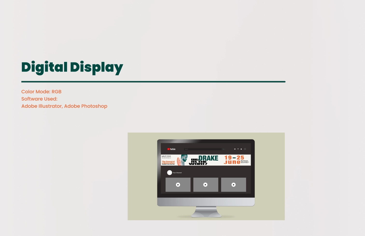
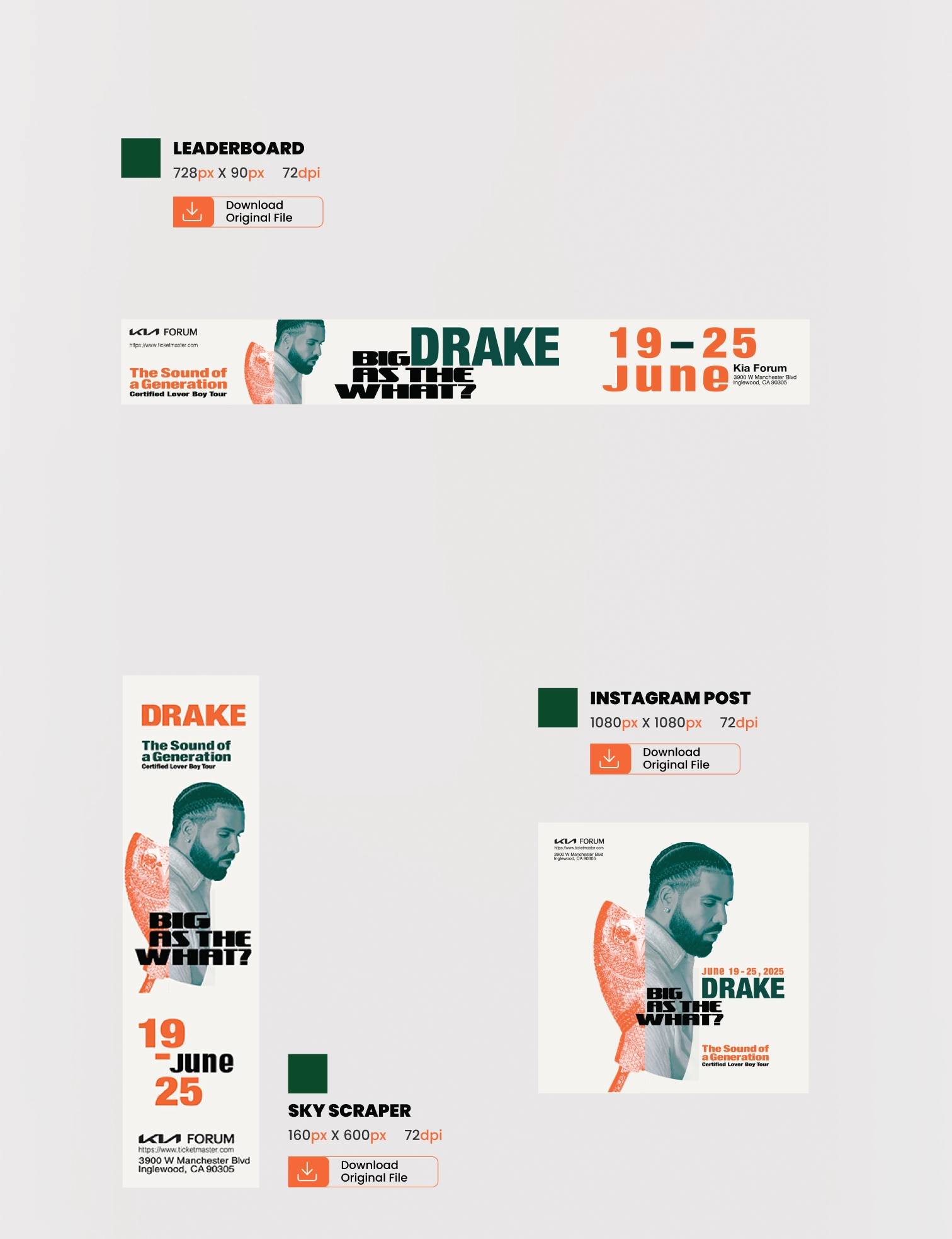
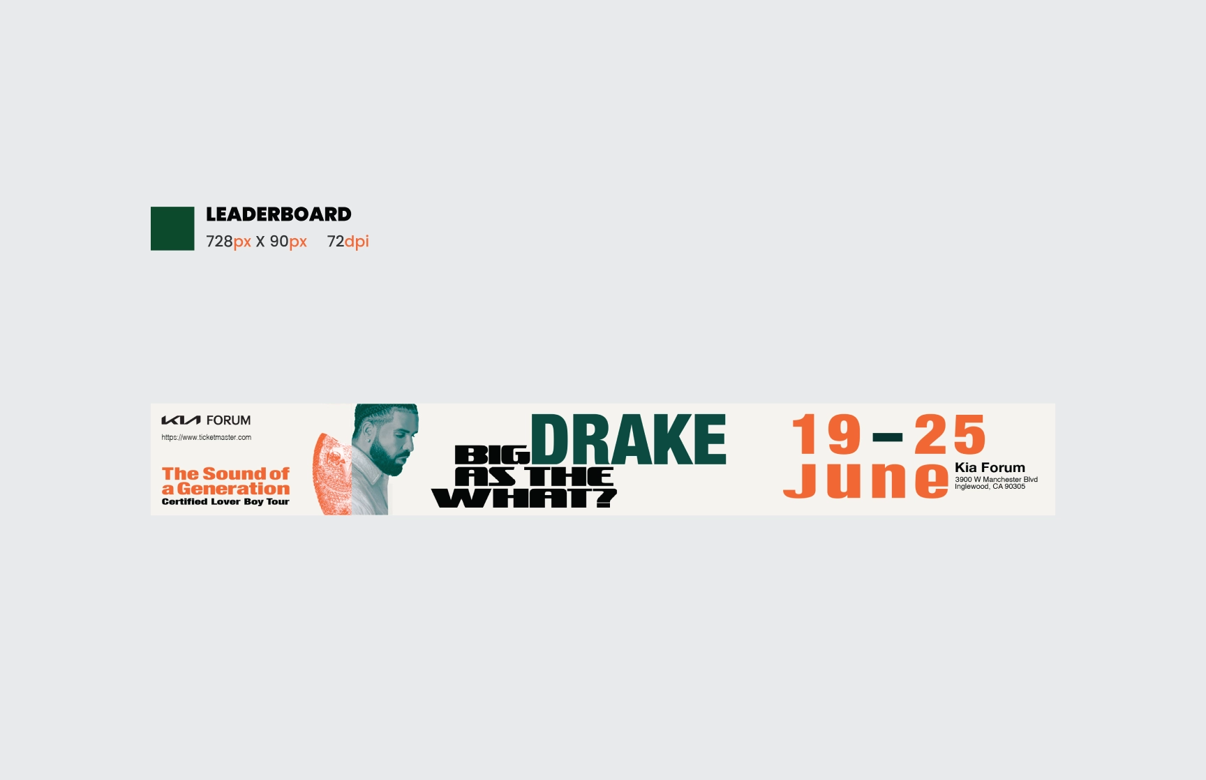
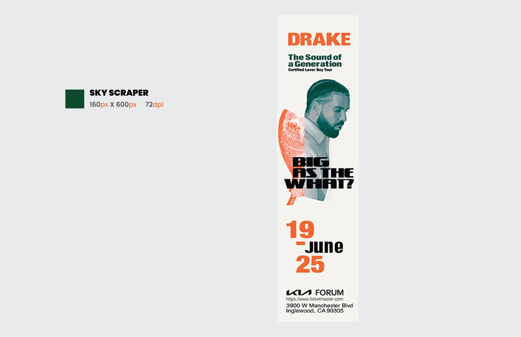
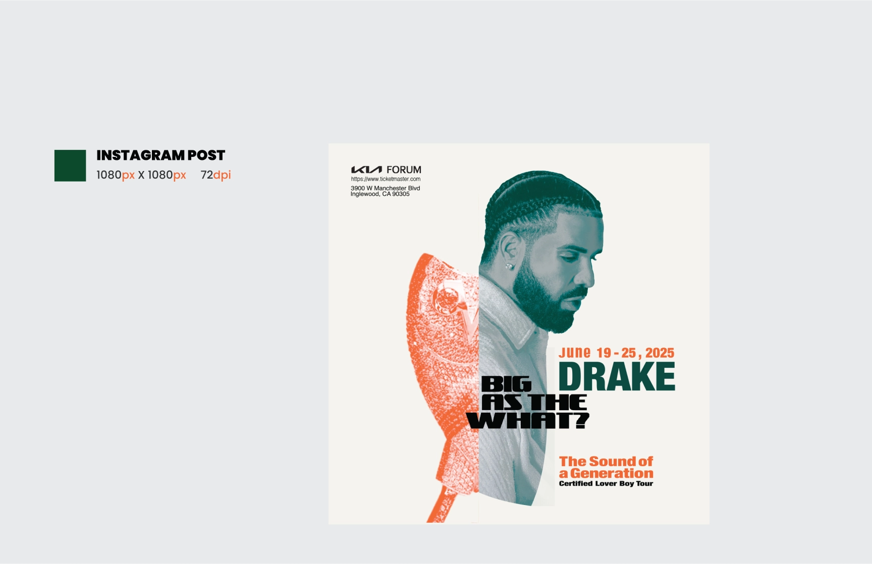
Drake
Stealth Project slidepanel
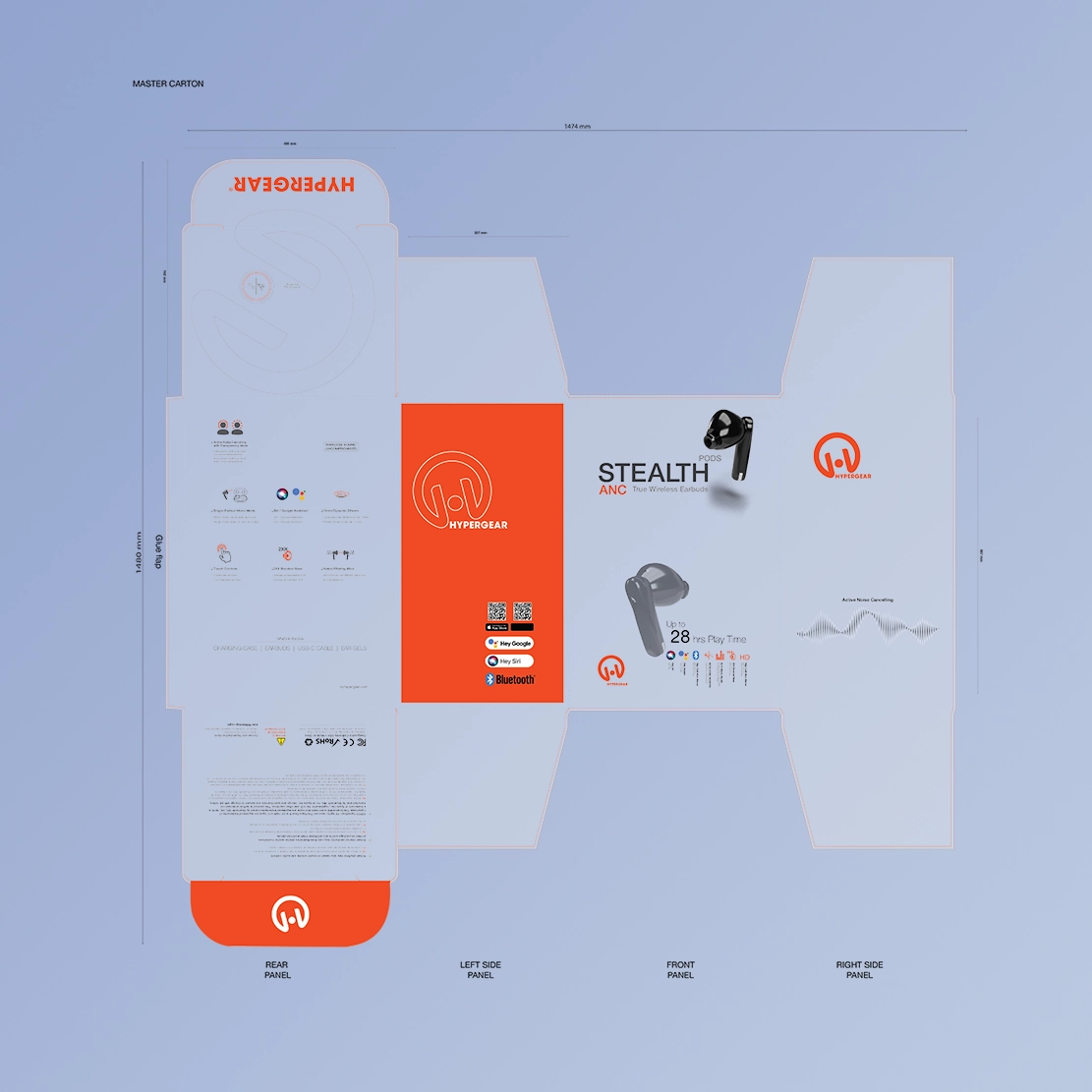
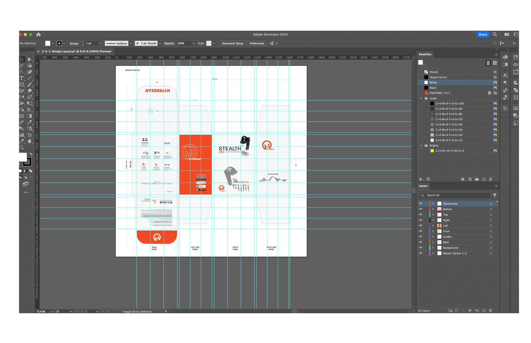
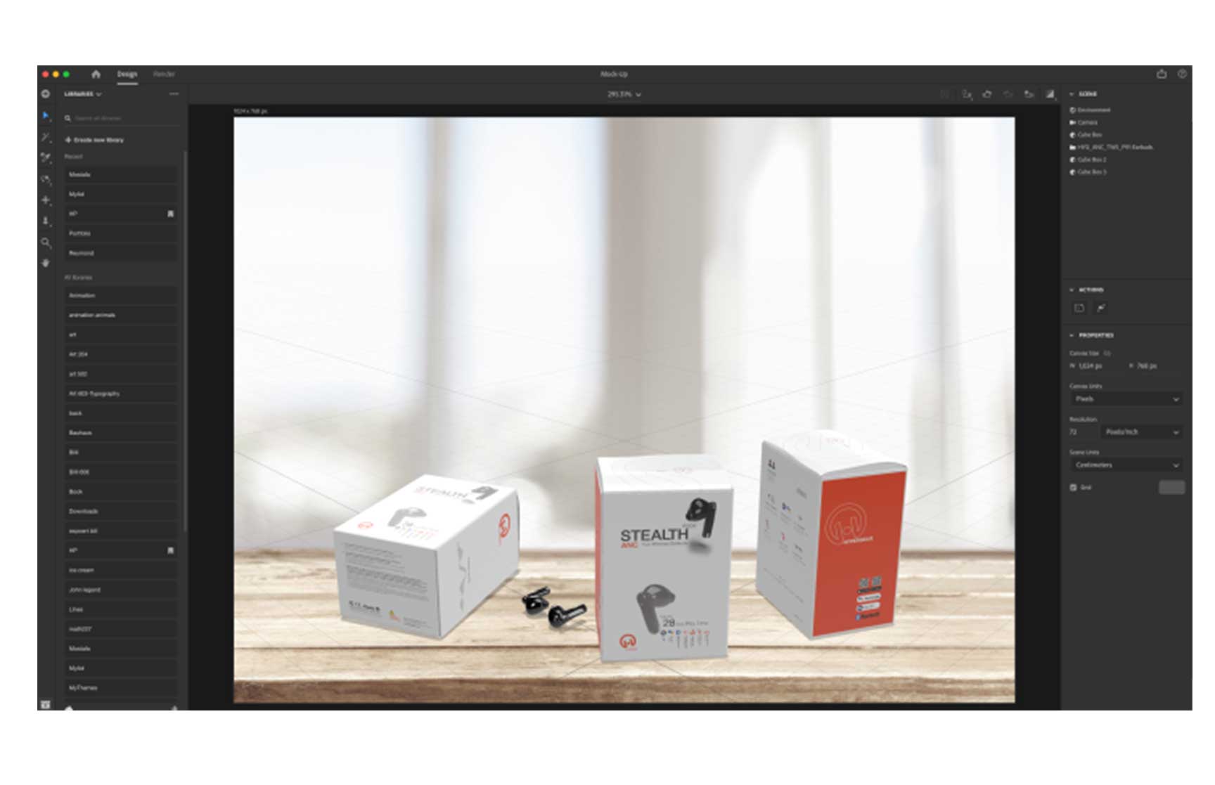
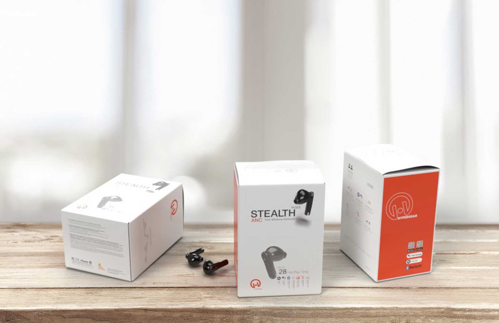
Creating a Master Carton for the HyperGear Brand
Introduction
As a graphic design student at California State University, Northridge (CSUN), with a background in visual design and various Adobe certifications, I am constantly seeking opportunities to apply my skills in practical, real-world projects. My recent endeavor involved designing a master carton for HyperGear's Stealth Pods ANC, a product known for its cutting-edge technology and sleek design. This project allowed me to blend my technical proficiency with creative insights to produce a packaging solution that is both functional and visually appealing. This design was specifically requested by a company as an assignment to demonstrate my skills during the job application process.
Design Concept and Objectives
The primary objective of the master carton design was to create a packaging solution that effectively protects the product while enhancing its shelf appeal. Given the competitive nature of the consumer electronics market, the design needed to reflect the high quality and advanced features of the Stealth Pods ANC. The design also had to adhere to specific dimensions and structural requirements to meet practical shipping and display needs.
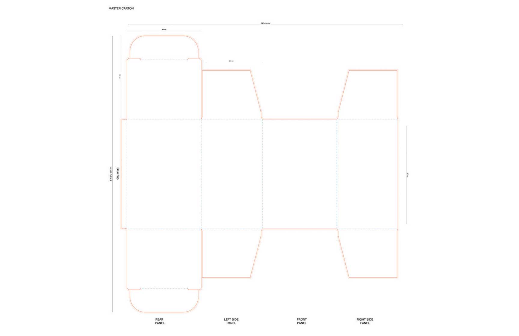
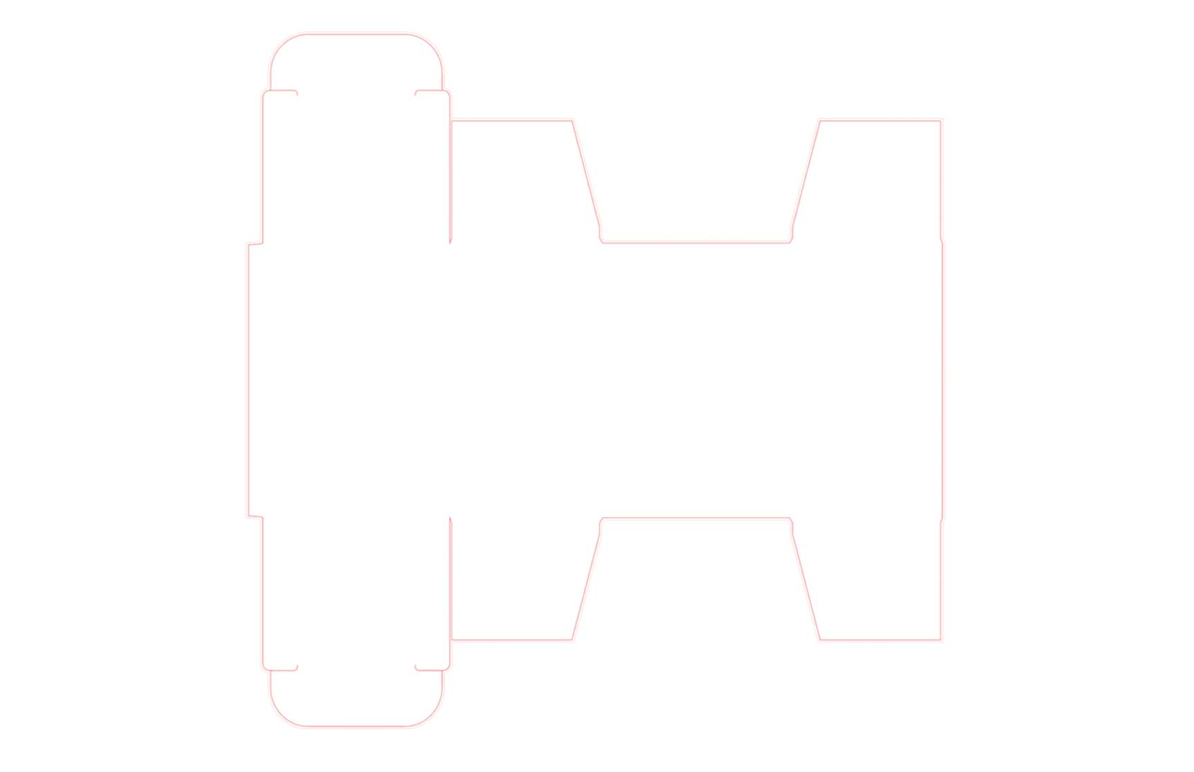
Technical Specifications
The master carton was designed with precise dimensions: a length of 587 mm, a height of 327 mm, and a width of 400 mm. These dimensions were crucial in ensuring that the carton could securely accommodate multiple units of the Stealth Pods ANC. The design process involved creating a detailed die-cut layout that specified the positions of various panels and flaps, ensuring ease of assembly and structural integrity.
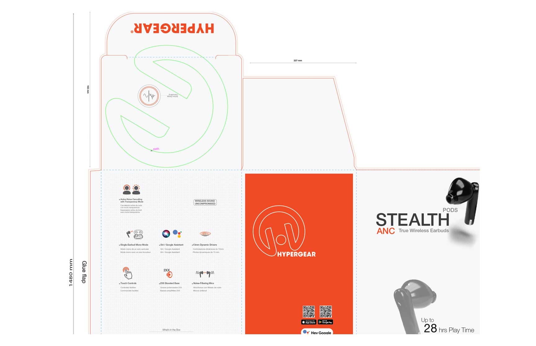
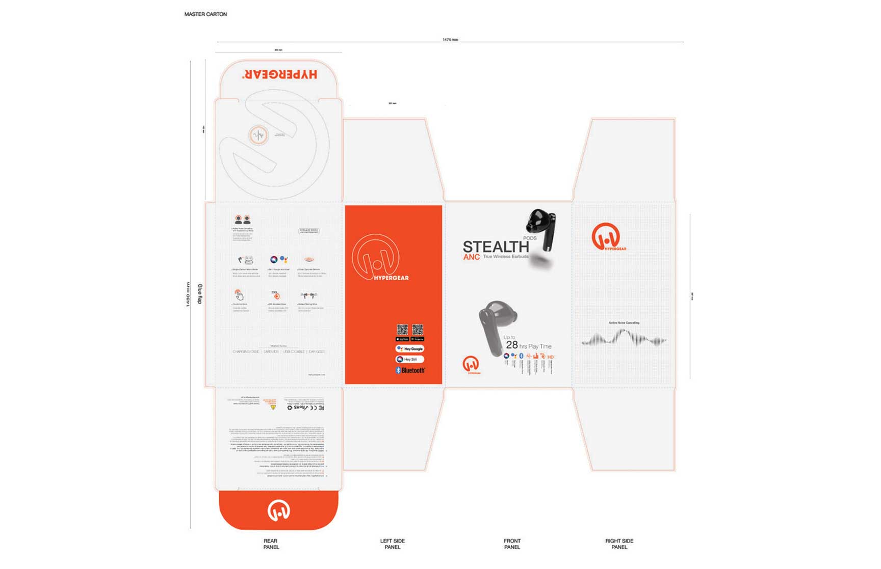
Visual Design Elements
The brand identity of HyperGear drove the visual design of the master carton. Key elements included: Brand Colors and Logo: HyperGear's signature orange and white colors, along with the prominently displayed logo, ensure brand consistency and recognition. Product Imagery: High-quality images of the Stealth Pods ANC were included on the front and side panels, showcasing the product's sleek design and key features. Informational Graphics: Icons and text were strategically placed to highlight important product features, such as active noise canceling, Bluetooth compatibility, and up to 28 hours of playtime. Clean and Modern Layout: The overall layout was clean and modern, with ample white space to avoid clutter and enhance readability.
Software and Tools
The design was created using Adobe Illustrator, leveraging my expertise in this software to produce a professional and precise layout. The die-cut design involved careful planning and attention to detail to ensure that all elements aligned correctly and the final product was both functional and aesthetically pleasing.
Challenges and Solutions
One of the key challenges was ensuring that the design was not only visually appealing but also practical from a manufacturing standpoint. This required close collaboration with the production team to understand the limitations and capabilities of the printing and cutting processes. Adjustments were made to the design to optimize it for efficient production while maintaining the intended aesthetic.
Conclusion
The master carton design for HyperGear's Stealth Pods ANC represents a successful integration of technical skills and creative design. By focusing on both the practical and visual aspects of the packaging, I was able to create a solution that enhances the product's marketability and ensures its protection during shipping and handling. This project not only showcases my capabilities as a graphic designer but also highlights the importance of thoughtful and strategic design in creating effective packaging solutions. This assignment, requested by a company, was a valuable opportunity to demonstrate my skills and creativity in a professional context.
All credit and rights to the 3D picture of the product, logo, brand name, and color swatch used in this design are the property of the HyperGear brand. The inclusion of these elements in this project is intended solely for the purpose of showcasing my design skills and is used with respect for HyperGear's intellectual property rights.
Drake Project slidepanel

contactme-header
I craft designs that speak for themselves
clear, impactful, and ready to connect without extra explanation.